


Color used to be a back-end production concern. A photographer calibrated a monitor, a designer checked a proof, a video editor exported to a known standard, and most consumers saw the result on roughly similar sRGB screens. That world is disappearing.
Today, creators sell products, teach design, review cosmetics, publish HDR video, create brand assets, build print-on-demand shops, and preview work across phones, tablets, laptops, TVs, gaming monitors, ultrawide displays, and portable monitors. A color decision made on one screen can become a buying decision on another. That is the core reason demand is growing for creator-to-consumer color matching tools: creators need a practical way to make color survive the trip from capture to edit to platform to buyer.

“Color matching” does not mean every consumer will see an identical red, blue, skin tone, paint chip, or product finish. Consumer devices vary too much. It means reducing avoidable errors, choosing the right color standard for the job, previewing likely outcomes, and using displays and workflows that make color decisions repeatable.
What Creator-to-Consumer Color Matching Means
Creator-to-consumer color matching is the set of tools and habits that help a creator’s intended color appear predictably when viewed, printed, purchased, or reused by someone else.
That can include:
- A calibrated monitor for photo editing, video grading, CAD review, or product imagery.
- ICC profiles that describe how a camera, file, display, or printer handles color.
- Soft proofing for print or packaging before physical output.
- Color charts, gray cards, LUTs, and reference images for capture and editing.
- Platform-aware exports for web, ecommerce, social video, HDR, and print-on-demand.
- Browser and device previews for sRGB, Display P3, HDR, and dark-mode contexts.
- Display buying decisions based on gamut, Delta E, uniformity, calibration support, and HDR behavior rather than resolution alone.
In plain terms: the creator wants the color they approve to be close to the color the audience receives. The growing demand comes from the fact that this gap is now commercially visible.
Why Demand Is Rising
1. Creators Are Now Direct Sales Channels
Creators are no longer only making content around products. Many are selling products, linking to products, licensing presets, running storefronts, producing paid tutorials, or building visual brands around their own merchandise.
That changes the cost of color errors. If a shirt looks muted, a sofa fabric appears warmer than expected, a makeup shade shifts on a phone, or a digital print preview looks different from the delivered item, the creator can lose trust even when the underlying product is fine.
The consumer behavior behind this is real. Pew Research Center found that 39% of U.S. social media users said influencers or content creators affected what they purchase at least a little, with higher influence among younger adults. That does not mean every creator recommendation converts directly into a sale. It does mean creator visuals now sit close enough to the purchase decision that color accuracy matters commercially.
The FTC’s Endorsement Guides also treat many creator product posts as endorsements when there is a material connection. That regulatory context reinforces the same practical point: creator content is not just entertainment. It often functions as consumer-facing product communication.
2. Wide-Gamut Screens Made “Good Enough sRGB” Less Simple
For years, sRGB was the safest default for web images because it matched the assumptions of many browsers, operating systems, and mainstream displays. It is still the most important baseline for general web delivery. But modern screens increasingly support wider color gamuts, especially Display P3 on many phones, tablets, laptops, and premium monitors.

A gamut is the range of colors a device or color space can reproduce. A wide-gamut display can show colors that an sRGB-only display cannot. That sounds straightforwardly better, but it creates new workflow risk: colors may look vivid on one device and ordinary, clipped, or oversaturated on another if files, profiles, and preview environments are not handled properly.
The web itself is moving in this direction. W3C’s CSS Color Module Level 4 includes color spaces beyond sRGB, including Display P3, and discusses gamut mapping for colors that fall outside a target display’s range. For creators, this means color is becoming more capable but also more conditional. A design system, product photo, thumbnail, or video frame may need to look acceptable in sRGB while taking advantage of wider-gamut screens where appropriate.
That is a major driver for color matching tools: creators need to know not only “does this look good on my screen?” but also “what color space is this actually in, and what happens when it lands somewhere else?”
3. HDR Video Raises the Stakes for Display Choice
HDR, or high dynamic range, expands the range between dark and bright parts of an image and can support richer color when handled correctly. For creators working with game capture, cinematic video, product demos, travel footage, or premium YouTube uploads, HDR is attractive because it can look more lifelike and more immersive.

But HDR is not just a brightness setting. It depends on metadata, color primaries, transfer functions, mastering assumptions, and the viewer’s display. YouTube’s HDR upload guidance, for example, says HDR videos need HDR metadata and recommends grading in Rec. 2020 with PQ or HLG. It also notes that YouTube creates HDR transcodes for HDR devices and SDR downconversions for other devices.
That creates a creator-to-consumer matching problem. The creator may grade on one monitor, upload to a platform that processes the file, and have viewers watch on phones, TVs, laptops, or gaming monitors with very different HDR capabilities. A display that merely accepts an HDR signal is not the same as one that can be trusted for HDR judgment.
This is why HDR-related display specs are now part of creator buying guidance. VESA’s DisplayHDR criteria, for instance, include color gamut, combined color luminance, contrast behavior, and local dimming requirements at higher tiers. For color-critical creators, HDR capability is not only about peak brightness. It is about whether highlight detail, saturation, black levels, and tone mapping are controlled enough to support repeatable decisions.
4. Consumers Compare Across Devices Before Buying
A consumer rarely sees one version of a product image. They may see a creator’s short video on a phone, a product page on a laptop, reviews on a tablet, and a checkout page on a desktop monitor. If the color appears inconsistent across those touchpoints, confidence drops.
This is especially important for categories where color carries product meaning:
- Apparel, footwear, and accessories.
- Beauty, skin care, and hair color.
- Interior decor, paint, tile, furniture, and textiles.
- Art prints, photography, stationery, and packaging.
- Food, beverages, and wellness products.
- Gaming content, presets, LUT packs, and visual identity systems.
The creator may not control the consumer’s final device, but they can control their own reference environment. A calibrated display, consistent export settings, and correct embedded profiles reduce the chance that preventable mistakes get baked into the file before the consumer ever sees it.
5. Remote Collaboration Needs Shared Visual References
Color matching is not only a creator-to-buyer problem. It is also a creator-to-client, creator-to-editor, and creator-to-printer problem.
A modern workflow may involve a photographer, retoucher, video editor, motion designer, brand manager, marketplace operator, and print provider, all working from different screens. Without shared profiles and reference targets, people may argue about color while looking at different realities.
The International Color Consortium was created to promote open, cross-platform color management. ICC profiles are designed to describe device color behavior so color data can be translated between devices and color spaces. Adobe’s color profile documentation describes the same basic logic: profiles help the color management system understand document, device, and monitor color behavior.
This is why demand is growing for tools that make color communication less subjective. A comment like “make it warmer” is useful creatively. A calibrated proof, reference profile, target white point, and measured display report are useful operationally.
6. Monitor Specs Are Becoming Workflow Specs
For general productivity, a monitor can be judged by size, resolution, refresh rate, ports, ergonomics, and price. For creator-to-consumer color work, those specs are incomplete.

A 27-inch or 32-inch 4K display may be sharp enough for editing, but sharpness does not guarantee accurate color. A 165 Hz gaming monitor may feel excellent for motion and responsive editing, but refresh rate does not tell you whether the display tracks sRGB accurately, supports hardware calibration, or has uniform brightness across the panel. An ultrawide monitor may improve timeline editing and trading-desk-style multitasking, but if the left and right sides vary visibly in color temperature, it can be risky for final color approval.
This is why creator display buying guidance increasingly focuses on reliability specs:
- Color gamut: Which color spaces can the display cover, such as sRGB, Display P3, Adobe RGB, or Rec. 709?
- Factory calibration: Does the monitor ship with a report, and is the report meaningful for the color space you use?
- Delta E: How large is the measured color difference from a target? Lower is better, but methodology matters.
- Uniformity: Does the panel show consistent brightness and color across the screen?
- Hardware calibration: Can the monitor store calibration internally, or does it rely only on the graphics card LUT?
- Bit depth: Can the workflow display smooth gradients without banding?
- HDR capability: Does the monitor have the brightness, dimming, contrast, and color volume needed for serious HDR preview?
- Profile support: Does the operating system, app, browser, and export format preserve the color information you expect?
Delta E is worth defining because it appears often in professional display marketing. Delta E is a numeric way to express perceived color difference between two colors. EIZO describes Delta E 00 as a value that quantifies how visually distinct two colors appear to the human eye. In buying terms, a low Delta E claim is useful only when you know which mode, target, measurement method, and brightness level were tested.
Key Display and Workflow Parameters Compared
Parameter |
Why It Matters |
Must-Have for Color-Critical Work |
Nice-to-Have or Context-Dependent |
sRGB / Rec. 709 accuracy |
Baseline for web images, SDR video, thumbnails, and general consumer viewing |
Yes |
No |
Display P3 coverage |
Useful for modern phones, tablets, laptops, web design, and richer digital visuals |
Sometimes |
Yes |
Adobe RGB coverage |
Important for some photography and print workflows |
Sometimes |
Yes |
Delta E reporting |
Indicates measured color error against a target |
Yes, if methodology is clear |
No |
Uniformity compensation |
Helps prevent one side of the screen from looking warmer, cooler, brighter, or darker |
Yes for proofing and retouching |
Sometimes |
Hardware calibration |
Stores calibration in the display, improving consistency across systems |
Strongly recommended |
Sometimes |
HDR certification or validation |
Helps assess whether HDR claims are meaningful |
Yes for HDR grading |
Nice for SDR-only work |
10-bit signal path |
Helps reduce banding in gradients when the whole pipeline supports it |
Useful for video and high-end imaging |
Not essential for all web work |
High refresh rate |
Improves motion clarity and responsiveness |
No for still color accuracy |
Yes for gaming, capture review, and fast editing |
Ultrawide format |
Improves timeline, CAD, programming, trading, and multi-panel layouts |
No |
Yes, if uniformity is good |
Portable monitor support |
Helps on-location review and travel workflows |
Sometimes |
Yes |
How Different Creators Feel the Pressure
Photographers and Retouchers
For photographers, color matching demand comes from the gap between artistic editing and client expectation. Portrait skin tones, wedding colors, apparel, food, and product finishes can all shift under poor display conditions.
A reliable workflow usually starts with a calibrated monitor, a known editing color space, embedded profiles on export, and soft proofing when print is involved. The monitor does not need every premium feature, but it does need stable brightness, accurate sRGB or Adobe RGB behavior depending on output, and enough uniformity that edits are not being made to compensate for panel flaws.
Video Editors and Colorists
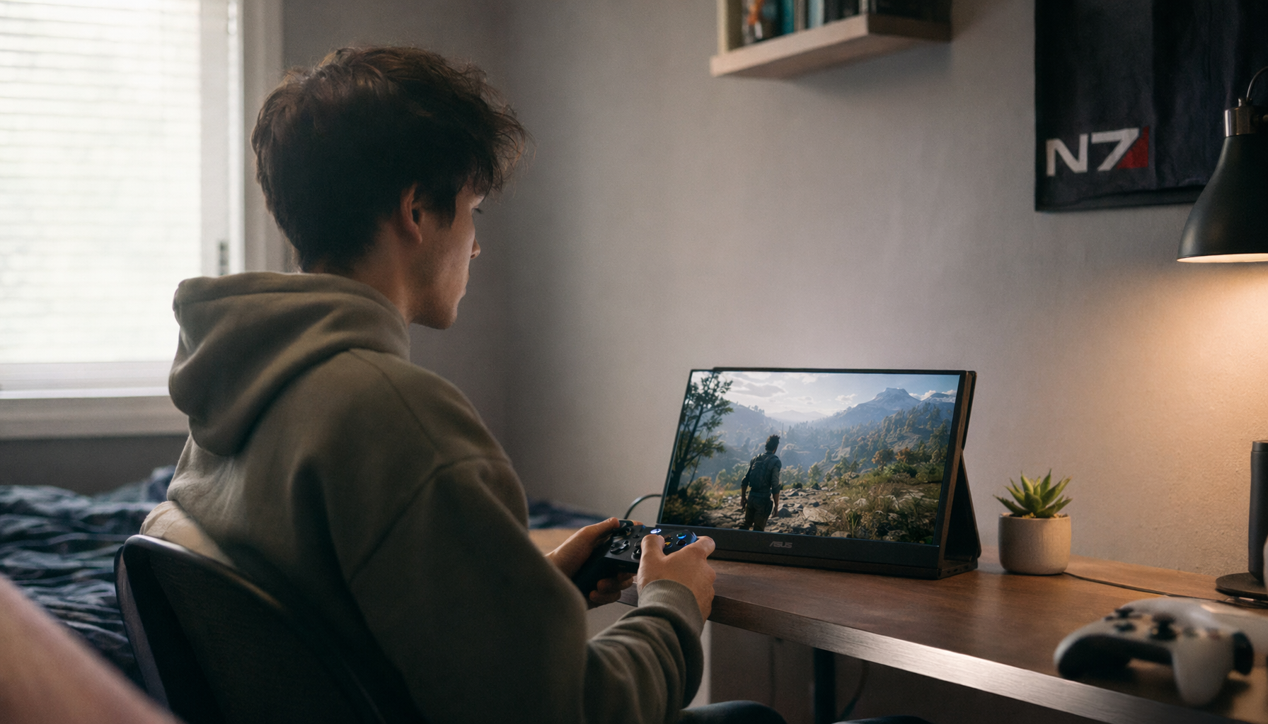
Video creators face more variables: camera color science, log footage, LUTs, SDR versus HDR delivery, platform transcoding, and viewer devices. For SDR social video, Rec. 709 accuracy is still central. For HDR, the display needs to support the relevant luminance and color workflow, not merely show an HDR badge.
A gaming monitor can be useful for creators who edit gameplay, esports content, or high-frame-rate footage. The key is not to confuse refresh rate with grading accuracy. A fast panel can be part of a creator setup, but final color decisions should happen in a controlled mode with known color behavior.
Designers, Developers, and Brand Teams
Designers and front-end developers increasingly work across sRGB, Display P3, dark mode, light mode, HDR imagery, and multiple operating systems. A color chosen in a design tool may be implemented in CSS, exported as SVG, used in a marketplace image, and viewed on a wide-gamut phone.
The rise of modern CSS color functions and wider-gamut support makes design systems more powerful, but it also increases the need for preview discipline. Designers need to know when a color is inside sRGB, when it only works on P3-capable screens, and how it degrades elsewhere.
CAD, Architecture, and Interior Workflows
CAD and interior workflows are not always “color-critical” in the same way as prepress, but color still affects decisions. Materials, finishes, lighting concepts, and client presentations rely on visual trust. A portable monitor on-site or an ultrawide workstation display can be valuable, but the display should be profiled if it is used for material approvals.
The key distinction is between color for navigation and color for approval. Navigation can tolerate more variation. Approval needs a controlled screen, known lighting, and documented output expectations.
Trading Desks and Programming Setups
At first, trading desks and programming displays may seem unrelated to color matching. But they show why display buying has become specialized. A trader may value multi-monitor consistency, brightness control, and text clarity. A developer may care about readable contrast, eye comfort, and accurate UI previews. A creator who also codes, trades, or manages ecommerce operations may need one setup to support multiple visual tasks.
That does not mean every professional needs a reference monitor. It means the buying decision should separate productivity requirements from final color requirements. An ultrawide can be excellent for layout and multitasking, while a smaller calibrated display handles final visual approval.
The Practical Display-Buying Implication
The growing demand for color matching tools changes how creators should evaluate monitors. Instead of asking “Which monitor has the best specs?” the better question is “Which monitor reduces uncertainty in my workflow?”
For general creator work, prioritize:
- Accurate sRGB mode.
- Stable brightness control.
- Good panel uniformity.
- Clear factory calibration documentation.
- Support for hardware calibration or reliable profiling.
- Enough resolution for the editing task, usually 4K for detailed photo, video, and design work on 27-inch to 32-inch displays.
- USB-C or docking features only if they simplify the workstation without compromising display performance.
For print-focused work, add:
- Adobe RGB coverage when your printer, paper, and workflow benefit from it.
- Soft proofing support.
- A calibration device and consistent room lighting.
- A hood or glare-controlled setup if the room is bright.
For video and HDR work, add:
- Strong Rec. 709 accuracy for SDR.
- HDR capability that includes meaningful brightness, contrast, dimming, and color volume.
- Correct handling of PQ, HLG, and Rec. 2020 workflows where relevant.
- A separate consumer-device preview step, because platform delivery can change the final appearance.
For mixed gaming and creator work, separate modes:
- Use high refresh rate for gaming, capture review, and responsive editing.
- Use calibrated sRGB, Rec. 709, P3, or HDR modes for color decisions.
- Avoid editing color in an oversaturated “vivid” or “gaming” preset unless that is intentionally the target look.
Concise Action Checklist
- Define the final output first: web, social video, HDR video, print, ecommerce product images, CAD presentation, or multi-use brand assets.
- Choose the correct working standard: sRGB or Rec. 709 for most SDR digital work, Adobe RGB for relevant print photography, Display P3 for supported digital design, and Rec. 2020 with PQ or HLG for HDR workflows.
- Calibrate and profile the monitor used for approval, then repeat on a schedule rather than only when the image “looks off.”
- Export with embedded profiles or required metadata so platforms and apps can interpret color correctly.
- Preview on at least one typical consumer device, especially for product images, skin tones, HDR video, and social commerce content.
- Keep a reference file, test chart, or known-good image in the workflow so unexpected shifts are easier to diagnose.
- Separate productivity displays from approval displays if one monitor cannot satisfy both speed and color reliability.
What Is Must-Have Versus Nice-to-Have?
A creator does not need to buy the most expensive display to improve color matching. The must-have features depend on the consequences of being wrong.
Must-have reliability features include accurate color modes for the target output, calibration support, stable brightness, good uniformity, and correct profile handling. These directly affect whether the creator can trust the image.
Nice-to-have features include high refresh rate, ultrawide format, built-in KVM switching, docking, speakers, RGB lighting, and ultra-thin design. These can improve comfort and productivity, but they do not replace color control.
HDR sits in the middle. It is unnecessary for many still-image and SDR workflows, but it becomes a must-have when the creator is actually grading HDR content. In that case, weak HDR support is worse than no HDR support because it may encourage bad decisions.
Why Tools Alone Are Not Enough
Color matching tools are only effective when the workflow is consistent. A calibrated monitor cannot fix an untagged export. A wide-gamut display cannot make a low-quality product photo trustworthy. A colorimeter cannot control a viewer’s screen. An HDR monitor cannot guarantee that every platform, browser, and device will render the file as intended.
The goal is not perfection. The goal is controlled uncertainty.
Creators who understand that distinction make better buying decisions. They do not chase every spec. They build a chain of trust: capture, edit, display, export, platform, and preview. Each link reduces the gap between creator intent and consumer experience.
FAQ
Q: Do creators still need to care about sRGB if modern screens support wider color?
A: Yes. sRGB remains the safest baseline for broad web and ecommerce delivery because many workflows, browsers, thumbnails, and consumer devices still handle sRGB predictably. Wide-gamut spaces such as Display P3 are useful when the platform and audience devices support them, but creators should still check how colors map back to sRGB.
Q: Is a gaming monitor good enough for color-critical creator work?
A: Sometimes, but not because it is a gaming monitor. High refresh rate, low input lag, and fast pixel response help with motion and gameplay review, but color-critical work depends on accuracy, calibration, uniformity, gamut control, and stable color modes. A gaming monitor with a strong calibrated sRGB or P3 mode can work for many creators. A vivid, oversaturated gaming preset should not be used for final color approval.
Q: What is the simplest upgrade for better creator-to-consumer color matching?
A: The simplest upgrade is usually not a new camera or a brighter monitor. It is a controlled workflow: calibrate the approval display, work in the correct color space, export with the right profile or metadata, and preview on a typical consumer device before publishing. If the current monitor cannot hold an accurate mode or has poor uniformity, then upgrading the display becomes the next practical step.
Practical Takeaways
Demand for creator-to-consumer color matching tools is growing because color now affects trust, sales, brand consistency, and production efficiency. Creators publish into a fragmented display world where sRGB, Display P3, HDR, mobile screens, desktop monitors, and platform processing all coexist.
The best response is not to chase every new display feature. It is to match the toolset to the workflow. For most creators, accurate SDR color, calibration, profile discipline, and consumer-device previewing matter more than headline brightness or refresh rate. For HDR video, print proofing, and product-critical ecommerce, the requirements become stricter, and the monitor becomes a production instrument rather than a general-purpose screen.
Color matching is ultimately about reducing surprises. The more directly a creator’s visuals influence consumer decisions, the more valuable that reduction becomes.
References
- Pew Research Center: For shopping, Americans turn to mobile phones while influencers become a factor
- Federal Trade Commission: FTC’s Endorsement Guides: What People Are Asking
- International Color Consortium: About ICC
- Adobe: Working with color profiles
- W3C: CSS Color Module Level 4
- YouTube Help: Upload High Dynamic Range (HDR) videos
- VESA Certified DisplayHDR: Performance Criteria
- EIZO: How to Read the ColorEdge Factory Report


