


Accurate highlight detail depends on three checks working together: a calibrated display, a proper white-level test pattern, and real high-key images where texture remains visible instead of turning into flat white.
Ever open a bright product shot, snowy game scene, or white-background portrait and wonder whether the missing texture is in the file or your screen? A disciplined check can reveal clipped highlights, overdriven contrast, or room glare in minutes, and it gives you repeatable settings you can trust for editing, gaming, and office work. You’ll learn how to tell whether your display is preserving fine bright detail or simply blasting it away.
Why Highlight Detail Matters in High-Key Images
High-key images live near the bright end of the tonal range. Think white sneakers on a white e-commerce background, a spreadsheet with pale gridlines, a cloud-heavy sky, a bright snow map in an FPS, or a presentation slide with subtle gray dividers. If your monitor clips highlights, all of those light tones collapse into the same white.
That is not only a photography problem. For a competitive gamer, blown highlights can hide muzzle flash shape, fog density, snow texture, and UI contrast. For office work, it can make pale borders, disabled buttons, and light gray text harder to judge. For creators, it can lead to edits that look fine on your screen but harsh or dull elsewhere.
The practical definition is simple: highlight detail is the visible separation between very bright tones. A good display setup lets you distinguish near-white steps, such as 245, 250, and 254 on an 8-bit scale, without making the entire screen look gray or dim.
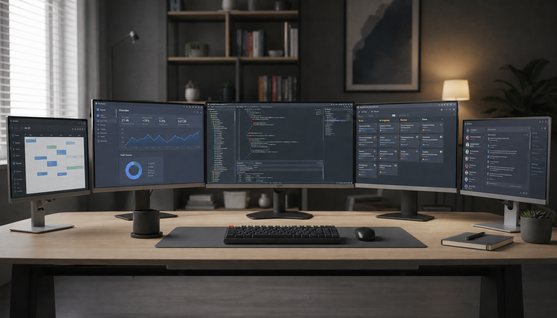
Start With the Display, Not the Image
Before judging a high-key file, put the monitor in a reliable state. Let it warm up for about 30 minutes, remove direct sunlight from the panel, and use one stable picture mode. Calibration is the process of checking and adjusting display behavior against a known reference, and calibration changes a display’s color behavior across white point, luminance, contrast, and gamma.
For most office, web, gaming, and SDR image review, start near a D65 white point, gamma 2.2, and a brightness that suits the room. Many calibration workflows use about 120 cd/m² in moderately dim editing spaces, which translates in practical terms to a screen that is comfortable rather than showroom-bright. In a sunny room, you may need more brightness, but glare can still trick your eyes into over-brightening the display.
Factory settings are often designed to impress on a sales floor. That usually means vivid color, boosted contrast, and aggressive brightness. Those settings can make a display feel punchy, but they often compress the last few highlight steps. A calibrated or carefully adjusted mode may look quieter at first, yet it usually reveals more usable detail.
Setting |
Practical Starting Point |
What Goes Wrong If It’s Off |
Picture mode |
sRGB, Custom, User, or Creator mode |
Vivid modes may oversaturate and clip tones |
White point |
D65 / 6500K |
Whites look too blue or too warm |
Gamma |
2.2 |
Midtones and bright gradients look wrong |
Brightness |
Room-matched, often near 120 cd/m² for editing |
Too bright causes fatigue and hides subtle steps |
Contrast |
As high as possible without clipping |
Too high turns near-white detail into flat white |
Use a White-Level Pattern to Find Clipping
The fastest technical check is a white-level or contrast test pattern. Open a pattern that shows several near-white bars or boxes against a white background. Your goal is to see separation in the brightest visible steps while keeping the background clean and neutral.
Raise contrast until the brightest boxes begin to merge, then back it down until each important near-white step becomes distinguishable again. If the monitor has a separate “black level” or “shadow boost” control, leave it alone during this step; you are testing the top end, not shadows. If your monitor has dynamic contrast, local contrast enhancement, eco mode, or automatic brightness, disable those features while verifying accuracy because they can change the result from scene to scene.
A real-world check works like this: display a white-level pattern full screen, sit at your normal viewing distance, and look for the lightest boxes without leaning in or squinting. If you can only see them when you move your head, your panel angle, coating, brightness, or contrast setting is interfering. On TN panels in particular, small vertical viewing changes can shift apparent brightness, so monitor height and tilt matter.
Confirm With Real High-Key Images
Patterns expose technical clipping, but real images expose practical clipping. Use a few files with known highlight texture: a white shirt with folds, a ceramic mug on a white desk, clouds with soft edges, a snow scene, or a product photo with a pale background. The decisive question is whether the white subject still has form.

For photography and content review, compare the image histogram with what you see. A histogram shows tonal distribution, and a histogram is useful for judging whether shadows or highlights are clipped. If the file’s histogram has data near the right edge but is not pressed against it, yet your display shows a blank white patch, the monitor setup is likely the problem. If the histogram is clipped hard at the right edge, the file itself may not contain recoverable highlight detail.
For gaming, use bright scenes rather than only desktop test patterns. A snow-covered map, a bright skybox, or a white training-room wall can show whether your settings preserve shape during motion. “Competitive visibility” presets can involve a tradeoff. They may help you spot opponents, but some boost contrast so strongly that bright haze, snow, and cloud detail flatten out.
Calibrate When Visual Tweaks Stop Being Enough
Software-only adjustment can get you closer, but hardware calibration is more reliable when accuracy matters. A monitor calibrator, or colorimeter, sits on the screen while software displays color and brightness patches; a monitor calibrator measures inaccuracies and creates a correction profile.
The advantage is repeatability. You get measured luminance, white point, tone response, and an ICC profile instead of guessing by eye. The drawback is cost and maintenance. Calibration also cannot turn a weak panel into a reference display, and it cannot fix poor uniformity, aging backlights, or a low-contrast screen.
For a practical cadence, recalibrate monthly for serious image work and every few months for general productivity unless you notice drift sooner. Brightness drift is not theoretical; factory-calibrated displays still need recalibration because display behavior changes over time. If you manage multiple monitors, calibrate each unit separately. Copying settings from another display, even the same model, is not dependable because panel variation is real.
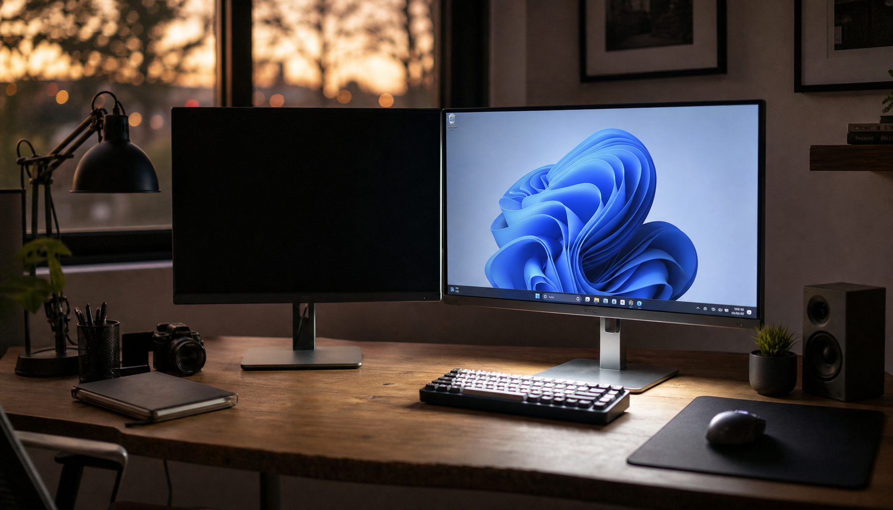
Control the Room Around the Screen
Highlight accuracy is partly visual perception. A glossy display beside a window can make near-white steps disappear even if the panel is technically capable. Keep lighting consistent, avoid direct sunlight, and reduce reflections from white walls or desk lamps. A monitor hood can help in bright workspaces, but simple repositioning often solves more than another round of settings.

For office productivity, match brightness to the room so white documents look like paper, not a flashlight. For image editing, keep the room moderately dim and stable. For portable smart screens, be extra cautious: USB-powered displays often change brightness depending on power source, battery mode, or host device settings.
Read the Result Correctly
If near-white test boxes are visible, real high-key images retain texture, and the histogram agrees with what you see, your display is handling highlight detail well. If patterns look fine but photos still blow out, inspect the file exposure. If photos look fine but patterns fail, your contrast or processing settings are probably masking the issue.
The value-oriented move is to fix settings before buying hardware, then calibrate if the work deserves measured accuracy. Reliable highlight detail is not about making the screen look dramatic; it is about seeing the data that is actually in the image. For gaming, editing, and daily work, that is the difference between a bright display and a trustworthy one.


