


Your monitor passes the test when you can distinguish the darkest near-black steps without turning black into gray, and the brightest near-white steps without washing them into one flat block.
Do dark game corners hide enemies, or do white spreadsheets and clouds lose texture no matter how you adjust the screen? A practical monitor test can show, within minutes, whether the problem is your display, your room lighting, or a bad setting in the signal chain. You’ll get a repeatable way to check shadow detail, highlight detail, HDR behavior, and portable-screen limits without guessing.
Why Shadow and Highlight Detail Matter

Shadow detail is the information just above black: dark fabric folds, hair texture, night-scene walls, game interiors, terminal panels, and dim UI separators. Highlight detail is the information just below full white: cloud edges, snow texture, bright reflections, white product packaging, spreadsheet gridlines, and HDR sparks or headlights.
A monitor with poor shadow handling “crushes” dark tones, making several near-black values look identical. A monitor with poor highlight handling “clips” bright tones, turning light gradients into a blank white patch. Black level and contrast are separate controls because one affects dark tones while the other affects white-level clipping.
For gaming, this decides whether dark-scene depth stays cinematic or becomes unfairly obscure. For office work, it decides whether long sessions feel clear or harsh. For creative review, it decides whether you edit photos and videos toward the wrong exposure because your display is hiding information.
Start With the Right Test Environment
Before judging the monitor, stabilize the room. Strong daylight, warm lamps, glare, and reflections can make a technically decent screen look wrong because your eyes adapt to the surrounding light. Display color accuracy depends on both calibration and room lighting, especially when warm or cool light changes how neutral grays appear.
For a real desk test, set the monitor where no lamp or window reflects directly on the panel, then open a white document beside a dark app. If the white window feels piercing, lower brightness before touching contrast. If the dark app looks muddy or vague after brightness is comfortable, black level, gamma, panel contrast, or signal range may be the problem.
A useful baseline for SDR work is a neutral or sRGB-like picture mode, a 6500K white point, gamma 2.2, and brightness matched to the room. The common office target is roughly 100 to 150 nits in typical indoor lighting, though portable monitors may need more brightness because they are often used in less controlled spaces.
Prepare the Monitor Before Testing
Switch away from Vivid, FPS, Movie, Cool, Eye Care, Dynamic Contrast, Eco, and aggressive enhancement modes. These presets can make a screen look punchy in a store, but they often distort gamma, saturation, contrast, or white point. Use Standard, Custom, User, Creator, or sRGB if available.
Make sure the display is running at native resolution. A 4K productivity monitor should be set to 3,840 x 2,160, not a lower scaled signal, because soft scaling can make test patterns harder to read. 4K monitors for productivity are most useful when their full pixel grid is available for crisp text, dense layouts, and detailed visual work.
Also check the GPU output range. A Full RGB versus Limited RGB mismatch over HDMI can make blacks look washed out or crush shadow steps, which leads many users to blame the panel when the signal path is wrong. If your monitor and GPU both offer RGB range controls, set both to Full for normal PC use unless your specific video chain requires Limited.
Test Shadow Detail With a Near-Black Pattern

Open a black-level or near-black gradient test pattern from a reputable monitor test page, or use a calibration app that shows values just above black. A browser-based visual display check is a practical starting point because it focuses on display behavior rather than entertainment content.
In a dim but not pitch-black room, look for separate steps near black. The darkest block should be almost black, but the next few steps should still be barely distinguishable. If every dark patch blends together, raise black level slightly or choose a gamma setting closer to 2.2. If the whole pattern turns gray and black letterbox bars glow, black level is too high or the panel’s native contrast is limited.
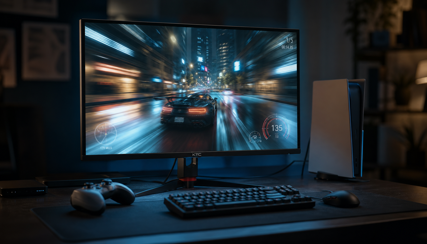
A simple gaming example makes this clear. In a dark hallway scene, a well-tuned monitor should keep the hallway dark while still revealing wall edges, doorway outlines, and texture. Raising black level until every corner is visible may help competitive visibility, but it sacrifices depth and accuracy. Lowering it until the scene looks dramatic may feel impressive, but hidden shadow detail means the monitor is no longer showing the full tonal range.
Test Highlight Detail With a Near-White Pattern
Next, use a white-level or contrast pattern with bright bars near full white. Increase contrast only until the lightest steps remain separate. If the top white blocks merge into one flat rectangle, contrast is too high or the monitor is clipping highlights. If the entire image looks dull and gray, contrast may be too low, brightness may be poorly matched, or an inaccurate preset may be compressing the range.
This matters in everyday work. A spreadsheet with faint gridlines should not disappear on a white background. A product photo with white packaging should show edges and material texture. A snow scene should reveal subtle shading instead of becoming a blank white slab.
The practical rule is simple: brightness sets comfort for the room, black level protects near-black detail, and contrast protects near-white detail. Treating all three as one “make it brighter” control is where most bad tuning begins.
Understand Panel Limits Before You Chase Perfection
Different panel types have different strengths, so the same test pattern will not look identical across monitors. IPS monitors are valued for wide viewing angles and color consistency, which is why they remain strong for design and productivity, but their blacks can look lighter than VA or OLED in dark rooms.

VA panels often produce deeper blacks than typical IPS panels, which helps shadow depth, but off-angle gamma shifts can change how dark tones appear from the side. OLED delivers pixel-level black and excellent contrast, but long static office layouts require burn-in-aware habits. Mini LED can get bright and improve contrast with local dimming, but small highlights may be muted or halos may appear depending on zone control.
Panel Type |
Shadow Strength |
Highlight Strength |
Main Trade-Off |
IPS |
Stable color and viewing angles |
Good for SDR productivity |
Blacks may look gray in dark rooms |
VA |
Stronger native contrast |
Solid mixed-use performance |
Off-angle gamma and color shifts |
OLED |
Excellent blacks and pixel control |
High perceived contrast |
Cost and static-image retention risk |
Mini LED LCD |
Better contrast than basic LCD |
Strong brightness potential |
Blooming or local dimming artifacts |
Portable LCD |
Flexible second-screen use |
Usable indoors when tuned |
Limited brightness and HDR headroom |
Test HDR Separately From SDR

HDR needs its own test because it is not just a brighter SDR mode. HDR support is common on modern monitors, but real HDR quality still depends on peak brightness, black level, local dimming, tone mapping, and panel technology.
Use actual HDR content, not only the desktop. A good HDR test includes one dark scene with subtle shadow texture and one bright scene with sunlight, reflections, sparks, neon, or headlights. If dark scenes turn milky, the black floor is too high or local dimming is weak. If dark textures vanish, black level is too low or tone mapping is crushing shadows. If highlights look bright but lose shape, the monitor is clipping or tone mapping too aggressively.
For productivity-first users, SDR should usually remain the daily default. Documents, web apps, email, and spreadsheets are built around stable SDR behavior, and HDR desktop mapping can make whites gray, colors inconsistent, or brightness unpredictable. Switch HDR on for HDR games, movies, client visuals, or HDR-aware creative work, then switch back for long text-heavy sessions.
Portable Monitor Checks
Portable smart screens and travel displays need the same shadow and highlight tests, but with more attention to power, glare, and viewing angle. Portable monitor adjustment often requires manual tuning because factory defaults are meant to be broadly acceptable, not optimized for a specific desk, hotel room, or console setup.

Set the portable display to native resolution, choose a neutral preset, and avoid direct sunlight. If you are working indoors, moderate brightness is usually better than maximum brightness because high output can reduce battery life and exaggerate glare. For quick testing, place the portable screen beside your laptop, open the same near-black and near-white pattern on both, and compare whether the portable panel loses steps sooner.
Do not expect a slim USB-C travel screen to match a premium OLED or Mini LED desktop monitor. The goal is not laboratory perfection; it is to know whether the portable screen is accurate enough for coding, dashboards, presentation previews, console play, or light creative review.
When Visual Testing Is Not Enough
Visual patterns are powerful, but they rely on your eyes, your room, and your judgment. If you edit client images, product photos, print work, or brand-sensitive media, use a colorimeter. A monitor calibration workflow measures known color patches, compares output against expected values, and creates a monitor-specific ICC or ICM profile.
Hardware calibration is especially useful when two screens disagree. For example, if your 27-inch 4K office display shows shadow texture but your creator monitor crushes it, a colorimeter can reveal whether gamma, luminance, or the profile is responsible. For professional work, repeated checks matter because displays drift over time.
Quick Pass-Fail Interpretation
If you can see all near-black steps except the absolute black patch, your shadow detail is usable. If you can see distinct near-white steps without the white field looking dull, your highlight detail is usable. If both are visible only after making the screen painfully bright or washed out, the monitor may be limited by panel contrast, room glare, or an incorrect signal range.
The best display setup is not the one with the most dramatic store-demo punch. It is the one that lets you see what is actually in the image, comfortably and repeatedly, whether you are tracking an opponent in a dark map, reviewing HDR footage, cleaning up a product photo, or working through a full day of spreadsheets.


