


If bright clouds, white shirts, product labels, snow, UI glow, or reflections turn into flat blank patches on one display but not another, your monitor may be clipping highlight detail. The fastest check is to use a white-level test pattern, compare the same image on another screen, and lower exposure in your editor to see whether real detail still exists.
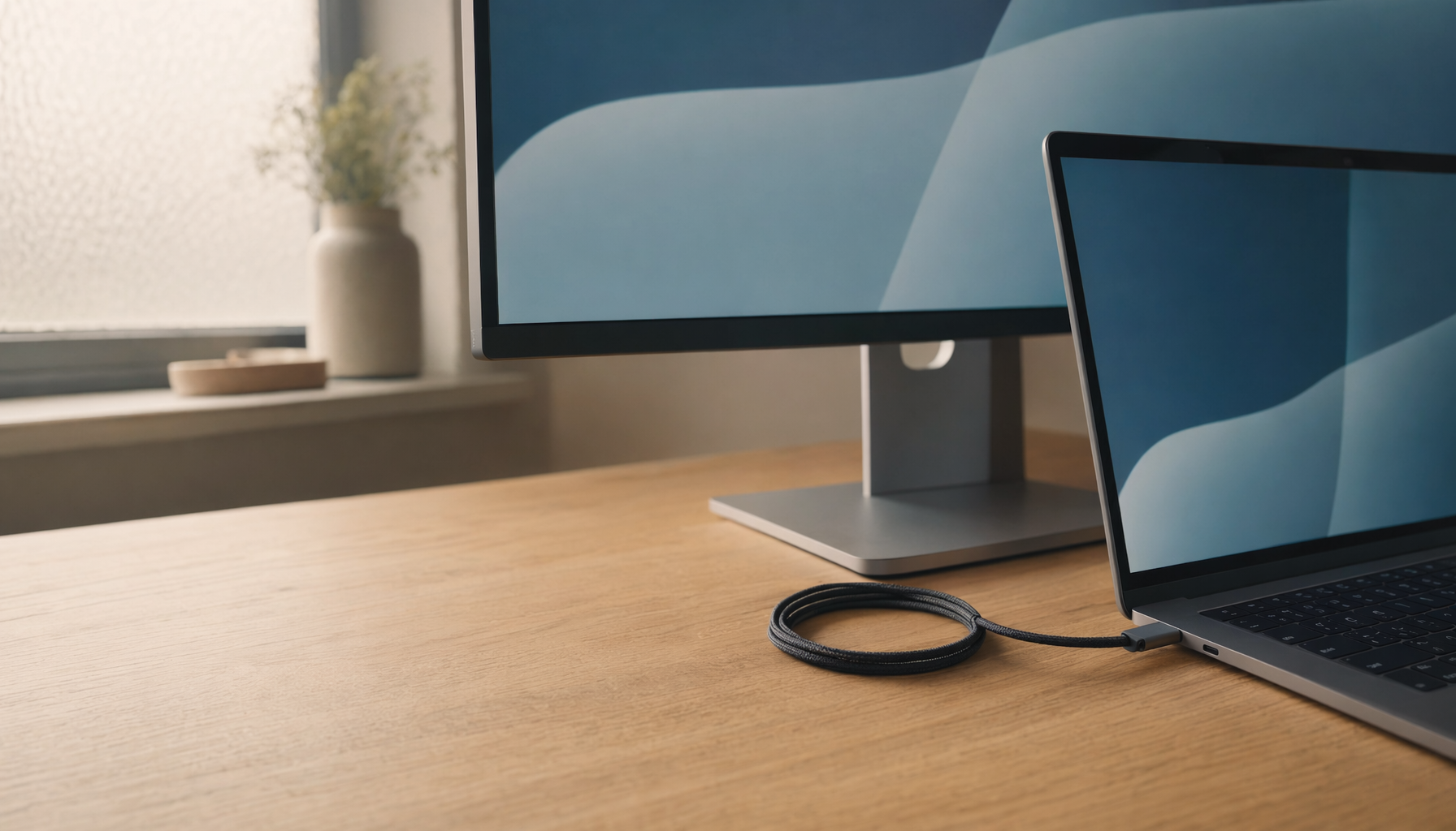
Do your edited photos look clean on your monitor, then harsh, blown out, or strangely dull on a laptop, TV, or client screen? A practical monitor check can separate a bad file from a bad display setting in minutes, using patterns and image comparisons instead of guesswork. You’ll learn how to spot highlight clipping, tune the right controls, and decide when the monitor itself is the limit.
What Highlight Clipping Means
Highlight clipping happens when bright tonal information gets pushed to the display’s maximum output, so multiple near-white tones all appear as the same white. In a photo, that can erase cloud texture, bridal dress folds, glossy product labels, skin highlights, or game HUD glow. In HDR content, it can also turn lamps, sparks, explosions, chrome reflections, and bright sky gradients into flat white or flat gray.
The key point is that clipping is not simply “bright.” A clean highlight can be intense and still carry texture. A clipped highlight has no visible separation. If a white shirt has folds, stitching, and soft shadows, it is bright detail. If it becomes a smooth white shape with no internal structure, the monitor, signal path, or image file is losing information.
For image work, this matters because a monitor that clips highlights encourages bad editing decisions. You may darken files too much, pull highlights until they look dirty, or reduce contrast because the display is hiding the top end. In gaming and HDR video, clipping makes scenes less readable and less immersive because bright effects lose shape.
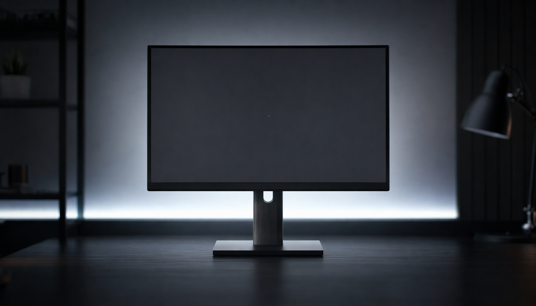
Start With the White-Level Test

The most direct test is a white-level pattern. A proper pattern shows several near-white bars or boxes, usually stepping from bright gray toward pure white. Your goal is to see the brightest visible steps just barely separate from the background. If the last several steps vanish into one solid white field, your contrast or HDR tone mapping is likely too aggressive.
Contrast controls white levels, and setting it too high can cause lost highlight detail. On many monitors, the factory contrast setting is close to correct, while “Vivid,” “Dynamic,” “Racing,” “Cinema,” or boosted game presets can push white too hard. In hands-on setup work, the most common fix is returning contrast to its default or standard value, then retesting with a white pattern.
A simple real-world example is a product photo with a white box on a white desk. If the label edge, folded cardboard, and subtle paper texture disappear only after switching to a vivid preset, the file is not the problem. The display mode is compressing the upper tones.
Use a Monitor Test Before Editing
A monitor test gives you a controlled baseline before you judge your images. The monitor test includes scenarios for uniformity, gradients, sharpness, viewing angle behavior, gamma, and other display quality checks. For highlight work, the most useful checks are gradients, gamma, uniformity, and white separation.
Warm the monitor up before testing. The test guidance recommends letting the display stabilize, ideally for about 30 minutes, because brightness and color behavior can shift during the first part of a session. Clean the screen as well; fingerprints and dust can create false bright spots or make smooth gradients look dirty.
Run the test in a controlled room. A bright window behind you can make highlight detail harder to see, while a dark room can make the same screen feel overly intense. If you edit during the day and game at night, test both environments because your best brightness level may change.
Check Brightness, Contrast, and Gamma Separately
Brightness, contrast, and gamma are often treated like interchangeable “make it look better” controls, but they do different jobs. Brightness usually changes the monitor’s light output. Contrast shapes the upper white level. Gamma changes the tonal curve between black and white, especially midtones and shadows.
Control |
What It Usually Changes |
Highlight Clipping Risk |
Practical Move |
Brightness |
Overall light output |
Usually indirect |
Match the room before judging edits |
Contrast |
White-level separation |
High |
Lower it if near-white bars disappear |
Gamma |
Midtone tone curve |
Moderate |
Start near 2.2 for SDR desktop work |
HDR mode |
Tone mapping and peak handling |
High |
Calibrate per display and content |
A neutral gamma near 2.2 is a strong default for SDR desktop use, office work, web images, and most gaming. A darker gamma can make contrast feel richer in a dim room, but it may also make you misjudge tonal balance. Do not use gamma to fix a clipped white pattern. If the top white steps are gone, contrast or tone mapping is the more likely issue.
For comfort and consistency, display brightness should match ambient lighting rather than sit at factory maximum all day. A practical paper check works well: hold a sheet of white copy paper near the screen under the same lighting and adjust the display until a white document on screen feels similar in brightness. This does not replace calibration, but it prevents the common mistake of editing on a screen that is far brighter than the room.
Compare the Same Image Across Screens
If one monitor clips but another does not, the file may be fine. Open the same high-resolution image on your main monitor, a laptop display, and a phone or tablet. Use a scene with known highlight texture, such as clouds beside a shiny car, a white wedding dress, a snowy sidewalk, or a bright office document with subtle shadows.
This comparison is especially useful because modern displays handle bright tones differently. IPS panels often provide consistent viewing angles and color behavior, VA panels can deliver stronger contrast, OLED can produce pixel-level blacks and intense small highlights, and Mini-LED monitors may offer more HDR brightness headroom with local dimming. None of these guarantees perfect highlight handling; tone mapping and settings still matter.

If highlights clip on every display, lower exposure in a photo editor. If detail reappears, the image data is still recoverable and your edit can be adjusted. If the bright area simply turns gray with no texture, the highlight was likely clipped during capture or export. That difference saves time because display tuning cannot restore detail that was never recorded.
Know the HDR Trap

HDR clipping is harder to diagnose because the monitor, operating system, app, cable path, and content metadata can all influence the result. A monitor may accept HDR10 but still lack enough peak brightness, contrast, local dimming precision, or tone-mapping quality to show bright detail cleanly.
HDR tone mapping treats small highlights differently from large bright areas because sparkle and broad brightness affect perception in different ways. A tiny sun glint on chrome can sit near peak brightness and still look correct. A large snowfield, white spreadsheet, or cloudy sky needs gentler compression so texture remains visible and the scene stays comfortable.
A useful HDR test is to view a scene with both clouds and a shiny object. The shiny object should pop brighter than the clouds, while the clouds should still retain soft structure. If both become the same flat white, peak brightness or tone mapping is failing. If the whole image looks dull and gray, the system HDR setup or monitor HDR preset may be wrong.
High-refresh modes can also complicate brightness behavior. High refresh rates can reduce or lock brightness on some displays because panel driving, strobing, bandwidth, HDR behavior, and power limits compete for the same headroom. If highlights look clipped only at 240 Hz with blur reduction enabled, test again at 144 Hz or 120 Hz with strobing off before blaming the panel.
Watch for Overscan and Scaling Problems
Not every “missing highlight” is tonal clipping. If the bright area is near the edge of the screen and appears cut off, you may be dealing with overscan or scaling. This is common when using a TV as a monitor, where the image can extend beyond the visible frame even when the computer reports the recommended resolution.
The symptom is different: taskbars, desktop icons, menu edges, or image borders disappear off-screen, while the mouse can move into hidden areas. The fix usually lives in the TV’s picture size menu, not the computer’s brightness settings. Look for modes named Just Scan, Screen Fit, 1:1, Full Pixel, Dot by Dot, or PC mode. Once the screen is mapped pixel-for-pixel, evaluate highlight detail.
Pros and Cons of Fixing Clipping Through Settings
Tuning the monitor is fast, free, and often enough. Restoring standard picture mode, reducing contrast, disabling fake dynamic contrast, and checking white-level patterns can produce an immediate improvement. It also gives office users and gamers a more reliable screen without buying new hardware.
The limitation is that settings cannot overcome a weak panel. A low-brightness monitor with poor HDR tone mapping will not suddenly reproduce premium HDR highlights. A glossy screen in a bright room may hide subtle near-white detail no matter how carefully contrast is adjusted. A wide-gamut display without proper color management may make images look intense but still inaccurate.
For photo and video work, consistent editing matters more than chasing the most expensive monitor. If your audience mostly views images on phones, laptops, and consumer screens, your priority is a stable, predictable editing environment. If you print frequently, deliver color-critical product work, or grade HDR content, a higher-grade monitor with better uniformity, calibration controls, and HDR behavior becomes easier to justify.
A Practical Detection Workflow

Start in the monitor’s standard, custom, sRGB, or creator mode. Avoid vivid and dynamic presets while testing. Set brightness for the room, then open a white-level pattern and adjust contrast only if the near-white steps disappear. Check a smooth gradient for banding or sudden rolloff. Then open a real image with bright fabric, clouds, snow, chrome, or a white product label and compare it across at least one other display.
After that, lower exposure in your editor. If texture appears, the image has recoverable highlight data and your monitor setup may be hiding it. If texture never appears, the file is clipped. For HDR, repeat the test with HDR enabled and disabled, then try a lower refresh rate or a different HDR preset if the monitor behaves inconsistently.
The best display setup is not the brightest setup. It is the one that lets you see separation where it matters, preserves impact where brightness should feel powerful, and stays comfortable enough for long work sessions. When highlights show texture, sparkle, and shape instead of blank white, your monitor is finally giving you the control your images deserve.


