


Neutral gray stops looking blue or green when your display’s color temperature, RGB balance, brightness, contrast, and ICC profile are aligned. Start with the monitor’s own controls, target 6500K/D65, validate with gray test patterns, and use a colorimeter if accuracy matters.
Is a white document fine, but a gray toolbar, game fog, or spreadsheet background looks faintly blue-green? A 15-minute basic calibration can usually remove the obvious tint and make long sessions easier on your eyes. Here is the practical path from quick fixes to reliable, color-managed accuracy.
Why Neutral Gray Shows a Blue or Green Cast
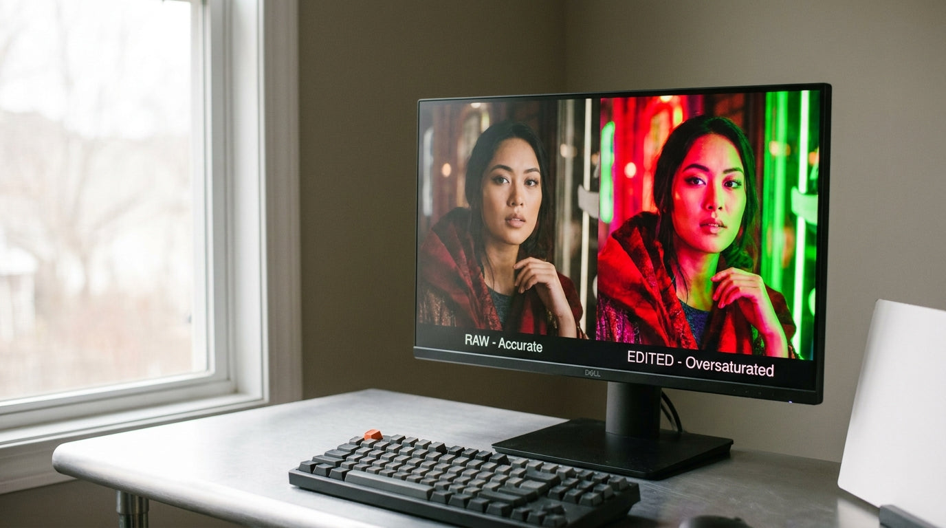
Gray is unforgiving because it contains no intentional hue. If red, green, and blue are not balanced, a neutral gray patch immediately exposes the imbalance. Too much blue makes gray look cold; too much green gives it a sickly office-monitor tint; too little red can make both problems worse.
A basic desktop LCD calibration focuses on brightness, contrast, and RGB color balance, and RGB color balance is the setting most directly tied to gray bars picking up red, green, or blue casts. That is why a screen can look sharp and bright while still being wrong for neutral tones.
Color temperature is the bigger control behind that behavior. A common accuracy target is 6500K, also called D65, because it is a practical daylight-style white point used in many photo and display workflows. The D65 white point is also a sensible default when you want images, documents, and web content to look more consistent across calibrated displays.
Start With the Monitor, Not the GPU
Use the monitor’s on-screen display first. Hardware controls are the cleanest place to fix the image because they change how the panel itself is driven. Driver-level tweaks can help later, but they add another layer that may affect desktop output, games, and video playback differently.
If your monitor has picture modes, begin with User, Custom, Standard, sRGB, Creator, or Game only if that mode gives you access to color controls. sRGB modes can be excellent for taming oversaturated color, but some displays lock brightness, RGB gain, or white balance in that preset. That is good for convenience and consistency, but frustrating if the gray still leans green or blue.
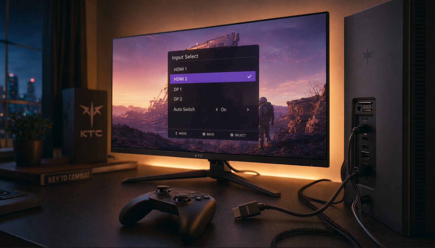
A digital connection matters too. Older analog VGA could introduce signal issues that made calibration harder, while a digital connection sends a cleaner signal from the PC to the monitor. For modern screens, a current digital display connection should be the baseline; it removes one avoidable source of display weirdness.
Adjustment |
What It Changes |
Gray-Tint Risk |
Best Starting Point |
Color temperature |
Overall warm/cool white balance |
Too high looks blue; wrong balance can look green |
6500K or D65 |
RGB gain |
Red, green, and blue channel strength |
Directly shifts gray hue |
Lower the dominant tint slightly |
Brightness |
Backlight intensity |
Too bright makes tint easier to notice |
Match room lighting |
Contrast |
White detail and highlight range |
Too high can clip detail |
Preserve bright detail |
ICC profile |
Color-managed rendering |
Wrong profile can skew apps |
Use a monitor-specific profile |
Set Brightness Before Chasing Color
A monitor that is too bright can make a mild tint feel dramatic. Many LCDs ship with showroom-level brightness, which looks punchy under retail lighting but punishing on a desk. For office work, the screen should not glow brighter than a well-lit book beside it.
In a dim room, lower brightness until white pages stop feeling like a light source. In a bright room, raise it enough that text and gray UI panels remain readable without glare. For photo editing, a practical luminance range around 80 to 120 cd/m² is commonly used, with 110 cd/m² as a workable compromise in controlled lighting; screen brightness should match the room rather than an abstract maximum.
Here is the real-world check: open a blank document next to a white sheet of paper under your normal desk lighting. If the screen is dramatically brighter, lower it. If the paper looks bright and the display looks dull, raise it slightly. This will not create lab-grade accuracy, but it prevents you from correcting color on a backlight setting you would never comfortably use.

Tune Contrast So White and Black Detail Survive
Contrast is not a “more is better” setting. Push it too high and bright details disappear, so a white shirt, cloud edge, or UI highlight becomes a flat white block. Set it too low and the whole image loses depth, making gray ramps harder to judge.
Use a contrast test image or a familiar photo with white fabric, clouds, or bright UI panels. Increase contrast until whites look strong, then back off if detail vanishes. The same principle applies to black level: blacks should look black, but dark gray detail should not collapse into a single block.
This step matters for tint because clipped highlights and crushed shadows hide the gray transitions you need to evaluate. Smooth grayscale ramps are your best diagnostic tool. If the ramp shifts from neutral gray to greenish gray in the midtones, you are looking at white balance or RGB gain. If it simply loses steps, you are looking at contrast, black level, or gamma.
Choose 6500K, Then Correct RGB Balance
Once brightness and contrast are sensible, set color temperature to 6500K, D65, Normal, or Warm, depending on how your monitor labels its presets. Avoid Cool as a default; it often pushes the image blue because higher color temperatures such as 7200K look colder than the common 6500K target.

Now use a neutral gray test pattern. Look at dark gray, mid gray, and light gray separately. If all gray patches look blue, reduce blue gain or choose a warmer preset. If gray looks green, reduce green gain slightly or increase red and blue carefully. If only shadows are tinted, avoid aggressive RGB gain changes and look for black level, gamma, or advanced bias controls.

Make tiny changes. A one-step green reduction can be enough on many monitors. After each adjustment, look away for a few seconds, then recheck the gray ramp and a real screen you know well, such as a spreadsheet, code editor, video timeline, or game menu.
Use ICC Profiles Carefully
An ICC profile tells the operating system and color-managed apps how your specific monitor behaves. It can improve consistency, especially for photo editing, design, and content review. It is not magic, and it should not be treated like a universal preset.
Community calibration advice often recommends using well-reviewed monitors and looking for model-specific ICC profiles, but ICC profiles are still not guaranteed to match your exact unit. Two monitors with the same model number can vary enough that copied settings reduce one tint while creating another.
The practical rule is simple: use manufacturer or trusted review settings as a starting point, not a finish line. If the profile makes neutral gray worse, remove it and return to the monitor’s own controls. On many PCs, ICC version 2 is often the safer compatibility choice, while some color-managed workflows handle newer profiles well.
When a Colorimeter Is Worth It
If you create content, edit photos, grade video, sell products online, or compare displays across a multi-monitor setup, a colorimeter is the reliable solution. It measures what your panel actually emits, then calibration software builds a monitor-specific profile instead of relying on your eyes.

A colorimeter measures displayed colors and brightness, while software compares those measurements against reference values and creates an ICC or ICM profile. That workflow is why a colorimeter can solve stubborn gray tint more confidently than manual RGB guessing.
The downside is cost and time. The upside is repeatability. Forum users commonly report keeping calibration devices through several monitor upgrades, which makes the value stronger over time. For a gaming monitor, office display, and portable OLED used in the same workflow, the ability to profile each screen can be more useful than buying one expensive display and leaving the others visibly mismatched.
Gaming, Office, and Portable Screen Considerations
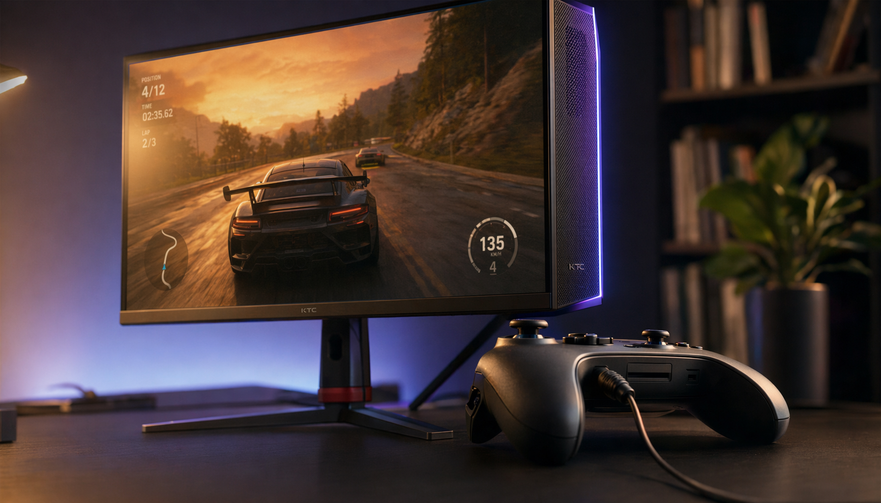
For gaming, do not blindly chase maximum saturation. Oversaturated color can make fantasy worlds look exciting, but it can also push fog, metal, stone, and UI grays toward blue or green. Use Game mode only if it preserves white balance controls, then test with a familiar title where smoke, concrete, snow, or menus should look neutral.
For office productivity, comfort wins. A slightly warmer neutral is usually better than a cold blue cast during long document, spreadsheet, and browser sessions. If your gray sidebar looks green after an hour of work, lower green gain a step and recheck with both dark and light themes.
Portable smart screens add another variable: power source and brightness limits. A portable display may shift appearance when running at reduced brightness from a laptop. Some creative-oriented displays emphasize single-cable convenience, and single-cable connections can clean up a workstation, but you still need to check the panel’s own color controls and profile behavior.
Monitor Quality Still Matters
Calibration can improve a display, but it cannot turn every panel into a reference monitor. Limited gamut, weak uniformity, poor viewing angles, and unstable color behavior can all leave parts of the screen looking different even after careful adjustment.

Creative monitor roundups consistently separate office-grade screens from color-critical panels by gamut coverage, calibration support, brightness, contrast, and ergonomics. Higher-end creator and professional displays are often recommended because color-critical panels give you a better foundation before calibration begins.
That does not mean everyone needs a $1,700 creator display or a professional reference monitor. Affordable color-grading discussions make the smarter point: choose a display that gives enough confidence for your work, budget, and delivery needs. For SDR office, gaming, and web work, a well-adjusted 4K IPS or OLED monitor can be excellent; for HDR grading, print proofing, or paid color work, the bar rises quickly.
A Practical Gray-Tint Workflow
Warm the monitor up for about 30 minutes, set it in the lighting you actually use, and connect it digitally. Reset unusual GPU color tweaks, choose a neutral picture mode, set brightness for the room, and adjust contrast until white and black detail are preserved. Then select 6500K or D65 and fine-tune RGB balance against a grayscale ramp.
After that, test real content. Open a document, a neutral website background, a black-and-white photo, a familiar game scene, and a video with skin tones. Neutral gray should look calm, not icy blue or fluorescent green. Skin should not drift sickly, white shirts should hold detail, and dark UI panels should not glow.
If the tint returns only in some apps, suspect color management or HDR settings. If it appears everywhere, suspect monitor settings, the ICC profile, cable/input mode, or panel limitations. If two displays never match perfectly, calibrate both separately and accept that different panel technologies may still have slightly different character.
FAQ
Should I use Night Light or blue-light mode to fix a blue tint?
Not as your main calibration tool. Blue-light filters intentionally warm the screen, which can make a cold display more comfortable at night, but they do not create accurate neutral gray. Use them for comfort after you have a good baseline, not as a substitute for white balance.
Is sRGB mode always best?
sRGB mode is useful when you want web-standard color and less oversaturation. The tradeoff is that some monitors lock brightness or RGB controls in sRGB mode, which can stop you from correcting a remaining tint. If sRGB looks neutral and comfortable, keep it; if it looks green or too dim, use Custom or User mode instead.
Why does my gray look different on another monitor?
Every panel has its own backlight, color filters, factory tuning, and age-related drift. Even two units of the same model can need different settings. That is why copied RGB values and ICC profiles are starting points, while hardware calibration is the more dependable route.
A clean neutral gray is not about making the monitor dull. It is about removing the color bias that gets between you and the work, match, document, or image. Set the fundamentals first, validate with real content, and bring in a colorimeter when your screen needs to be trusted rather than merely tolerated.


