


Set your monitor bright enough to hold detail against the room, but not so bright that the screen becomes the main light source. For most setups, the best result comes from adjusting both the display and the room lighting together.
Do your eyes feel strained after a night gaming session, or does your office monitor look washed out the moment sunlight hits the desk? A simple white-screen-to-paper check, paired with controlled room lighting, can make text clearer, preserve shadow detail, and reduce the harsh screen-versus-room contrast that drives fatigue. Here is how to choose a usable brightness range for your space, whether you are tuning a competitive display, a productivity monitor, or a portable smart screen.
Brightness Range Means More Than the Number on the Box
Monitor brightness is usually marketed in nits, which are equivalent to cd/m² for display luminance. The important point is that the advertised number is typically a peak capability, not the brightness you should use all day. A 400-nit office monitor and a 1,000-nit HDR gaming display can both be comfortable at night if you lower the backlight, while a 250-nit portable screen may feel underpowered near a bright window.
For everyday tuning, separate three ideas. Brightness controls how much light the backlight or panel emits. Contrast controls the difference between bright and dark content. Gamma changes the way midtones appear without simply turning the whole monitor lamp up or down. Brightness controls are usually the first comfort setting to adjust, while contrast and gamma should be handled more carefully because they can crush shadow detail or clip highlights.
For example, if a dark game scene looks invisible in the afternoon but painfully bright at night, the fix is not one permanent brightness setting. You need a daytime profile that fights ambient light and an evening profile that lowers screen output while adding soft room light behind or around the display.
Start With the Room, Not the Slider
The strongest brightness setting is rarely the smartest setting. When the room is too dark, even a moderate monitor can feel like a spotlight. When the room is too bright, raising the monitor may help visibility, but glare and reflections can still erase detail.
A controlled lighting study on computer-screen comfort found that a bright screen in a dark surrounding environment can create visual discomfort because the eyes must keep adapting between very different luminance levels. In that study, warm high-intensity desktop lighting produced the best comfort outcome among the tested conditions for dark-environment leisure computer use, with 3,000K lighting at 1,500 lux performing best for participants. That does not mean every desk should run that bright, but it does support the main point: do not make the screen carry the whole room.
For office productivity, a more moderate target is often better. The same research cites typical office-task illuminance guidance around 200 to 750 lux, with about 500 lux used for writing, typing, reading, and data processing. If your room is around that range and your monitor is not facing a window, a standard 250- to 350-nit monitor usually has enough headroom for spreadsheets, dashboards, coding, and browser work.
Match Common Lighting Conditions to Practical Brightness Behavior
The goal is not to memorize a universal percentage, because monitor brightness sliders are not standardized. A 35% setting on one panel can be brighter than 70% on another. Instead, match the screen to the visual job and the room.
Ambient condition |
What it feels like |
Monitor behavior that usually works |
Dark room at night |
Screen feels like a lamp; blacks look intense but eyes tire quickly |
Lower brightness and add warm bias or desk lighting |
Soft home office lighting |
Text is readable; little glare; room is not cave-dark |
Use moderate brightness and keep contrast at a neutral preset |
Bright office or daylight room |
Whites look dull; dark details disappear; reflections show |
Raise brightness, reduce glare, and reposition the screen |
Window-heavy workspace |
Brightness changes by hour; one side of the screen may wash out |
Use blinds, side lighting, and separate day/night presets |
Color-critical editing room |
Small tone shifts matter; daylight can hide noise and shadow detail |
Control ambient light first, then calibrate luminance |
For a fast field test, open a mostly white document and place a white sheet of paper on the desk under your normal lighting. If the screen looks like a glowing billboard beside the paper, lower brightness or increase room light. If the paper looks much brighter than the screen, raise monitor brightness or reduce glare. This is not laboratory calibration, but it is a reliable comfort check for daily work.

Use Lower Brightness in Dim Rooms, but Do Not Work in the Dark
For night gaming, streaming, or focused writing, lowering the screen is only half the adjustment. The better setup is a dimmer monitor plus soft ambient light. Behind-monitor bias lighting works because it reduces the contrast between the screen and the wall, so your eyes are not jumping between a bright rectangle and a black background.

A monitor forum discussion on dynamic ambient-lighting setups describes smoothing as a way to reduce abrupt LED color transitions, with higher smoothing levels trading responsiveness for a more fluid effect. For fast-paced games, higher smoothing levels can be more comfortable when rapid flashes would otherwise make the room pulse. The tradeoff matters for competitive players: smoother lighting feels calmer, while more responsive lighting tracks the image more accurately.
A DIY ambient-lighting setup can also be inexpensive. One project used addressable LEDs behind the monitor and estimated that a 60-LED strip could need at least 3.6 amps at full brightness, with a 5-amp supply recommended for margin. The practical benefit of addressable LEDs behind the monitor is straightforward: the screen stops being the only bright object in the room.
Raise Brightness in Bright Rooms, but Fight Glare First
In daylight, a monitor at a comfortable night setting can look flat and weak. Fine texture, photo noise, enemy silhouettes, and low-contrast UI elements may disappear. A calibration forum discussion makes the key point clearly: monitor luminance should rise as ambient light rises, especially when the lighting cannot be controlled. For color-critical work, however, control the environment instead of simply pushing brightness higher.
For photo and proofing workflows, the standards are stricter. One technical discussion of editing-room lighting notes that LCD monitor viewing may target about 55 lux measured at the center of the screen, with a common maximum monitor brightness around 120 cd/m² for LCD displays. The same source explains that editing-room lighting should be evenly dispersed and not shine directly on the monitor.
For a real workspace, that means moving the monitor perpendicular to a window is often better than maxing the brightness slider. A window behind you reflects on the screen. A window behind the screen makes the display compete with daylight. Side daylight, softened with blinds or curtains, gives you more usable brightness range without turning the monitor into a searchlight.

Choose the Right Brightness Range Before You Buy
If your desk lives in a controlled room, you do not need to chase extreme peak brightness for SDR office work. A flexible 250- to 350-nit productivity monitor can be very effective when paired with good lighting. If your monitor sits in a bright office, near windows, or in a shared space with overhead lighting, a display above 400 nits gives more useful headroom.
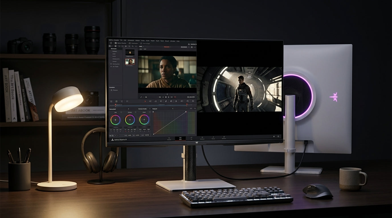
For HDR gaming and media, higher peak brightness matters more because highlights are part of the experience. Explosions, sunlight, neon, reflections, and specular detail need brightness capacity to look convincing. The catch is that HDR headroom does not replace good tuning. A 1,000-nit display running too bright in a dark room can still feel punishing, and a high-brightness display with weak local dimming or poor contrast may not deliver the immersion you expect.
Portable smart screens need special caution. Many are used in hotels, coffee shops, cars, conference rooms, and temporary desks where lighting changes constantly. For portable work, prioritize usable brightness range, matte or low-glare coating, and quick controls over a single impressive peak number.
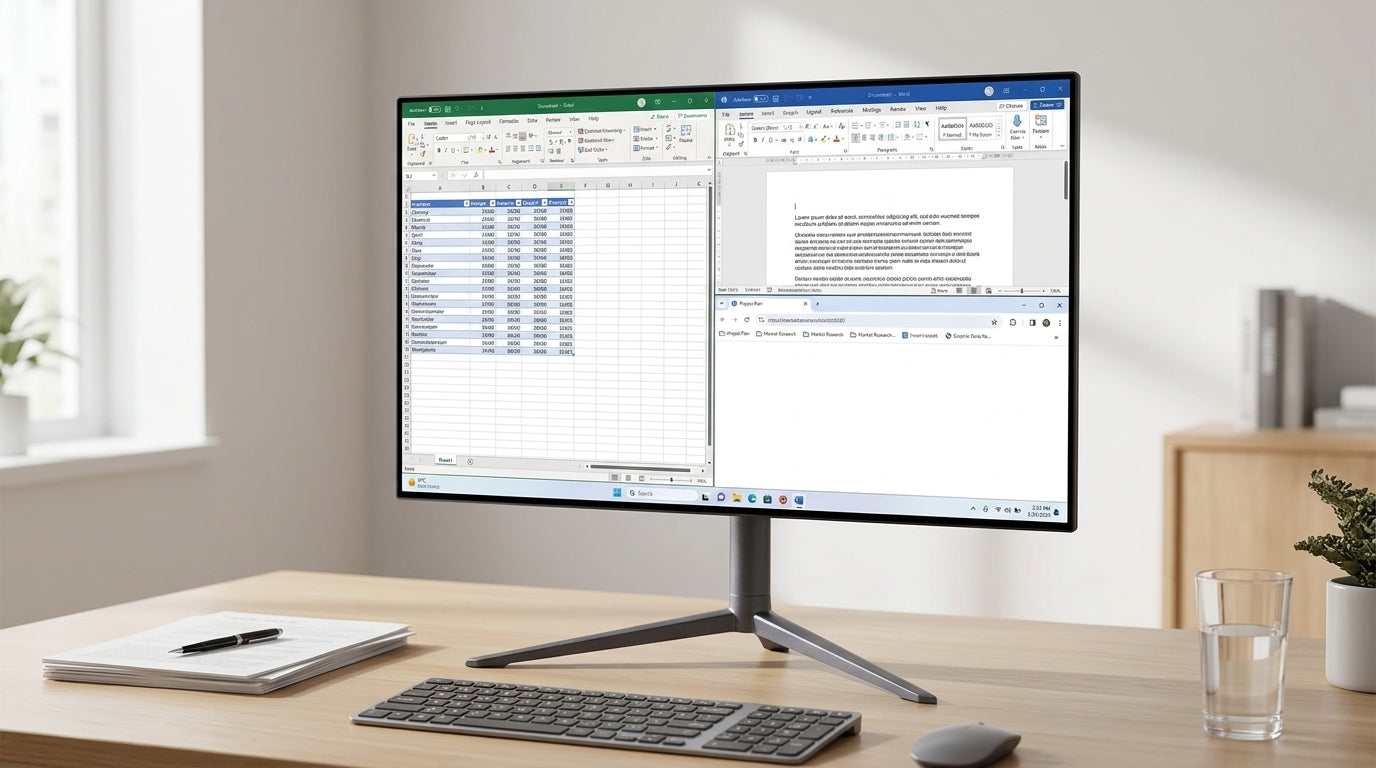
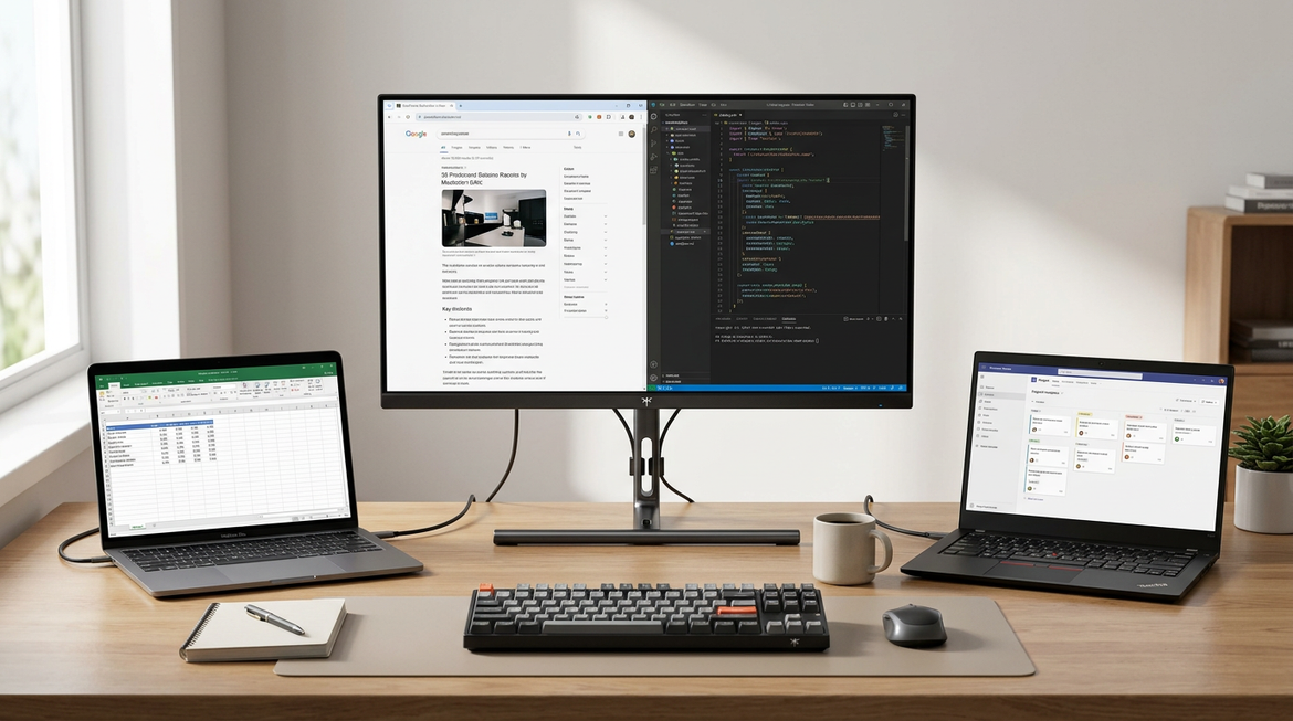
Keep Color and Multi-Monitor Setups Honest
Brightness matching becomes harder with two displays. Even two units with the same model name can differ because panels, backlights, manufacturing batches, and age vary. That is why copying another person’s brightness percentage or color profile is risky.
For practical matching, put the same neutral image, spreadsheet, and dark scene on both screens. Adjust brightness first, then contrast, then color temperature. Display brightness and color controls can help supported displays keep color more consistent across apps, but hardware calibration is still the better path for paid creative work.
If one screen is for gaming and the other is for chat, documents, or monitoring tools, perfect matching may not be worth the time. Match white brightness closely enough that your eyes do not feel a hard jump when moving between screens. Keep the primary display tuned for the task that actually matters.
A Practical Tuning Workflow
Begin in your normal lighting, not in a showroom-bright test condition. Set the monitor to a neutral or custom picture mode rather than a vivid mode, because vivid presets often exaggerate brightness and saturation. Adjust brightness until a white document feels similar to white paper on the desk, then check a dark image or near-black test pattern to confirm that shadow detail is still visible.
Next, fix the room. If the screen is the brightest object by far, add indirect lighting, a monitor light bar aimed at the desk, or soft bias lighting behind the display. If the monitor looks dull even at high brightness, reduce reflections, change the desk angle, or control window light. Only after that should you fine-tune contrast, gamma, and color temperature.

For color-sensitive work, lock the environment down. Use consistent lighting, avoid direct light on the screen, and calibrate the monitor to the workflow. For general office and gaming use, build two or three saved modes: daytime, evening, and color-critical or media. That gives you repeatable performance without touching every setting daily.
The Bottom Line
A good brightness match makes the monitor disappear as a source of strain and reappear as a precision tool. Tune the room and screen together: lower the display and add soft light at night, raise brightness and control glare in daylight, and reserve peak nits for bright rooms, HDR, and demanding visual work. The best monitor is not the brightest one; it is the one with enough range to stay comfortable, readable, and accurate wherever you actually use it.


