


For most UI/UX design work, a 27-inch 1440p display offers the best balance, while a 27- to 32-inch 4K display is better when sharper text, dense artboards, and extra panel space matter.
Start With the Workspace, Not the Spec Sheet
A bigger screen is not automatically a better design screen. The goal is usable workspace: canvas, layers, inspector panels, prototype preview, and reference material without constant window shuffling.

For most UI/UX designers, 27 inches at 2560 x 1440 hits the practical sweet spot. It gives noticeably more room than 1080p while avoiding some of the scaling and graphics demands that can come with 4K.
A 32-inch 4K monitor makes sense when you work on complex dashboards, design systems, or high-density desktop apps. Just remember that 4K often needs OS scaling, and using the monitor’s native resolution usually gives the sharpest result.
Match Resolution to Real UI Targets
Design files should not be treated as screenshots of your monitor. A 4K display can show a huge canvas, but your users may be on a 390 px-wide phone viewport, a 768 px tablet viewport, or a 1440 px desktop browser.
Responsive work should target viewports and breakpoints, not the monitor’s raw pixel count. Common responsive widths include 320 px, 480 px, 768 px, 1024 px, and 1280 px+, with the ideal set depending on your actual audience and device mix.

For desktop UI, a practical artboard workflow has four checks:
- 1440 px wide for primary desktop layouts
- 1280 px wide for small laptop stress testing
- 390 px wide for modern phone-first flows
- 768 px wide for tablet and split-view checks
This lets your monitor support precision without nudging you into designing only for people with large displays.
The Practical Monitor Picks
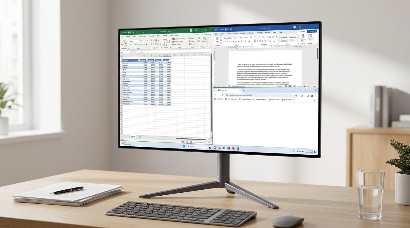
A 24-inch 1080p screen is workable for entry-level wireframing, QA notes, and admin-heavy product tasks. For serious UI work, it can feel cramped once the design app, browser previews, documentation, and handoff panels are open.
A 27-inch 1440p display is the best value-oriented choice for most designers. It offers strong pixel density, comfortable UI scale, and enough canvas space for desktop and mobile artboards side by side.
A 27-inch 4K monitor is sharper, especially for typography and icon review, but you may need to run it scaled. A 32-inch 4K monitor gives dense interfaces and multitasking more comfortable physical space while preserving crisp detail.
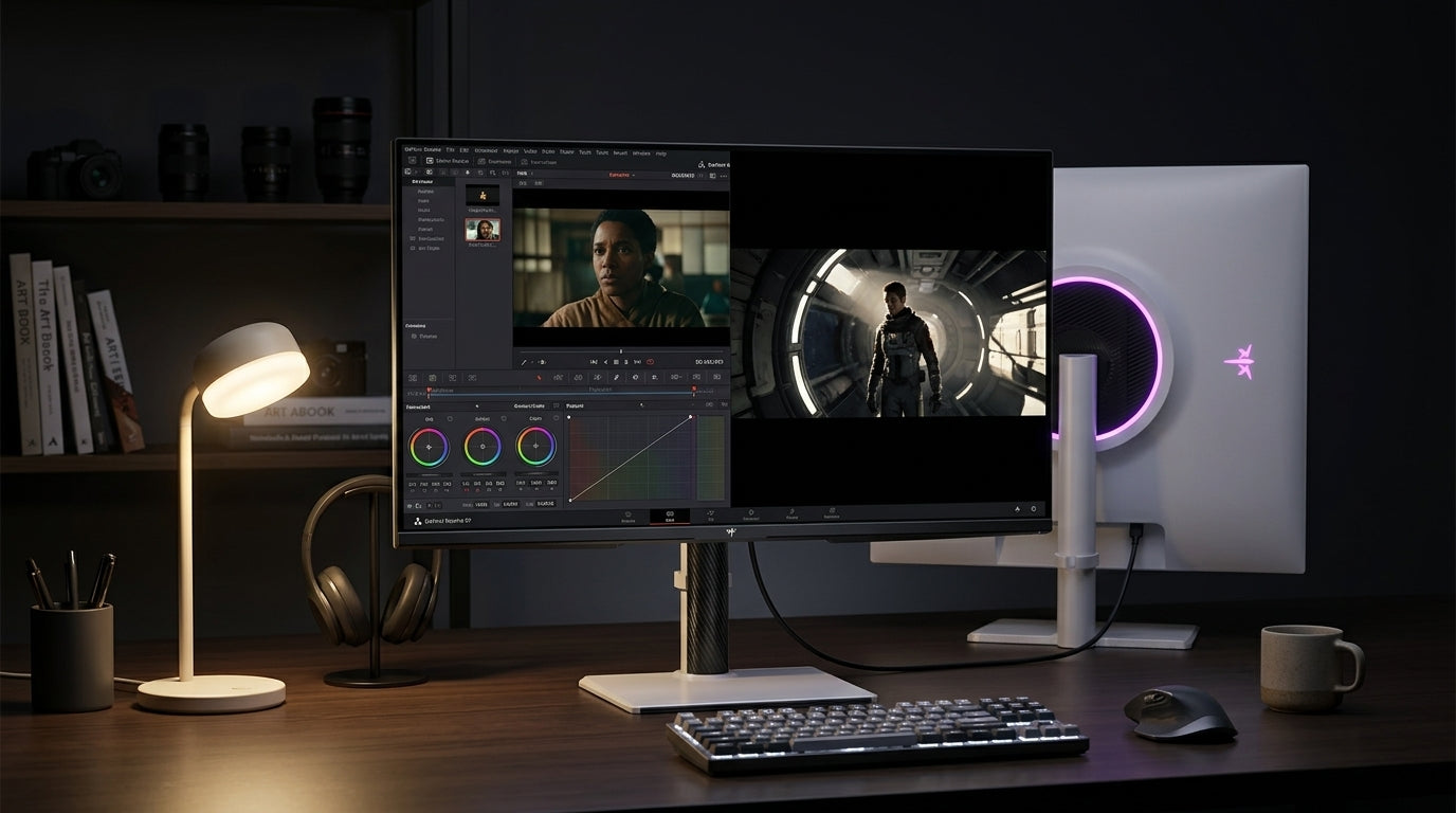
If color work matters, prioritize an IPS panel, calibration support, and wide color coverage over cosmetic extras. For creative monitors, color accuracy and panel quality matter more than flashy features, and design-focused displays often emphasize 99% or higher coverage of a professional wide-gamut color space.

Keep UI Decisions Device-Aware
High resolution helps you see more. It does not replace good responsive rules.
Touch targets still need comfortable sizing, especially when desktop tools produce mobile interfaces. A consistent dimension system helps layouts remain usable across odd screen widths, and a 48 x 48 dp minimum is a strong baseline for tappable controls.

Older 1024 x 768 and 1366 x 768 environments have not vanished, so enterprise, education, kiosk, and legacy web products still deserve lower-width checks.
The strongest setup is not the largest monitor you can buy. It is a display that lets you design at real breakpoints, inspect fine detail, and test the interface under pressure. For most UI/UX teams, that means 27-inch 1440p as the value baseline, with 32-inch 4K as the premium productivity upgrade.


