


Display contrast ratio determines whether text, icons, borders, focus rings, and buttons stand out clearly against a dark background. In dark UI design, the goal is controlled contrast that keeps key elements visible without creating glare, glow, or fatigue.
Straining to find a gray icon on a charcoal toolbar during a late-night work session is both a display problem and a design problem. A well-tuned dark interface can make controls easier to scan, preserve OLED battery advantages, and keep static dashboards readable for hours without punishing your eyes. Here is how contrast ratio changes what you see, and how to choose better settings, panels, and UI colors.
What Contrast Ratio Means in a Dark Interface
Contrast ratio measures the luminance difference between a foreground element and its background. In practical terms, it tells you how strongly a label, icon, outline, or button separates from the surface behind it. A 1:1 ratio means almost no visible difference, while 21:1 represents the strongest black-and-white contrast commonly referenced in accessibility guidance; WCAG contrast ratios are widely used because they translate visual difference into testable thresholds.
For dark-themed interfaces, contrast affects more than body text. It decides whether a disabled-looking button is actually disabled, whether a selected tab feels selected, whether a thin input border can be found quickly, and whether keyboard focus is visible. A dark UI with beautiful colors but weak component contrast may feel polished at first, then quickly slow the user down.
The key technical distinction is between text contrast and non-text contrast. Normal text generally needs stronger contrast than large text, while icons, form borders, chart lines, toggles, and focus indicators still need enough separation to be perceivable. Non-text UI components commonly use a 3:1 minimum target, which is especially relevant in dark software tools where icons often replace written labels.
Why Dark Themes Make UI Visibility Tricky
Dark mode is often described as easier on the eyes, but that depends heavily on the environment and the panel. In a dim room, a dark interface can reduce the blast of screen light and make media or code feel calmer. In a sunlit office, the same interface may lose shadow detail, flatten hierarchy, and make low-contrast controls harder to see. Dark mode benefits and drawbacks are strongest when the theme is built deliberately instead of created by simply inverting a light palette.

Pure black backgrounds look decisive on paper, but they can be harsh with bright white text. On OLED, pure black pixels can turn fully off, which helps black level and power use, yet the jump from off pixels to bright UI elements may create a hard edge that feels glowy or smeared during motion. A near-black surface, such as a very dark gray, often gives the interface enough black depth while letting designers create layers, shadows, borders, and readable surface differences.
This is why many mature dark interfaces use softened whites, muted grays, and reduced-saturation accents. A headline might use a light gray close to white, body text a softer gray, and secondary metadata a lower-contrast gray that still passes legibility requirements. The interface remains readable, but it stops shouting at the user.
The Visibility Chain: Text, Icons, Borders, and Focus Rings
Text is usually the first contrast issue users notice. If body copy is too dim, reading speed drops and the display feels muddy. If it is too bright, white strokes can bloom against black, especially for users with astigmatism, making letters appear to bleed. Dark UI best practices commonly warn against pure white on pure black because comfort and clarity are not the same thing.
Icons need different treatment. A 16-pixel settings icon in a dark toolbar has less visual mass than a word label, so it may need stronger contrast or a clearer hover state. If the icon is the only signal for an action, a weak gray can make the control functionally invisible. For productivity displays and gaming monitor OSD menus, this matters because users often work quickly, glance from the center of the screen to a corner control, and expect instant recognition.
Borders and dividers are more subtle. Too little contrast and panels blend together; too much contrast and the interface becomes a grid of distracting lines. A practical approach is to make default dividers quiet, then give active inputs, selected tabs, hover states, and focus rings a clearly stronger contrast. Contrast in UI design supports scannability and visual hierarchy, so the brightest or sharpest contrast should be saved for the elements that drive action.
Focus indicators deserve special attention. In dark mode, a keyboard focus ring that worked on white may disappear against charcoal or electric-blue accents. If a user tabs through a monitor control app, streaming dashboard, or web-based creative tool, the active element must remain visible at every step. This is core navigation, not decorative polish.
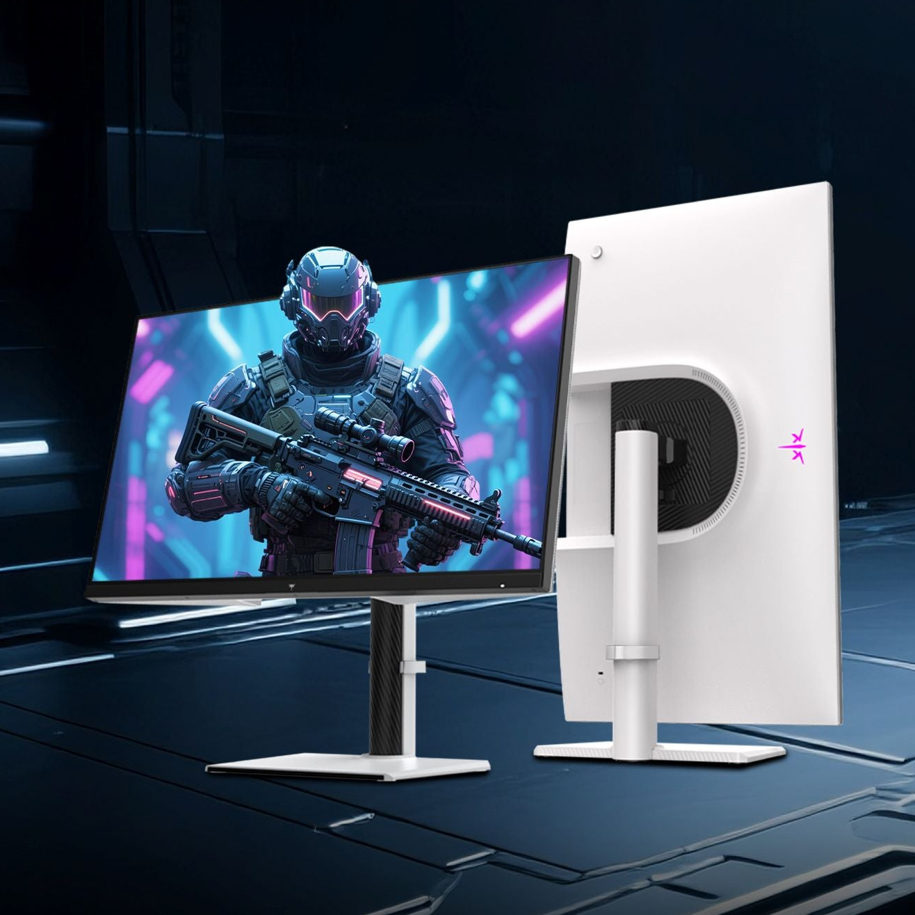
OLED vs IPS: Contrast Ratio Changes the Same UI Differently
OLED and IPS panels can both show excellent dark interfaces, but they do it differently. OLED pixels emit their own light and can turn off completely, producing true blacks and extremely high perceived contrast. IPS LCDs use a backlight, so black areas are actually dark gray, but good IPS monitors can offer stable brightness, strong text clarity, and predictable behavior for long office sessions. OLED and IPS display behavior changes how dark UI contrast feels in real use.

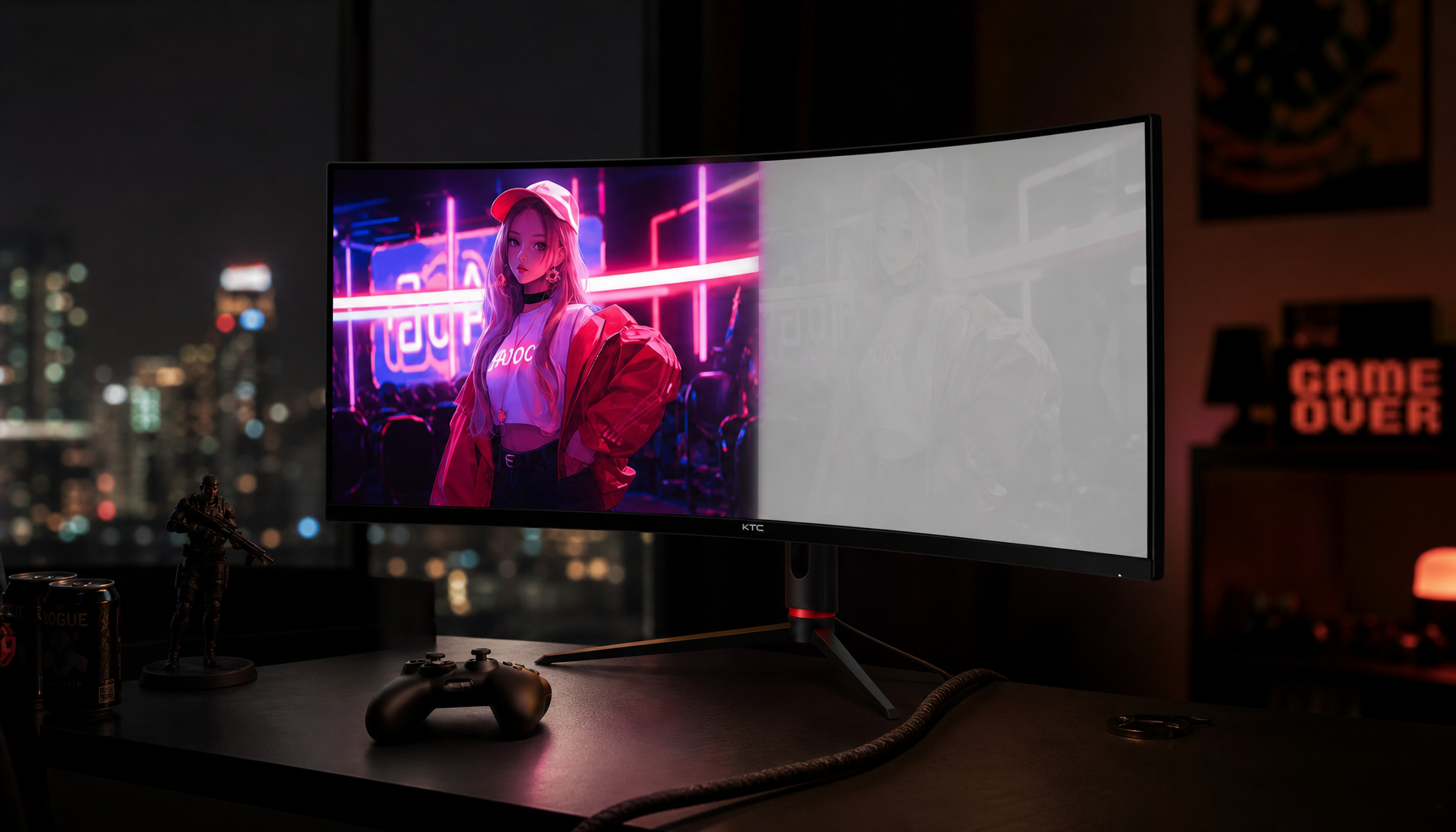
On an OLED gaming monitor, dark UI elements can look deeply separated from the background. HUDs, inventory panels, subtitles, and launcher overlays often feel more immersive because black space recedes. The tradeoff is that very bright static UI on black can look intense, and long-term static elements such as taskbars, HUDs, and dashboards deserve burn-in awareness. A long-use OLED analysis found little normal-use burn-in after 2,656 hours, but faint marks appeared in stress-style gray tests, reinforcing the practical advice to use pixel shifting, screen savers, moderated brightness, and auto-hidden static elements when possible through OLED burn-in mitigation.
On an IPS productivity monitor, dark themes may look less absolute, but they can be easier to manage in bright rooms because the panel can maintain full-screen brightness more consistently. For office productivity displays, static dashboards, spreadsheets, IDEs, trading layouts, and admin consoles, IPS remains a reliable choice because it avoids OLED-style permanent image retention risk. The best panel is not always the one with the highest advertised contrast; it is the one that keeps your actual UI visible in your room, at your brightness level, for your workload.
Use case |
Better contrast behavior to prioritize |
Practical display choice |
Dark-room gaming |
Deep blacks, fast pixel response, strong highlight separation |
OLED is usually stronger |
Bright office work |
Sustained brightness, stable text, low static-image risk |
IPS is often safer |
Mixed work and media |
Balanced dark detail, adjustable brightness, good UI clarity |
High-quality OLED or IPS can work |
Static dashboards |
Durable panel behavior and visible low-contrast UI components |
IPS is usually the conservative pick |
How Much Contrast Is Enough?
For normal text, a 4.5:1 contrast ratio is the common minimum target for accessible interface reading, while 7:1 is a stronger target for more demanding accessibility contexts. Large text can use lower ratios because bigger strokes are easier to perceive. Color contrast guidelines also emphasize that UI graphics and controls should not rely on color alone, which is crucial for color-blind users and for anyone viewing a screen under glare.
A simple real-world example is a dark settings panel. The page title can use a near-white gray with strong contrast. Body copy can sit slightly lower, still passing readability requirements. Secondary labels can be dimmer, but not so dim that they vanish at 40% monitor brightness. Buttons should have text, fill, or outline contrast that makes their state obvious. A destructive action should not be identified only by a red hue; it should also use label text, icon shape, placement, or confirmation behavior.
The practical mistake is treating every element as if it needs the same contrast. If every label, border, icon, and chip is bright, nothing has priority. If everything is muted, the interface becomes a fog. Good dark UI contrast is tiered: primary actions stand out first, active states second, readable content third, and background structure last.
Color Saturation, Logos, and Dark-Mode Adaptation
Contrast is not only black versus white. Saturation changes perceived visibility too. Highly saturated blue, red, green, or purple accents can vibrate on dark backgrounds, making small icons and labels feel noisy. Dark interfaces usually benefit from colors that are slightly less saturated than their light-theme equivalents, because the dark background amplifies perceived intensity.
Logos are a special case. A mark designed for a white page may become too bright, too saturated, or strangely distorted on a dark screen. Research on dark-mode logo adjustment found that bright logo colors often needed to become darker, dark colors often needed to become lighter, and high-chroma colors generally needed reduced saturation; dark-mode logo adjustment also showed that preserving hue identity matters for recognition. That finding maps directly to UI accents: do not blindly paste light-mode colors into dark mode and expect them to remain comfortable.
For a monitor line, game launcher, creator dashboard, or office SaaS interface, the smarter move is to build a dark palette from the same identity, not the exact same values. Preserve recognizable hue, then tune lightness and chroma until the component is visible, legible, and not glaring.
Practical Settings for Users and Designers
If you are choosing or tuning a monitor for dark UI work, start with ambient lighting. In a bright office, increase room light control before pushing the monitor into excessive brightness. In a dim room, reduce brightness until white UI text stops glowing. Contrast controls should preserve near-black detail rather than crushing all dark grays into black, because crushed shadows make panels, menus, and disabled states harder to distinguish.
For OLED users, use dark mode intelligently but avoid leaving bright static UI elements pinned for days. Auto-hide the taskbar, enable pixel shift or screen saver features, and keep full-screen brightness reasonable. For IPS users, pay attention to black uniformity and backlight glow, especially if you work with dark dashboards at night.
If you design interfaces, test the theme on at least one OLED-like high-contrast display and one typical office LCD. Also test at reduced brightness, under glare, and with the screen slightly off-axis. A dark UI that only works on a calibrated design monitor in a dim studio is not ready for real users. Dark mode accessibility improves when the theme can adapt to user preference, device settings, and viewing conditions.
FAQ
Is a higher display contrast ratio always better for dark UI?
Not always. Higher panel contrast can make dark UI elements look more immersive and precise, but excessive foreground-to-background contrast can cause glow, halation, or fatigue. The best result comes from high display capability paired with restrained UI colors.
Should dark mode use pure black?
Pure black can be useful for media apps, OLED power savings, and cinematic screens, but it is not ideal as a default surface for every productivity interface. Very dark gray usually gives better depth, softer reading, and clearer component layering.
Why do some dark themes feel blurry even on sharp monitors?
The issue is often excessive contrast, overly bright text, thin font weights, or saturated colors on a dark background. Panel behavior matters too; OLED’s instant contrast can make poor dark-theme choices more obvious, while LCD backlight glow can flatten subtle dark grays.
Dark interface visibility is a performance feature. Tune contrast so the screen guides the eye, protects readability, and matches the panel technology, and a dark theme becomes more than a cosmetic switch: it becomes a faster, calmer way to work and play.


