


Contrast ratio matters only when you judge it alongside usable brightness and real black levels. For most buying decisions, native contrast tells you far more than inflated dynamic specs.
A contrast ratio claim becomes meaningful only when you connect it to two things spec sheets often hide: how bright the screen gets in your room and how dark its black level stays at the same time. For real buying decisions, native or static contrast matters far more than giant dynamic numbers.
Do dark scenes keep turning gray, or does a bright desktop feel harsh while black bars still look washed out? Put two screens at the same usable brightness and the one with the lower black floor will usually look richer, calmer, and easier to read in mixed scenes. The goal is to judge whether a contrast claim will actually improve gaming, office work, or portable viewing.
What Contrast Ratio Actually Tells You

The most useful definition of contrast ratio is simple: it is the luminance of the brightest white divided by the luminance of the darkest black a display can produce. If a monitor shows white at 300 nits and black at 0.3 nits, that is 1000:1. If it holds the same 300-nit white but drops black to 0.1 nits, that becomes 3000:1.
That sounds abstract until you see it in a real setup. On a desk, higher contrast usually means menus stand off the background more cleanly, dark game scenes keep their shape instead of turning into gray fog, and highlight detail is less likely to blur into a bright smear. An explanation of LED contrast behavior matches what many people notice in practice: the gain is not just deeper blacks, but stronger separation between near-black shadow detail and bright accents in the same image.
A common mistake is to read a high contrast figure as a guaranteed picture upgrade. Many LCD monitors fall in the 1000:1 to 3000:1 range, which is already enough for web work, documents, and spreadsheets. That is why a 5000:1 claim is not automatically a must-buy. The real question is whether that extra black depth survives your room lighting, screen coating, and viewing habits.
Why Brightness Changes the Meaning of Contrast

Brightness and contrast are related, but they are not the same control and they do not solve the same problem. This contrast guide makes the key point: contrast is fundamentally a ratio of maximum brightness to minimum brightness, so you cannot judge it well without thinking about both ends.
Here is the practical version. Suppose two monitors are both comfortable at about 300 nits for daytime use. A 3000:1 panel can sit around 0.10 nits black, while a 5000:1 panel can sit around 0.06 nits black. That difference sounds small on paper, but in a dim room it can make letterbox bars, shadow-heavy maps, and dark UI panels look noticeably more solid. In a bright office, reflections can raise the apparent black floor enough that the visible gap shrinks.
That is why headline brightness can rescue a screen in one situation and hurt it in another. A display-quality overview describes typical office brightness around 250 to 350 nits, while brighter displays above 400 nits help more in strong ambient light and HDR-style use. But more brightness alone does not create depth. If the black level rises along with white, the image may look punchy at first and still feel flat in dark content.
In day-to-day tuning, factory settings are often the problem. KTC’s eye-comfort guidance notes that many displays ship far too bright for home desks, sometimes above 300 nits, because retail floors reward immediate visual impact. In actual work, that can make whites feel glaring while blacks still do not look truly dark.
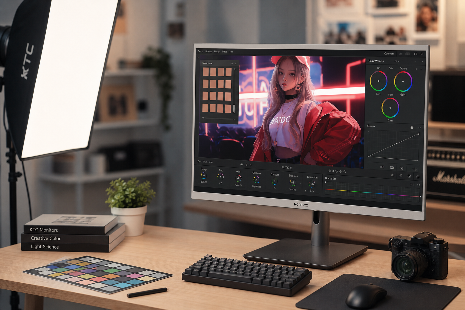
Static Contrast Beats Dynamic Contrast for Real Buying Decisions

The first spec worth trusting is native or static contrast, not dynamic contrast. This display contrast explanation and Wikipedia’s contrast-ratio entry point to the same core issue: dynamic figures often come from changing backlight behavior or scene processing over time, which can inflate the number without improving simultaneous bright-and-dark scenes.
That matters because real use is mixed content. You are not watching a full-white frame followed by a full-black frame all day. You are looking at a spreadsheet with dark text on a bright field, a game HUD over a night map, or a movie scene with firelight in a dark room. This ANSI versus full on/off explanation is useful even outside projectors: measurements taken with bright and dark areas on screen at the same time are usually closer to what your eyes will experience.
When a manufacturer advertises “millions to one,” treat that as a secondary feature until proven otherwise. This contrast guide warns that manufacturers often do not clearly label whether they mean static, dynamic, or ambient contrast, and that alone makes cross-screen comparison shaky. If you cannot find “native,” “static,” or “typical” beside the number, the claim is not decision-grade yet.
Room Light Can Destroy a Great Contrast Spec

A monitor does not perform in a vacuum. Wikipedia’s discussion of real-room viewing notes that ambient light reflected off the screen lowers effective contrast, because black stops being limited only by the panel and starts being lifted by room reflections. That is why a premium dark-room monitor can look average in a sunlit office.
This real-world contrast discussion pushes the same idea further: a display rated at 10,000:1 in controlled conditions can fall dramatically in brighter environments. For office productivity, portable smart screens, and travel setups, screen finish and glare control often matter almost as much as native panel contrast. A modestly higher-contrast screen with strong reflections can lose to a slightly lower-contrast matte screen beside a window.
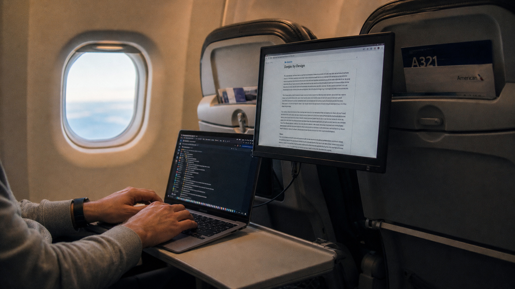
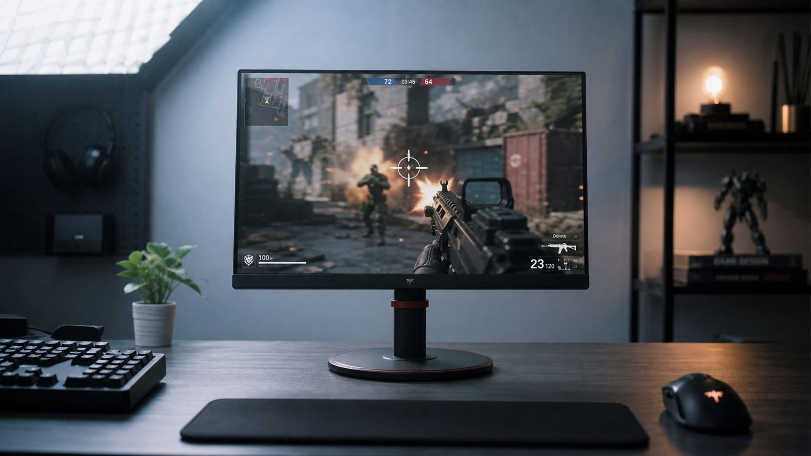
This is also where portable displays need different judgment. If you use a screen in coffee shops, hotel desks, or airport lounges, you may benefit more from adequate brightness and lower reflectivity than from chasing a native contrast jump you will barely see outside a dim room. For fixed gaming stations and movie setups, deeper blacks become easier to appreciate because the room is under your control.
Panel Type Changes What “Good Contrast” Looks Like

A practical monitor-buying baseline is that IPS and TN often land around 1000:1, while VA commonly reaches around 3000:1. That matches what many people notice in side-by-side use. IPS often feels cleaner for wide viewing angles and balanced color work, while VA tends to look more cinematic in dark scenes because the black floor starts lower.
This summary of panel behavior adds the premium end: OLED can effectively reach infinite contrast because pixels can switch off. In real use, that translates into truly black backgrounds and exceptional separation in shadow-heavy content. The tradeoff is that panel choice is never about contrast alone. A stronger VA panel can still show more smearing in motion than a faster IPS option, and OLED still requires you to weigh brightness behavior, cost, and long-term usage patterns.
The choice becomes easier when you tie it to the use case. For office-heavy work, about 1000:1 with sensible brightness is usually enough. For horror games, movies, and late-night console sessions, 3000:1-class VA or OLED has a visible edge. For portable productivity, glare resistance and brightness headroom may matter more than a paper spec bump in contrast.
How to Check Whether a Claim Holds Up
A quick reality check helps more than ten minutes of spec-sheet comparison. This contrast test is still one of the simplest ways to see whether dark bars are crushed together or bright bars are clipping into a single patch. If the leftmost dark shades disappear, your practical black detail is worse than the headline ratio suggests. If the brightest steps merge, your highlight detail is being lost.
The control workflow also matters. This calibration guidance explains the right order well: set contrast high enough to preserve separation in bright tones, then adjust brightness downward for the room instead of blasting both controls upward. In plain terms, the best setting is usually the highest contrast that does not clip light shades, followed by the lowest brightness that still feels comfortable and readable.
This table is a useful shorthand when you are matching specs to real use:
Use case |
Usually enough |
Usually better |
What actually matters most |
Office, coding, spreadsheets |
1000:1-class LCD |
1200:1 to 3000:1 if the room is controlled |
Comfortable brightness, low glare, readable text |
Dark-room gaming, movies |
3000:1-class VA |
OLED or strong local dimming |
Low black floor, shadow detail, minimal blooming |
Bright room or portable use |
1000:1 to 3000:1 |
Higher brightness with a matte finish |
Reflection control, usable brightness, stable contrast in ambient light |
A reliable buying read sounds like this: if two monitors cost about the same and both hit the brightness you need, choose the one with better native contrast for dark-room immersion. If one is much brighter, less reflective, or clearly better tuned for your room, that can beat a higher contrast figure on the box.
A strong display does not win on contrast ratio alone. The best screen is the one that keeps blacks convincingly dark, whites controlled, and details intact at the brightness you actually use in the room where you actually sit.


