


Adaptive Sync usually does not change color accuracy directly; it changes refresh timing to smooth motion. Color shifts during frame rate swings are more often caused by calibration mode changes, HDR behavior, panel overdrive, flicker, drivers, cables, or app rendering paths.
Does your preview window look smooth one second, then slightly dull, tinted, or flickery when the timeline drops frames? A practical setup check can separate motion smoothness from true color problems before you waste hours recalibrating a display that is not actually drifting. You’ll get a clear way to decide when to keep Adaptive Sync on, when to limit it, and how to protect color-critical work.
What Adaptive Sync Actually Changes

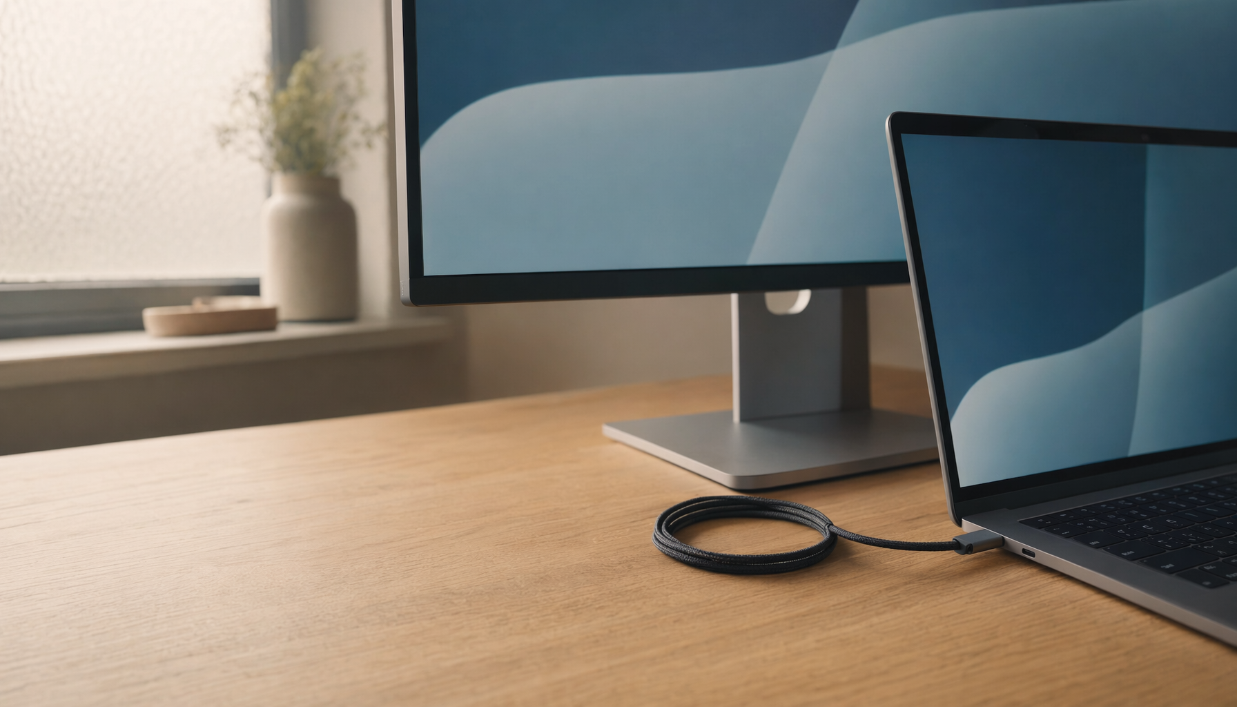
Adaptive Sync is a variable refresh rate technology. Its job is to let the display refresh in step with the graphics card instead of forcing a fixed cadence. In plain terms, if a game, animation preview, or video timeline moves from 120 frames per second to 82 frames per second, the monitor can follow that rhythm instead of showing split frames or uneven motion.
The key point for creators is that Adaptive Sync is a timing feature, not a color-management feature. It does not redefine sRGB, Adobe RGB, DCI-P3, gamma, white point, or ICC profiles. Adaptive Sync dynamically matches monitor refresh rate to GPU output, mainly to reduce tearing and stutter in motion-heavy content through real-time synchronization.
A simple example makes the distinction clear. If you are grading a 24 FPS video on a 144 Hz monitor and your preview occasionally drops to 19 FPS, Adaptive Sync may make playback feel less broken. It should not, by itself, turn neutral gray warmer or make skin tones more saturated. If you see that kind of shift, the cause is probably elsewhere in the display pipeline.
Why Color Can Seem to Change During Frame Rate Fluctuations
Perception Changes Before Measurement Does
Creative work is full of motion-dependent judgment. When a timeline stutters, your eyes spend more time on repeated or uneven frames. That can make contrast, saturation, and shadow detail feel unstable even when a colorimeter would read the same values. Motion judder can also make compressed footage, temporal noise reduction, and sharpening artifacts more visible, which your brain may interpret as a color problem.
This is why Adaptive Sync can indirectly help creative confidence. By reducing tearing and stutter, it can make timeline scrubbing, animation previews, and motion graphics review easier to evaluate. The benefit is especially noticeable on 120 Hz, 144 Hz, or 165 Hz displays where inconsistent frame pacing stands out more than it does on a basic 60 Hz office screen.
The Real Color Risks Live Around the Edges
The bigger risk is not Adaptive Sync itself. It is what changes when Adaptive Sync is enabled. Some monitors switch picture behavior by input, refresh range, HDR state, game mode, or variable refresh mode. A display might offer its most accurate sRGB preset at a fixed refresh rate but loosen controls, enable overdrive, or trigger flicker in a variable refresh mode.
Calibration guidance is useful here because it separates color settings from motion settings: full calibration gives the most accurate result, while variable refresh rate features generally have few downsides unless bugs or flicker appear. That “unless” matters for creators. Flicker or mode switching can make shadows and near-black gradients look unstable, even if the underlying color profile is correct.
Adaptive Sync, Color Accuracy, and Creative Monitor Specs
For professional visual work, color accuracy still depends on the fundamentals: panel type, gamut coverage, bit depth, calibration, uniformity, brightness stability, and room lighting. IPS remains the dependable mainstream choice because it tends to provide consistent viewing angles and color reproduction, while OLED and premium Mini-LED displays can deliver excellent contrast at higher prices. Business monitor guidance also frames IPS as the default recommendation for mainstream work, with OLED mostly relevant to design environments where contrast and color performance justify the cost.
A creator editing web graphics should usually prioritize a reliable sRGB mode over a higher refresh rate. A video editor working in DCI-P3 should care more about gamut coverage, 10-bit workflow support, and repeatable calibration than whether the monitor advertises the most aggressive sync certification. For motion designers, the best display is often the balanced one: 1440p or 4K resolution, IPS or high-end OLED panel quality, strong calibration controls, and Adaptive Sync that behaves cleanly inside the supported range.
Creative Scenario |
Adaptive Sync Benefit |
Color Accuracy Priority |
Timeline scrubbing |
Smoother preview motion when FPS varies |
Stable calibrated picture mode |
Photo editing |
Minimal benefit unless panning or zooming heavily |
sRGB or Adobe RGB accuracy, uniformity |
Motion graphics |
Helps judge movement and timing |
Gamma, white point, and repeatable preview settings |
HDR video review |
Can help playback smoothness |
HDR tone mapping, brightness stability, DCI-P3 coverage |
Office plus light design |
Nice quality-of-life feature |
IPS panel, 1440p or 4K clarity, ergonomic setup |

When to Keep Adaptive Sync On
Keep Adaptive Sync on when the task involves motion and your monitor remains visually stable. That includes video preview playback, animation review, 3D viewport movement, game capture review, fast scrolling through visual dashboards, or using a portable external screen where GPU output may fluctuate. Adaptive Sync technologies are built to reduce tearing, stuttering, and visual fatigue during changing frame rates, and they are widely available through open display standards.
For example, a designer reviewing a 60 FPS product animation on a 144 Hz monitor may see uneven motion when the preview dips to 48 FPS during particle-heavy scenes. Adaptive Sync can make that dip less distracting, which helps you judge pacing and transitions. The color grade itself still needs a calibrated mode, but the motion read becomes cleaner.
The smarter buying decision is matching the graphics card, monitor certification, port support, refresh range, and review-tested behavior. Brand loyalty matters less than whether the display stays stable in the workflows you actually use.
When to Turn It Off or Limit It
Disable Adaptive Sync temporarily if color-critical work shows flicker, brightness pulsing, or unexplained gamma shifts only when frame rates fluctuate. Also test with Adaptive Sync off if the problem appears in windowed creative apps, browsers, screen sharing, office software, or mixed-refresh multi-monitor setups. Some non-gaming stutter comes from drivers, power settings, app rendering, or moving windows between displays rather than from variable refresh rate behavior alone, so the fastest diagnosis is a controlled A/B test.
A practical test takes five minutes. Open the same calibrated image, grayscale ramp, and video preview in your usual creative app. View them in your calibrated picture mode with Adaptive Sync on, then off, without changing brightness, HDR, or color mode. If still images remain identical but motion playback improves with Adaptive Sync on, keep it. If near-black areas pulse or the monitor exits your accurate preset, limit variable refresh rate behavior to fullscreen motion workloads.
Mixed monitor setups deserve extra caution. A 144 Hz creative monitor beside a 60 Hz reference or office display can trigger odd desktop pacing, especially with hardware-accelerated apps. Matching refresh rates where possible, using the most reliable display connection for the main monitor, updating graphics drivers, and avoiding low-quality cables can remove many false color and motion symptoms.
Calibration Still Wins the Color Accuracy Fight

Adaptive Sync is not a substitute for calibration. For serious editing, start with the most accurate picture mode, usually Custom, User, Creator, or sRGB depending on the monitor. If you work for web, an sRGB clamp can prevent oversaturation. If you work in print or cinema pipelines, choose a display and workflow that support the required gamut rather than forcing a gaming preset to behave like a reference monitor.
Color accuracy depends on measurable targets. A properly calibrated display should control brightness, contrast, gamma, color temperature, and profile behavior. Calibration values vary even between units of the same model, which is why borrowed settings are only a starting point. Community calibration discussions often point users toward trusted review settings and ICC profiles first, then hardware calibration when accuracy matters.
For a real-world workflow, let the monitor warm up for about 30 minutes, set room lighting to a repeatable level, choose your creative color mode, calibrate or apply a verified ICC profile, then test Adaptive Sync separately. Do not calibrate in one monitor mode and edit in another. If HDR, game mode, or variable refresh behavior changes the active preset, your calibration assumptions no longer hold.
Buying Advice for Creative Work With Variable Refresh

Choose the monitor around the work first, then treat Adaptive Sync as a motion-quality bonus. For most creators, a 27-inch 1440p IPS display is a strong value point. For detailed photo, layout, and video work, a 32-inch 4K display gives sharper inspection space. Ultrawide monitors can be excellent for timelines, tool panels, and side-by-side references, but confirm picture-by-picture support if you plan to use multiple inputs because it is not universal.
Office and creative monitor guidance consistently favors matching size, resolution, ergonomics, and workflow rather than chasing one headline spec. A 24- to 27-inch range works well for many office tasks, while larger and ultrawide displays support multitasking and media work when desk depth allows more usable screen space. For long sessions, place the display around arm’s length, keep the top third near eye level, and avoid direct glare; poor posture and unstable lighting can sabotage visual judgment as quickly as a bad preset.
If you need one monitor for gaming and paid creative work, look for independent reviews that measure color accuracy with Adaptive Sync enabled, not just factory calibration. Prefer models with a dedicated sRGB or creator mode, wide gamut controls, firmware updates, reliable display inputs, and enough brightness for your room. Adaptive Sync is valuable, but a monitor with accurate color, stable backlight behavior, and ergonomic adjustment will serve you longer.
FAQ
Does Adaptive Sync reduce color accuracy?
Not directly. Adaptive Sync changes refresh timing, while color accuracy comes from panel quality, calibration, gamut, gamma, bit depth, and profile handling. If color changes when Adaptive Sync is enabled, suspect flicker, HDR switching, picture mode changes, drivers, or cable/input behavior.
Should video editors use Adaptive Sync?
Yes, if it improves playback smoothness without changing the calibrated picture mode. It is useful for timeline review and motion judgment, but final color decisions should happen in a stable calibrated mode with consistent lighting.
Is Adaptive Sync certification important for creative work?
It can help confirm compatibility, but it should not outweigh measured color performance. For creative work, stable mode behavior, calibration controls, panel quality, and repeatable viewing conditions matter more than the sync logo.
Adaptive Sync is a performance tool, not a color engine. Keep it when it makes motion cleaner, disable or limit it when it introduces flicker or mode switching, and let calibration, panel quality, and controlled lighting carry the color-critical decisions.


