


OLED text clarity for office work can be good enough for documents, spreadsheets, and email, but it is not a universal yes. If you are shopping for an OLED monitor for work, the real question is whether the panel, scaling, resolution, and viewing distance line up with your tolerance for small text quirks. If you want the safest text-first choice, Mini-LED or IPS is usually more predictable.

Is OLED Clear Enough for Office Text?
For office productivity, OLED is workable for some people and distracting for others. The difference usually is not that OLED is "bad" for text in every case. It is that text clarity on OLED depends more on setup than on a typical IPS office monitor. Newer OLED generations have also improved the older reputation a bit, which is why the answer is more conditional than it used to be.[^1]
That matters most if you spend all day in Word, Excel, browser tabs, and email. If your work mix includes long reading sessions and small fonts, treat OLED text clarity for office work as something to verify on your own desk, not something to assume from a spec sheet. If you want the strongest blacks and are willing to tune the setup, OLED can make sense. If you want the least fuss, Mini-LED or IPS is the safer default.
[^1]: OLED text legibility has improved in newer generations, but the result still depends on the panel and the way you use it.
Why OLED Text Fringing Happens
The main issue is subpixel layout. OLED text clarity problems are primarily caused by non-standard subpixel arrangements, such as the triangular RGB structure in QD-OLED or the RWBG and RGWB layouts in WOLED, which differ from the traditional RGB stripe found in most LCDs.[^2] In plain English, the screen can still look excellent for images and video, but thin text edges may not line up the way Windows and many apps expect.

That is why people describe colored edges or a slightly soft look on small text, especially on high-contrast interfaces. It is also why the same OLED can feel fine to one user and annoying to another. The effect depends on the font, the app, the theme, and how close you sit to the display.
Native resolution is the first thing to check before blaming the panel. Microsoft notes that ClearType is designed around an RGB stripe layout, so it may not render perfectly on every OLED subpixel pattern. In practice, that means OS tuning can help, but it does not magically make every OLED behave like a conventional text-first LCD.
Subpixel Layout and Text Edges
Non-standard subpixel layouts can make fine text edges appear tinted or uneven. Thin fonts and light text on dark backgrounds tend to show it most clearly. If you read mostly in dark mode, you may notice the issue sooner than someone who uses larger fonts and brighter themes.
Resolution, Size, and Scaling
Higher pixel density usually makes OLED text easier to live with. A 27-inch 1440p OLED will generally be easier to judge than a larger screen at the same resolution, simply because the pixels are packed more tightly. Scaling also matters. If scaling is too aggressive, some apps can look softer than they should, even when the panel is fine.
Viewing Distance and Desk Setup
Distance changes the experience more than many buyers expect. Sitting a little farther back can make fringing less noticeable for some users, while sitting very close makes it easier to spot. That is why desk depth matters. A monitor that feels acceptable at a normal office distance can feel more distracting on a shallow desk.
What to Check Before You Blame the Panel
Before you decide OLED is the problem, check three things: whether the display is running at its native resolution, whether scaling is set the way you intended, and whether your cable or dock is limiting the signal path. If the issue still shows up after that, you are probably seeing the panel behavior itself rather than a setup mistake. How to check native resolution is the fastest place to start.
If you want a deeper look at how panel families behave around static content, the panel technology comparison for CAD-style work is a useful follow-up because it frames the same issue around long-session readability instead of gaming.
OLED vs Mini-LED and IPS for Office Text
For text-first office work, the practical comparison is less about image quality in the abstract and more about predictability. OLED usually wins on contrast and dark-room punch. Mini-LED and IPS usually win on consistency, because they are less likely to trigger the same subpixel-fringing conversation in the first place. If your daily work is mostly spreadsheets, documents, and email, that predictability can matter more than OLED's visual advantages.
| Panel Type | Text Clarity For Office Use | Main Strength | Common Drawback For Productivity | Best Fit |
|---|---|---|---|---|
| OLED | Can be very good, but more setup-sensitive | Deep blacks and strong contrast | Some users notice fringing or softness on small text | Mixed-use buyers who also care about contrast and are willing to tune setup |
| Mini-LED | Usually more predictable for text-first use | Strong brightness and office-friendly clarity | LCD contrast can still trail OLED in dark scenes | Buyers who want a safer all-around desktop choice |
| IPS | Usually the most familiar and easy to judge | Stable text appearance and broad compatibility | Less dramatic blacks than OLED | Office-first users who want the least hassle |
If you are leaning toward a non-OLED route, browse Mini-LED monitors when you want stronger contrast without the same text-fringing concern. For a broader office-first shortlist, office monitor options are the simpler place to start.
A practical way to read the table is this: choose OLED when you value contrast enough to accept some setup sensitivity; choose Mini-LED when you want a middle ground; choose IPS when your top priority is text predictability. That is the real split for OLED vs Mini-LED text clarity office shopping.
What Matters Most for Readable Text
Before you buy, focus on the variables that actually change day-to-day readability. The best OLED monitor for productivity text is not just the one with the best headline specs. It is the one that matches your desk, your distance, your scaling habits, and your tolerance for tiny artifacts.
-
Native resolution comes first. If the monitor is not running at its intended resolution, text can look worse than the panel deserves. That check matters before you worry about subpixel layout or app settings.
-
Screen size and pixel density come next. A 27-inch OLED with enough pixel density is usually easier to live with than a larger panel at the same resolution. If you sit close to the screen, this matters even more.
-
Scaling can help or hurt. The right scaling choice makes text easier to read. The wrong one can make a sharp panel feel fuzzy, especially in apps that do not scale cleanly.
-
Desk depth changes the result. If your monitor sits too close, fringing is more likely to stand out. If your desk is deep enough, some of that detail becomes less noticeable in normal work.
-
Connection path still matters. If you use USB-C, a dock, or a KVM, check that the full path supports the mode you want. A convenient setup is not worth much if it quietly degrades the signal before the image reaches the panel.
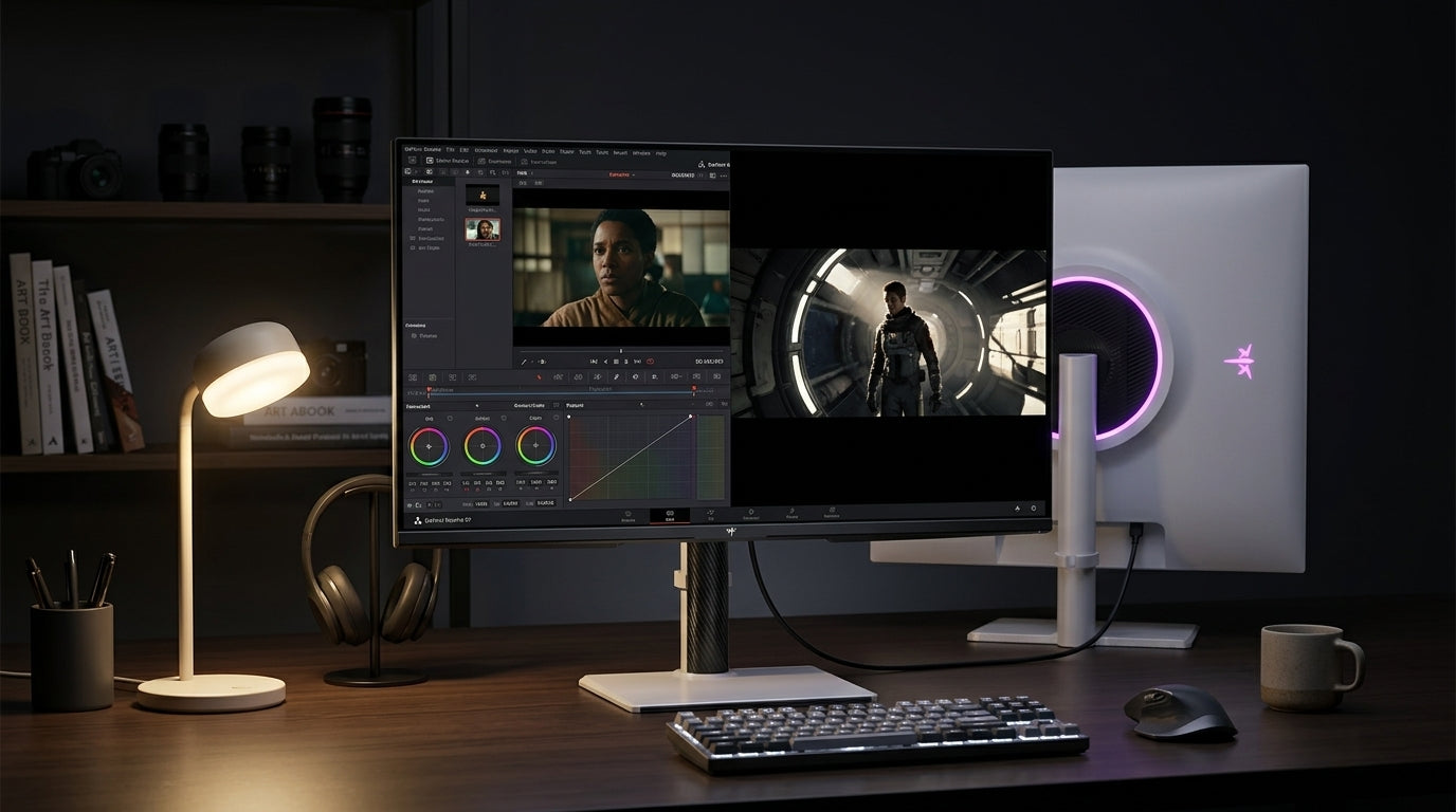
For a neutral product example, the KTC OLED 27-inch 2K 240Hz USB-C monitor is the kind of OLED desk display people often consider for mixed use. It is not proof that OLED is automatically best for office work, but it does show the kind of spec combination buyers often compare when they want one screen for work and media.
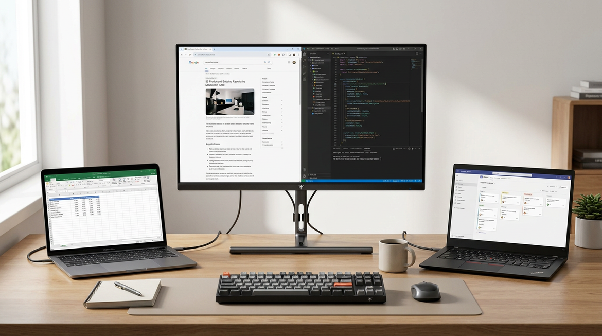
If you are comparing that kind of OLED against office-oriented models, the 27-inch 5K office monitor is the cleaner text-first reference point. In plain terms, higher pixel density is what usually makes office text feel calmer, even if it does not deliver OLED contrast.
When OLED Is the Right Office Pick
OLED makes the most sense when you are not purely text-first. If you split time between documents, browser work, streaming, and casual creative tasks, OLED can be a good fit as long as you are comfortable checking the setup and adjusting scaling if needed. It is also a better match if you value contrast enough that a small amount of text behavior is an acceptable trade-off.
If your work is mostly spreadsheets, dense documents, coding, or remote-office reading, and you do not want to think about tuning anything, OLED is easier to skip. That is the simplest buying rule here: choose OLED when you want the visual trade-off; choose IPS or Mini-LED when you want the safer text-first default.
A quick self-check helps: if you notice font edges immediately and get annoyed by tiny visual quirks, lean away from OLED. If you are tolerant of some setup time and care more about mixed-use flexibility, OLED can still be a reasonable office screen.
Practical Office Buying Checklist
Use this before you click buy.
- Confirm the monitor will run at its native resolution on your PC or laptop.
- Check whether your desk distance is comfortable for the screen size you want.
- Decide how much text fringing you are willing to notice during a full workday.
- Make sure your scaling settings are something you actually want to live with.
- If you want the least uncertainty, choose IPS or Mini-LED instead.
- If you want OLED contrast plus office use, test the panel first and be ready to return it if text feels distracting.
That is the cleanest way to approach OLED text clarity for office work. If you want the lowest-risk choice, go IPS or Mini-LED. If you want OLED, buy it with your desk setup in mind and judge it on real spreadsheets, not showroom demos.
FAQs
How Do I Make OLED Text Look Sharper for Office Work?
Start with native resolution, then check scaling and viewing distance before changing anything else. A different font size or theme can also make text easier to live with. Those changes may improve the experience, but they do not fully remove subpixel-layout differences on every OLED panel.
What Screen Size and Resolution Work Best for OLED Productivity?
For office use, the safer rule is to match higher pixel density with a normal desk distance. Smaller OLEDs with enough resolution usually look cleaner than larger panels at the same resolution. If you sit close, size matters more, because fringing becomes easier to notice.
Why Does OLED Text Look Worse in Some Apps Than Others?
App design changes the result. Thin fonts, dark themes, sharp UI edges, and inconsistent scaling can make fringing stand out more in one program than another. That is why a panel can look fine in a browser but more distracting in spreadsheets or document editors.
When Is OLED a Poor Fit for Office Text Work?
OLED is a weaker pick if you spend most of your day in small-font documents, spreadsheets, or coding and you do not want to tune settings. It is also less attractive if you are highly sensitive to colored text edges. In those cases, IPS or Mini-LED is usually the safer buy.
Can a Mini-LED Monitor Be Better Than OLED for Productivity Text?
Yes, for some buyers. Mini-LED can be the better office choice when you want a more predictable text experience and still want strong brightness and contrast. OLED may look more dramatic, but that does not automatically make it the better text-first monitor.


