


Budget-conscious creators usually need a creator monitor with color accuracy that is good enough for the work they deliver, not a perfect studio reference display. For web, social, and mixed creator jobs, the practical question is whether the panel is accurate enough to avoid obvious color drift, not whether it wins on every spec. Color accuracy baseline guidance commonly uses ΔE under 2 as a professional target, but the right purchase still depends on the workflow.

What Budget Creator Accuracy Really Means
The first filter is workflow, not branding. If you mostly deliver web posts, thumbnails, reels, and client previews, an affordable panel that stays close to sRGB is often enough. If you are matching prints, grading color-sensitive footage, or doing client-facing approval work, the buyer question becomes stricter and the monitor needs better verification before it earns the desk.
A useful way to think about creator monitor color accuracy on a budget is this: buy for the output you are paid to deliver, not for the most ambitious thing the display could possibly do. A monitor can look impressive on a product page and still be a poor fit if its real coverage or consistency is weak. The best first check is whether the display is meant for your main delivery space, then whether the exact model has enough measured consistency to support that work. For a quick follow-up, see how gamut specs can mislead when you compare claims on the box.
In practice, the floor is workflow-dependent. A monitor that is comfortable for general creator work may be too loose for print proofing, while a more accurate panel may be overkill if you only need consistent web color and sharp text. sRGB vs. DCI-P3 calibration is the right next read if you are deciding whether your work really needs a wider target.
Specs That Matter Most for Editing
For most buyers, the main specs to trust are color gamut coverage, viewing stability, uniformity, and practical brightness. Extra refresh rate can be nice, but it does not fix weak color behavior. The goal is to separate what changes the image you judge from what only changes motion or convenience.
Coverage vs. Volume
Coverage tells you how much of a reference color space the panel can reach. Volume tells you how far it extends within that space. For buying decisions, coverage is usually the first number to check because it tells you whether the display can actually represent the colors your workflow expects. A high volume number may still be useful, but it should not distract you from checking coverage first.
For web and social content, sRGB-oriented coverage is usually the most practical baseline because that is the environment most viewers will see. DCI-P3 matters more when your work leans into richer tones, video delivery, or HDR-style presentation. Adobe RGB matters more when print-oriented color is part of the job. Adobe RGB for print workflows is mainly a photographer's concern, not a universal creator requirement.
Factory Calibration and Delta E
Factory calibration is helpful because it reduces the amount of setup needed before editing, but it is not a guarantee of perfect output. That is where ΔE comes in, which is a simple way to describe color error, with lower being better. In plain language, ΔE under 2 is a useful professional target, but it still does not tell you everything about the panel, the room, or the specific unit you receive. Delta E guidance for professional work backs up that threshold for controlled indoor work.
On affordable monitors, calibration should be treated as a starting point, not a substitute for good panel behavior. If the display is inconsistent from unit to unit, or if the factory preset is only accurate in one mode, the final result may still need verification. The useful buyer move is to ask whether the model is factory tuned, then confirm whether the exact mode you plan to use is the one that was tuned.
Panel Type, Viewing Angle, and Uniformity
Panel behavior matters because color can look different as you shift in your chair or move your head. Viewing angle and color accuracy becomes especially relevant if you edit at an angle, share the screen with someone else, or use a larger display where the corners are farther from your eyes.
Uniformity is the other quiet spec. A screen with dim corners or tint shifts can push you to correct the monitor instead of the image. That is a real risk for retouching and grading, because the screen can make one area look too dark or too warm even when the file is fine. Brightness uniformity for grading and uniformity issues in photo editing are worth a look before you assume a budget panel is automatically good enough.
Brightness and Room Conditions
Brightness matters because the monitor has to stay readable in your actual room, not just in a dark demo space. Adobe's guidance for color-accurate work points to roughly 120 nits in controlled indoor conditions, which is a useful reminder that overly bright settings can make editing less stable and more tiring. In a brighter room, room light and reflections can matter as much as the panel spec itself.
What this means is simple: if you edit near a window or under strong overhead light, check brightness and anti-glare behavior before you chase a wider gamut. A monitor can be technically capable and still feel inaccurate if the room is washing out what you see.

Minimum Acceptable Accuracy Levels
For a budget creator monitor, the minimum acceptable level depends on what you make. The table below shows a practical floor by workflow class, not a universal rule. It is meant to help you decide when a lower-cost panel is enough and when it is smarter to spend more.
| Workflow | Practical floor | What to prioritize | When to step up |
|---|---|---|---|
| Web content, social posts, thumbnails | Solid sRGB coverage and stable viewing | sRGB first, then usable uniformity | Step up if client approvals are color-sensitive |
| General photo editing | Reliable sRGB or wider gamut with checked mode accuracy | Coverage, factory calibration, uniformity | Step up if you edit for print or proofing |
| Light video editing | sRGB is often fine for basic deliverables | Viewing stability and predictable presets | Step up for richer-toned or client-facing work |
| Print-focused photo work | Wider gamut and careful verification | Adobe RGB support and consistency | Step up if soft proofing is part of the job |
| Color-critical grading | Stronger measured accuracy and controlled room setup | Verified coverage, uniformity, and calibration | Step up if your work must track a reference target closely |
A 99% sRGB class monitor can be enough for many creator workflows, especially if your work ends on the web. Wider-gamut support becomes more valuable when the deliverable itself needs richer color or when you want more headroom for print or HDR-style content. The key is not to overpay for DCI-P3 or Adobe RGB unless your workflow can actually use them.
If you want a quick benchmark for the minimum accuracy conversation, professional color work often treats ΔE under 2 as a strong target, but that alone does not settle the buying choice. It is only one part of the decision, and it has to be weighed against the model's actual coverage and uniformity.
How to Judge a Budget Monitor Before Buying
Use this pre-purchase sequence to avoid paying for the wrong features:
- Define your main output first. If most of your work is web, social, or general creator content, prioritize sRGB stability before anything else.
- Check the exact color target the monitor supports. Match the advertised gamut to reality before you trust a label that looks impressive on a product card.
- Look for the panel behavior that affects editing most. Viewing angle and uniformity matter more than a flashy refresh-rate badge when color judgment is the point.
- Verify the room fit. Bright rooms, reflective desks, and side lighting can make a good monitor feel worse than it is.
- Confirm the exact model page. Similar-looking monitors can differ enough that a vague "27-inch creator monitor" comparison is not enough.
A useful rule is this: if the display only looks good when you ignore the room, the target, or the exact model page, it is not ready for creator work. For buyers who are still deciding between sRGB and richer-gamut targeting, the calibration choice guide can help narrow the next step.
Which Monitor Type Fits Your Workflow
The right monitor class depends on how demanding your edits are. Budget creator work does not always need a dedicated studio display, but it does need the right compromise.
Best Fit for Tight Budgets
If you mainly need dependable web color, light photo cleanup, and ordinary video edits, a lower-cost IPS office-style monitor can be enough. In that scenario, a model like the 27-inch office monitor is a neutral example of the kind of display that can make sense when the budget is tight and the work is mostly sRGB-based.
That kind of monitor is not a fit if you regularly compare work across multiple devices, print proof, or rely on more exact color matching for clients. In those cases, the decision flips toward a sharper creator-class panel with better verified coverage and more confidence in the exact mode you will use.
Best Fit for Sharper Mixed Work
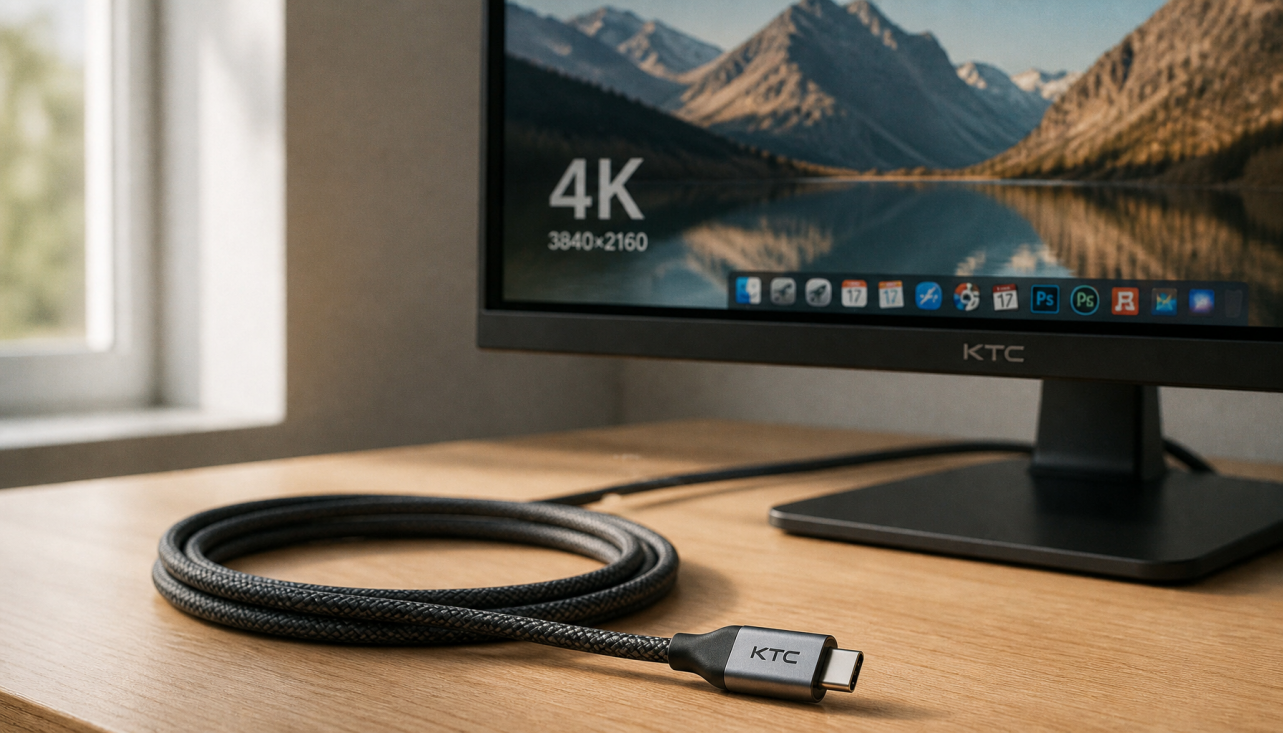
If you want sharper timelines, more desktop space, and stronger creator-friendly coverage, a 5K office-class model is easier to justify. The KTC 27" 5K@60Hz 2K@120Hz Home&Office Monitor | H27P3 is a good neutral example because its product facts list 5K resolution, factory-calibrated ΔE<2, 100% sRGB, 99% DCI-P3, and 99% Adobe RGB. That makes it a stronger fit for creators who want more room for photo and video tools without jumping into a pro-brand display.
If your work leans more toward HDR-style contrast or you simply want an optional Mini-LED path, the KTC Mini LED 27" 180Hz 2K HDR1400 Gaming Monitor | M27T6 is a different kind of fit. Its product facts show 96% DCI-P3, 99% sRGB, 95% Adobe RGB, and Mini-LED with HDR1400. That can make sense when contrast and wide color are both useful, but it should not be treated as an automatic creator upgrade.
For a broader browse path, the Office Monitor collection is the cleanest place to compare office-style displays when you are weighing creator-adjacent options against price.
Final Buying Checklist for Creator Work
Before you buy, check the workflow, not just the headline spec. Confirm the exact gamut target, ask whether the model's coverage is verified, and make sure the viewing angle and uniformity fit your desk setup. If your work is mostly web or social, you can keep the bar lower. If you edit for print, clients, or color-sensitive video, step up to a tighter verified panel instead of hoping calibration will fix a weak display.
FAQs
How Accurate Does a Budget Creator Monitor Need to Be for Client Work?
For client work, the monitor only needs to be accurate enough for the deliverable, but the bar rises when the client is judging color closely. Web-only or social-first work can often stay in the sRGB lane, while print, grading, or brand-sensitive work usually deserves more verification.
What Color Gamut Should I Prioritize for Photo and Video Editing?
Start with sRGB if your output is mostly web and social. Move toward DCI-P3 when richer tones or HDR-style delivery matter more, and think about Adobe RGB only if print-oriented photography is part of the job.
Can a Factory-Calibrated Monitor Replace My Own Calibration?
No. Factory calibration is a helpful starting point, but it does not remove the need to confirm the exact model, preset, and room conditions. It lowers setup work; it does not guarantee that every unit will behave the same.
Why Does Uniformity Matter on an Affordable Monitor?
Uniformity matters because uneven brightness or tint can trick you into editing the screen instead of the file. That matters most in photo retouching and grading, where small differences across the panel can change your judgment.
Can Mini-LED Be Worth It for Creator Work on a Budget?
Sometimes, yes, but only when the extra contrast or HDR behavior matches the work you actually do. Mini-LED can be useful for certain mixed creator setups, yet it is not a blanket fix for color accuracy.
What Should I Check Before I Trust a Gamut Claim?
Check whether the claim is for coverage or volume, then confirm that the exact model supports the mode you plan to use. A spec line can sound impressive and still be the wrong fit if the real-world target does not match your workflow.


