


HDR can improve color-critical work by revealing highlight detail, richer color volume, and smoother gradients, but it also makes accuracy harder unless the display, OS, calibration path, and delivery target are controlled.
Does your grade look clean on your editing monitor, then suddenly too bright, too dull, or oversaturated on another screen? A disciplined HDR setup can give you more reliable highlight decisions, cleaner shadow separation, and fewer surprises when moving between SDR, HDR, web, and print-adjacent workflows. You will get a practical way to decide when HDR helps, when it hurts, and how to keep color decisions trustworthy.
HDR Changes the Accuracy Problem
HDR is not just “brighter SDR.” It changes the working range of brightness, the expected color space, the transfer curve, and the way your monitor maps signal values into visible light. That is why HDR can make a sky, specular reflection, or LED sign look more lifelike while also making a neutral gray, skin tone, or brand color harder to judge if the pipeline is unstable.
For color-critical work, accuracy means the screen is a dependable reference for a defined target. In SDR, that target is often sRGB, Rec. 709, or a wide-gamut RGB space for print-oriented photography. In HDR, the target may involve PQ or HLG, wider gamuts such as DCI-P3 or Rec. 2020 containers, higher bit depth, and much higher peak luminance. The benefit is real: HDR workflows commonly use 10-bit or higher color depth, which reduces banding in skies, gradients, and bright transitions.
The catch is that a monitor can “support HDR” without being accurate enough for professional grading. A low-brightness HDR mode may stretch colors, clip highlights, or flatten contrast. For example, a monitor that peaks around 400 to 600 nits may accept an HDR signal, but if your footage was mastered for 1,000-nit highlights, the display must compress that information. That compression is tone mapping, and it directly affects what you think you are correcting.
Color Accuracy Depends on Color Volume, Not Gamut Alone
Gamut coverage tells you which colors a display can reach, but HDR accuracy also depends on how bright those colors can remain. This is color volume. A monitor may cover much of DCI-P3 at moderate brightness, then lose saturation as highlights rise. That matters when grading a neon sign, sunset, stage light, or polished product shot where brightness and saturation happen together.

The DisplayHDR standard is useful because it evaluates HDR displays through measurable criteria such as luminance, color gamut, bit depth, and response behavior. It does not replace a reference monitor review or your own calibration, but it is a better starting point than vague “HDR ready” marketing. In practice, DisplayHDR 400 is usually a compatibility signal, while DisplayHDR 1000 or stronger certification is more relevant when HDR decisions affect paid delivery.
For photography, HDR becomes genuinely compelling around 1,000 nits, while displays under 600 nits often deliver a limited HDR experience. Current monitor guidance also highlights a professional limitation: there is no simple, universal ICC-style HDR calibration workflow that behaves like mature SDR profiling, so factory accuracy and hardware calibration matter more than many buyers expect.
Display Trait |
Why It Matters for Accuracy |
Practical Reading |
Peak brightness |
Determines whether small highlights can be judged without heavy compression |
Stronger for HDR at around 1,000 nits or higher |
Sustained brightness |
Shows whether large bright scenes stay stable |
Critical for product, snow, sky, and UI-heavy work |
Black level |
Controls shadow separation and perceived contrast |
OLED excels; Mini-LED depends on dimming quality |
Local dimming |
Affects haloing, blooming, and highlight shape |
More zones help, but processing still matters |
Hardware calibration |
Keeps the display closer to known targets |
More valuable than software-only tweaks for professional work |
HDR Can Improve Professional Decisions
The biggest HDR advantage is highlight visibility. In SDR, bright areas are often compressed into a narrow range. In HDR, a colorist can preserve detail in chrome, water, lamps, windows, fire, signage, and reflective product surfaces. That makes exposure and roll-off decisions more precise.
HDR also improves gradient smoothness when the workflow is properly 10-bit. If you edit a sunset in 8-bit SDR, aggressive curves can reveal banding. In a 10-bit HDR workflow, there are far more tonal steps available, so subtle transitions in skies and studio backgrounds are easier to protect. This is why HDR capture advice often recommends log recording at minimum, with RAW when storage and post resources allow, rather than baking contrast into Rec. 709 early.
There is also a creative benefit. HDR lets you separate brightness from artificial saturation. In SDR, editors often push saturation or contrast to create impact. On a capable HDR display, a bright practical light or metallic reflection can feel intense because it is actually bright, not because the whole image has been overprocessed.
HDR Can Also Damage Accuracy
HDR hurts accuracy when the monitor is not predictable. Consumer HDR modes often add dynamic contrast, sharpening, saturation boosts, local contrast tricks, or automatic brightness limiting. Those features may look impressive in games and movies, but they are dangerous for client work because the display keeps changing the image while you are trying to judge it.
The operating system adds another complication. Calibration discussions warn that traditional SDR ICC workflows do not transfer cleanly into HDR because SDR calibration curves do not describe how the display behaves at HDR luminance levels. The practical advice from that calibration discussion is to use accurate SDR color management for SDR work, then avoid applying unsuitable SDR correction curves when switching into HDR.
This is why leaving HDR permanently enabled for all desktop work can be a trap. Your browser, design app, NLE, GPU driver, OS compositor, and monitor mode may not agree on how to interpret color. The result can be oversaturated SDR assets, dull-looking UI, or double-managed color. For color-critical jobs, use HDR mode when you are actually reviewing or mastering HDR content, and return to a controlled SDR mode for SDR deliverables.
Monitor Choice Matters More Than the HDR Checkbox
For professional color work, an IPS monitor with strong uniformity and hardware calibration can be a better SDR tool than a flashy HDR gaming display with weak HDR accuracy. For HDR mastering, however, you need more than IPS consistency. You need real brightness, deep contrast, stable tone mapping, and repeatable color.

Mini-LED LCDs can be strong for HDR editing because they can reach high brightness and often sustain more brightness across larger screen areas. Their weakness is blooming, where bright objects create halos against dark backgrounds. OLED and QD-OLED displays provide excellent black levels and pixel-level contrast, but some models cannot sustain high full-screen brightness, and long-term static UI use requires burn-in awareness.
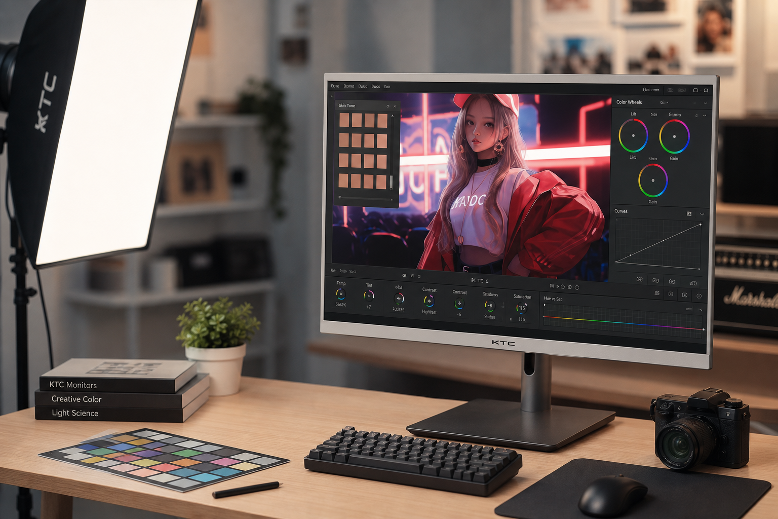
Creative monitor guidance correctly emphasizes calibration as the process of aligning display output with recognized standards, especially for photo editing, video editing, design, and 3D production. That calibration-first mindset matters because it separates a pleasant-looking screen from a dependable production tool.
A practical example: if you edit real estate interiors with bright windows, a 1,000-nit Mini-LED display may help you judge window detail better than a lower-brightness OLED. If you grade dark music videos or game trailers with tiny bright highlights, OLED contrast may be more valuable. The right answer depends on the content you deliver, not the panel technology alone.
Build Separate SDR and HDR Workflows
The most reliable setup uses separate modes for separate jobs. Use a calibrated SDR mode for web images, office design, print preparation, and Rec. 709 video. Use an HDR reference or cinema mode for HDR review and grading. Use a separate gaming HDR mode only when low latency matters more than strict accuracy.
KTC’s HDR calibration discussion makes a useful point: HDR content is mastered inconsistently across movies, games, streams, discs, and creator exports, so chasing one title until it “looks perfect” can break everything else. A stable standard is better than constant adjustment, especially when HDR calibration affects shadow detail, highlight clipping, and color naturalness.
For desktop users, run the HDR calibration tool only after choosing the monitor’s intended HDR mode, then rerun it if that mode changes. Disable unnecessary monitor post-processing for professional review. In editing software, confirm the project color management, timeline color space, output transform, and export metadata. HDR mistakes often happen because one link in the chain silently assumes SDR.
When HDR Is Worth It for Color-Critical Work
HDR is worth it when your deliverable is HDR video, HDR photography, premium streaming content, game capture, product visualization, or any project where highlight behavior is part of the creative intent. It is also useful for reviewing how modern phones, tablets, OLED laptops, and HDR TVs may present your content.
HDR is less useful when the final target is print, standard web images, office documents, SDR streaming video, or brand assets that must match sRGB. In those cases, a disciplined SDR workflow with accurate calibration, good uniformity, and the right gamut target will usually produce more dependable results.
HDR production experience is a useful reality check: HDR video can look brighter, more colorful, and more realistic than SDR, but the production path involves standards, metadata, OS behavior, browser support, and monitoring complications. That workflow friction is why HDR video still demands more discipline than simply exporting a brighter file.
Practical Setup Advice
Choose the display around the work first. For SDR-heavy photography and print matching, prioritize uniformity, hardware calibration, wide-gamut RGB or sRGB accuracy as needed, and stable brightness around normal editing levels. For HDR video, prioritize 10-bit support, real HDR brightness, strong contrast, meaningful certification, accurate HDR picture modes, and hardware calibration or proven factory performance.
Keep your room consistent. HDR review in a bright office can make shadow decisions unreliable, while an overly dark room can make highlights feel more aggressive than they will in normal viewing. Use controlled ambient lighting and avoid changing brightness settings mid-project.

Verify with real content and test patterns. A good HDR monitor should show highlight detail without harsh clipping, neutral grays without color casts, smooth gradients without banding, and stable skin tones across exposure changes. If your display makes every HDR clip look dramatic in the same way, it is probably applying a look instead of showing the signal.
FAQ
Should I edit photos in HDR all the time?
No. Edit in HDR when the final image will be viewed as HDR or when you are intentionally creating an HDR version. For print, standard web, and client assets that must match SDR expectations, a calibrated SDR workflow is still the safer reference.
Is DisplayHDR certification enough for professional color work?
It is a useful filter, not a full guarantee. The DisplayHDR program helps compare measurable HDR capability, but professional accuracy still depends on calibration, uniformity, panel behavior, software color management, and the exact delivery target.
Does HDR make colors more accurate automatically?
No. HDR gives the system more brightness and color range to work with. Accuracy only improves when that extra range is measured, calibrated, correctly tone-mapped, and interpreted by your software and display.
HDR is powerful when it is treated as a controlled production mode, not a universal picture enhancement. For serious color work, let SDR remain your precision baseline when the deliverable is SDR, and use HDR only on a display and workflow stable enough to earn your trust.


