


Display dithering can make gradients look smoother by blending limited color steps into a finer-looking transition, but it does not make a panel more color-accurate. Done well, it hides banding; done poorly, it can add grain, shimmer, or eye-comfort issues.
Do dark game skies, soft shadows, or office app gradients look striped, noisy, or oddly active on your screen? A simple gradient check at your normal brightness can help separate file banding, monitor processing, and panel limitations before you blame the entire display. You’ll learn what dithering changes, when it helps, when it hurts, and what to adjust before replacing a monitor.
What Display Dithering Means
Dithering is a controlled technique: a screen or image system uses patterns, noise, or rapid changes to create the impression of colors or tones it cannot directly show. In image processing, the illusion of extra shades is created by arranging limited colors so your eyes blend them at normal viewing distance.
For monitors, the idea matters because every display has limits. An 8-bit RGB signal gives 256 levels per red, green, and blue channel, while a lower-depth panel has fewer native steps. When those steps are too visible, you see banding: a sunset becomes rings, a dark game fog bank becomes blocks, and a soft gray UI background becomes stripes.

There are two practical forms to understand. Spatial dithering changes neighboring pixels in a pattern, so a cluster of pixels visually averages into an intermediate tone. Temporal dithering changes a pixel over time, rapidly alternating nearby tones so your eye perceives something between them. Frame Rate Control, often shortened to FRC, is the monitor technique many buyers encounter: 6-bit plus FRC switches between nearby colors to simulate more tonal levels than the panel natively owns.
Why Dithering Can Make Color Look Smoother
The best case for dithering is gradient smoothness. Instead of showing a hard jump from one tone to the next, the display spreads tonal error across space or time. Your eye then reads the transition as smoother, especially from a normal desk distance of roughly 2 ft to 3 ft.
This is why dithering has such a long technical history. Floyd-Steinberg dithering became a standard error-spreading method because it pushes quantization error into neighboring pixels rather than leaving harsh contour lines. Ordered dithering, often associated with Bayer matrices, uses repeatable threshold patterns that are fast and predictable. Blue-noise approaches can reduce obvious patterning and are often used when designers want less banding without the messy look of pure random noise.

For gaming, the visible win is most obvious in skies, smoke, fog, and dim interiors. For office productivity, it shows up in app backgrounds, browser gradients, and presentation decks. For portable smart screens, it can be the difference between a compact secondary display that feels polished and one that makes every dark UI look compressed.
Dithering type |
Main benefit |
Main risk |
Best-fit use |
Spatial dithering |
Smoother-looking tones from pixel patterns |
Fine grain or visible texture up close |
Static images, web graphics, retro visuals |
Temporal dithering or FRC |
More perceived shades without a higher native panel depth |
Shimmer, flicker-like sensitivity, noisy dark tones |
Budget panels, high-refresh displays, video playback |
Ordered dithering |
Stable, controlled pattern |
Pattern may be noticeable |
Stylized visuals and predictable rendering |
Blue-noise dithering |
Less obvious structure than regular patterns |
Can still look like texture |
Banding reduction in graphics and effects |
Smoothness Is Not the Same as Accuracy
Dithering improves perceived continuity, not necessarily measured color truth. A dithered patch may look closer to the intended shade because your eyes average it, but the display is still alternating or patterning around available values. For color-critical work, that distinction matters.
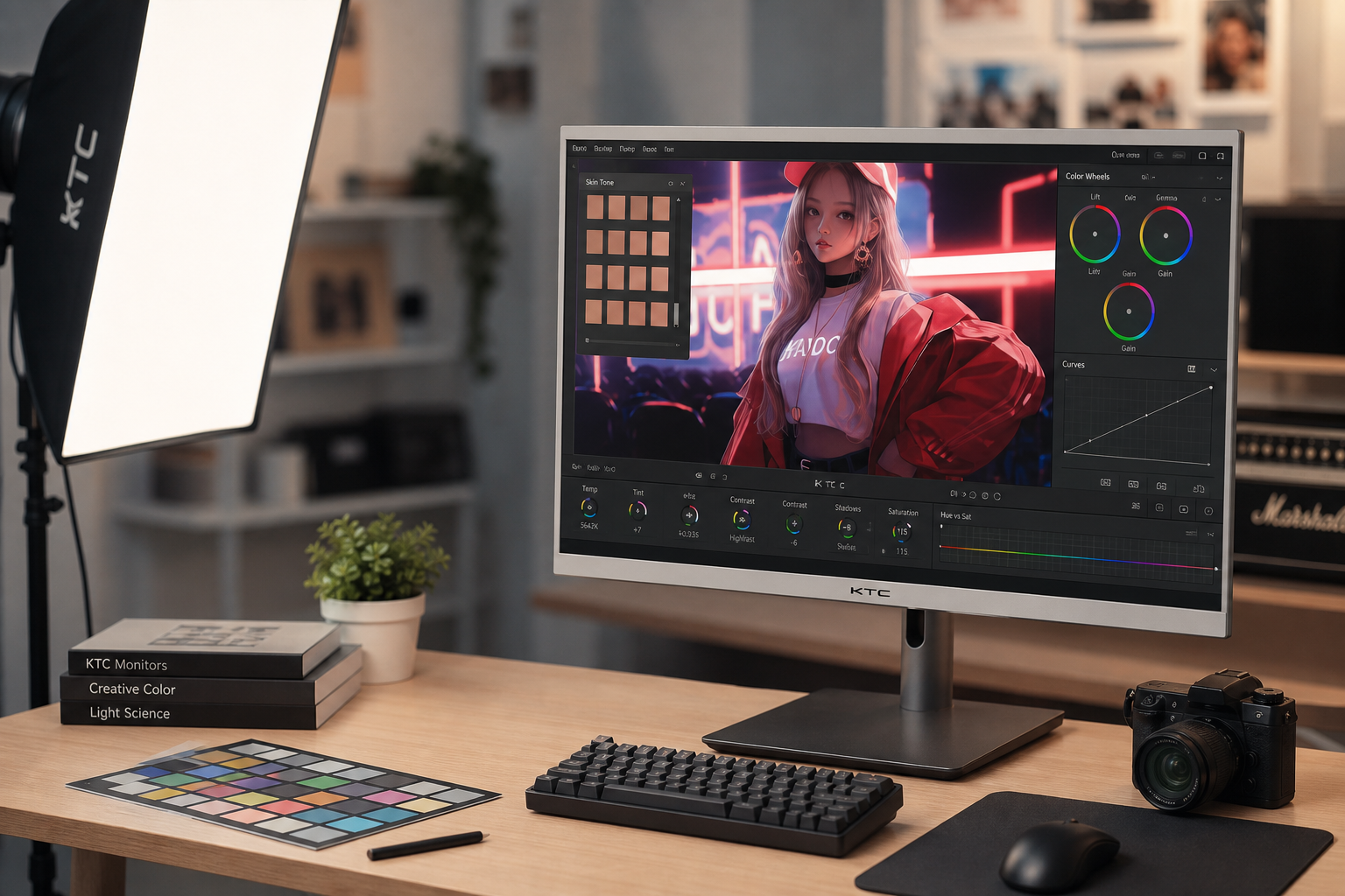
Color accuracy depends on gamut behavior, white balance, gamma, grayscale tracking, panel uniformity, calibration, and the signal path. A review of a productivity-focused 27-inch QHD display noted a true 8-bit panel, but also found factory gamma behavior that missed the intended target, showing why true 8-bit color alone does not guarantee visual accuracy.
In practice, dithering is most helpful when the display chain has enough underlying control to stay close to the target. If the monitor’s grayscale is tinted, dithering may make the tint smoother rather than correct. If a video file is heavily compressed, dithering at the panel cannot restore missing detail. If a wide-gamut monitor lacks a reliable sRGB clamp, dithering will not stop web colors from looking overcooked.
Where Dithering Helps Real Users
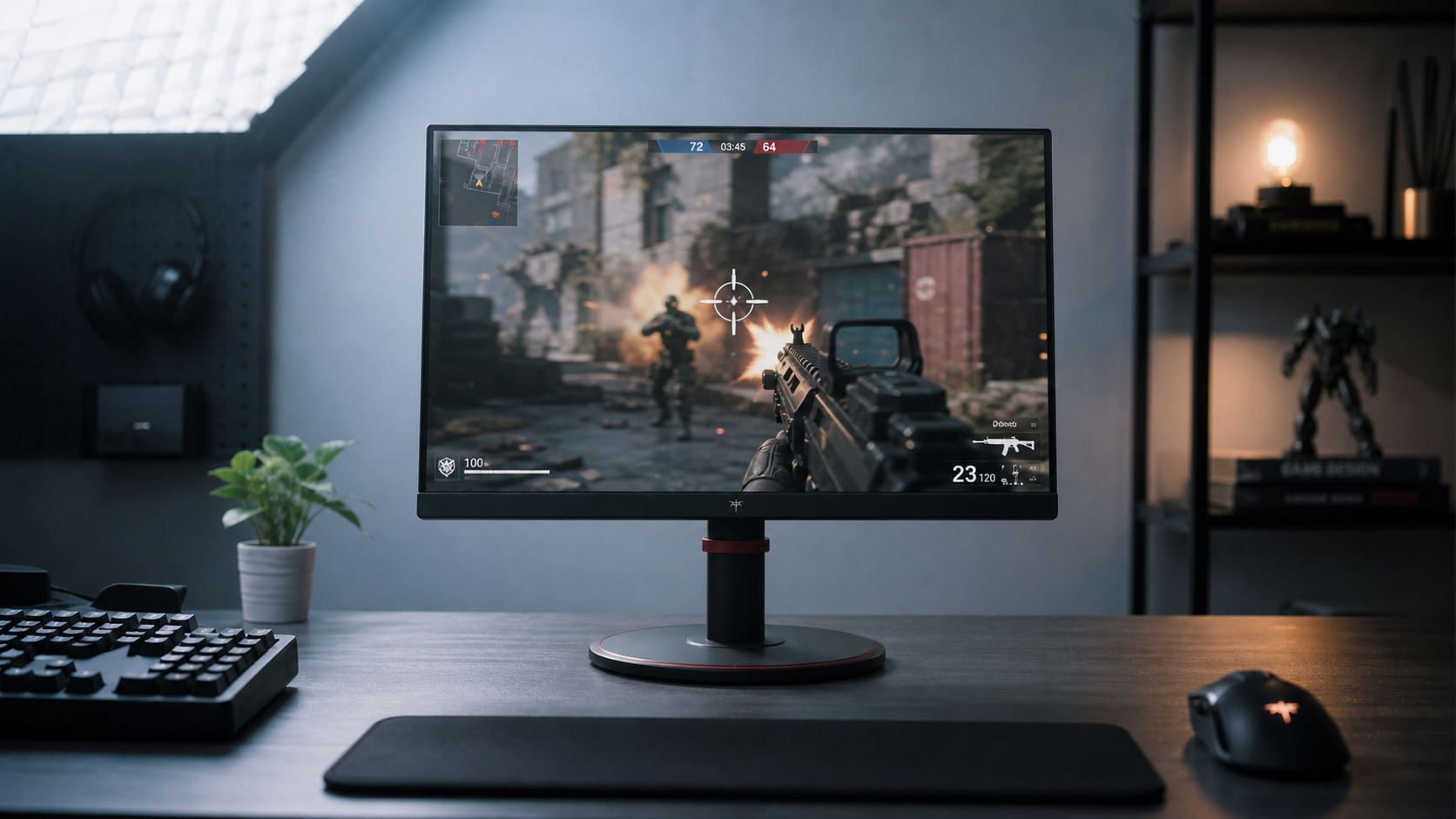
A competitive player may benefit from dithering when dark gradients in a game stop breaking into obvious bands. The advantage is not that enemies become brighter or color becomes more accurate; it is that the image stops distracting the eye with false contour lines. On a 27-inch 1440p gaming monitor, that can make smoke, night maps, and skyboxes feel more continuous while keeping the display responsive.

A designer or editor benefits differently. When reviewing soft shadows, product renders, or subtle UI gradients, dithering can reveal whether a band is truly in the asset or caused by the display path. If you export a clean gradient and see steps only on one monitor, the issue may be panel processing, color depth, or calibration rather than the design file.
A knowledge worker also has a stake in this. Color is not only cosmetic; color cues can support learning by guiding attention and reducing effort when used deliberately. If a display renders those cues with harsh banding, tint shifts, or noisy dark backgrounds, the screen feels less stable during long reading, spreadsheet, and presentation sessions.
Where Dithering Hurts
The tradeoff is artifacts. Temporal dithering can create shimmer, especially in dark colors where the eye is sensitive to small luminance changes. Some users describe this as grain, crawling texture, or a faint flicker-like sensation. Discussions around noisy dark colors point to the classic budget-panel issue: FRC artifacts vary by implementation and viewer sensitivity.
Eye comfort is the harder edge case because the evidence is mixed and often user-reported. Some users have proposed that matte or anti-glare protectors may change how temporal dithering feels, but those discussions treat this as a hypothesis rather than controlled proof. The practical takeaway is cautious: screen protectors may influence perceived comfort on some setups, but they should be tested rather than treated as a universal fix.
Dithering can also complicate calibration. In one calibration forum case, a user saw visible banding after calibration and reduced it with GPU-side dithering, while also questioning whether dithering should be active during measurement. That kind of workflow shows the real-world tension: visible gradient banding can be improved by GPU-side dithering, but calibration results depend on a stable, repeatable signal path.
How to Diagnose Dithering and Banding on Your Monitor
Start with the simplest real-use test. Open a high-quality smooth gray gradient, a dark game scene, and a clean sky image at your normal brightness, not at maximum showroom brightness. Sit at your normal distance and ask whether the issue looks like fixed bands, moving grain, tint shifts, or flicker-like pulsing.

Then isolate the signal path. Set the monitor to its accurate sRGB or standard mode, disable HDR, turn off motion-blur reduction or black-frame insertion, and test adaptive sync both on and off. Modern flicker sources can include PWM dimming, FRC, pixel inversion, strobing, software output, drivers, and cable instability, so modern monitor flicker should be diagnosed one setting at a time.
Brightness deserves special attention. Many people work around 30% to 40% brightness, where some displays show more visible flicker or processing artifacts. For a portable monitor, also test wall power versus laptop USB-C power, because unstable power can look like brightness pulsing or signal noise rather than ordinary color banding.
If your GPU and monitor support higher output depth, try 10-bit output in the operating system or graphics driver. Do not expect miracles in every app, and do not assume 10-bit output means the panel is native 10-bit. Still, when the full chain supports it, more tonal steps reduce the need for aggressive dithering.
Buying Advice for Gaming, Office, and Portable Displays
For esports monitors, do not let refresh rate distract from tonal behavior. A 500 Hz or 1,000 Hz mode can be impressive, and current high-refresh panels show how far the category is moving with Dynamic Frequency and Resolution modes. But refresh rate does not automatically solve banding, FRC artifacts, PWM, or poor gamma. Test dark scenes, not just motion demos.
For office productivity, prioritize stable grayscale, a usable sRGB mode, adjustable brightness, comfortable matte treatment, and clean text rendering. A true 8-bit panel is a strong baseline for dependable work, but factory tuning still matters. If your screen is used for dashboards, presentations, or product pages, smooth gradients and accurate neutral grays reduce visual fatigue and make decisions feel more trustworthy.
For portable smart screens, look for full-sRGB IPS or OLED quality, stable USB-C power, enough brightness for travel lighting, and low-glare coating that does not add heavy sparkle. A small display viewed close up makes dithering texture easier to notice, so real-use testing matters more than spec-sheet color claims.
Practical Settings That Usually Improve Results
Use the monitor’s sRGB or standard mode when accuracy matters, then adjust brightness for the room. If sRGB locks brightness too high or too low, a well-tuned custom mode may be more usable even if it is slightly less strict. For creators, a hardware calibration device and a unit-specific ICC profile are better than downloading someone else’s profile, because individual panels vary.
Enable 10-bit output only when the display, cable, GPU, operating system, and application support it cleanly. If it causes instability, black screens, or app-specific issues, return to a stable 8-bit path with good dithering rather than chasing a setting that breaks the workflow.
For eye comfort, disable blur-reduction strobing first, then test adaptive sync, HDR, and low-brightness behavior. If the issue is temporal dithering sensitivity, settings may reduce the effect but may not remove it fully. In that case, a true 8-bit or true 10-bit panel with well-documented flicker-free behavior is the more reliable long-term move.
FAQ
Does dithering make a cheap monitor as accurate as a premium one?
No. Dithering can make transitions look smoother, but it cannot fix poor gamma, weak grayscale tracking, oversaturated color modes, uneven panels, or inaccurate factory calibration.
Is FRC bad for gaming?
Not automatically. Many gamers never notice it, and it can make gradients look better on affordable panels. The risk is visible shimmer or noisy dark colors, especially in dim scenes or for sensitive users.
Should I turn dithering off?
Turn it off only if it causes visible shimmer, eye discomfort, or calibration trouble. If disabling it creates obvious banding, the better answer may be a cleaner signal path, a higher-quality panel, or settings that reduce the artifact without removing smoothness.
Dithering is a performance tool, not a purity test. Use it when it makes gradients smoother without adding visible noise, but judge the whole display by the result that matters: stable motion, clean tone transitions, accurate color modes, and a screen you can trust for long sessions.


