


Wider color gamut coverage affects more than visual punch. When the panel and settings are well matched to the game, it can make story scenes feel closer to their intended mood.
Do your favorite story games ever look strangely flat, harsh, or emotionally off even when the writing and music are doing their job? Across hands-on display tuning notes, monitor buying guidance, and game-color research, the pattern is consistent: better color range and tone handling can make the same scene feel richer, calmer, more threatening, or more intimate. The key is knowing when wider gamut helps, when it hurts, and how to tune for story-first immersion rather than empty showroom punch.
Why color gamut affects narrative feeling

In story-driven games, color is not just decoration. Color is tied to perception, memory, and emotional arousal, which means a display’s ability to reproduce a scene’s intended palette can directly influence how you read tension, warmth, dread, nostalgia, or relief. That matters even more in narrative-heavy titles, which often rely on environmental mood, facial lighting, weather, and subtle transitions rather than pure mechanical urgency.
That pattern also fits how modern story games are designed. The strongest story games use careful plotting and memorable characters, so the display becomes part of the storytelling chain. If a monitor compresses dark shades into one muddy block or oversaturates every highlight into candy-colored glare, the emotional register shifts. A lonely campfire can become merely orange. A cold blue corridor can become cartoonish. A dusk scene meant to feel bittersweet can end up looking louder than the writing intends.
Game art psychology points in the same direction. Color and design affect player behavior and feeling, which is why gamut coverage matters most in slow-burn exploration, character drama, horror, and cinematic RPGs. In those genres, your screen is not just showing content; it is carrying emotional cues frame by frame.
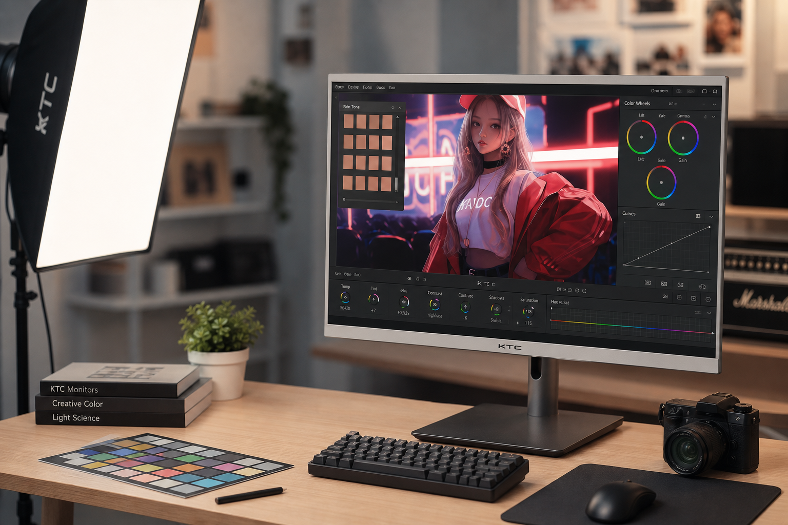
What color gamut coverage actually means on a gaming display

Color gamut is the range of colors a display can reproduce inside a reference space such as sRGB or DCI-P3. In buying terms, 95% or better sRGB coverage is a practical baseline. That does not mean every wider-gamut monitor automatically looks more accurate. It means the panel has the capacity to show more of the intended color range.
The emotional effect shows up in separation, not just saturation. A display with limited coverage often makes adjacent shades collapse together, especially in skies, firelight, foliage, neon, and shadow-heavy interiors. A wider-gamut display can preserve differences between rust and crimson, teal and cyan, and dusk-violet and night-blue. In a narrative game, those differences are emotional signals. They tell you whether a city feels romantic, dangerous, decayed, clinical, or dreamlike.
At the same time, wider gamut is only one part of the chain. Measured contrast and uniformity affect perceived color quality. If the panel has uneven brightness or weak contrast, strong gamut specs alone will not save story scenes. That is why color-rich IPS, deeper-contrast VA, and premium OLED panels each create a different kind of immersion instead of a single universally best result.
How wider gamut changes the tone of real game scenes
The easiest way to feel gamut coverage is to compare emotionally loaded scene types. In a sunset conversation after a major story loss, wider gamut usually gives skin, sky, and environmental bounce light more nuance. The moment feels fuller and less generic because warm shades do not blur into one orange wash. In a neon-soaked detective scene, wider coverage helps separate signage, reflections, and smoke, which can make the setting feel more uneasy and layered rather than merely bright. In forests, candlelit ruins, or foggy villages, richer greens, ambers, and blue-grays can make the world feel older, wetter, sadder, or more intimate.
That said, more color is not always better storytelling. A useful reminder comes from two months of hands-on testing across several major games. The testing found that a boosted color mode could increase vibrancy and perceived brightness dramatically, but in darker or dynamically lit games it could also distort atmosphere and even push some blues toward purple. That is the crucial distinction: gamut capability can enrich mood, while aggressive enhancement modes can overwrite it.
This is where many buyers confuse panel performance with image processing. A monitor or TV with broader native gamut can reveal more intended tonal variation. A color-boost mode may simply remap or exaggerate it. The first tends to preserve emotional intent. The second can turn a restrained scene into a showroom demo.
Panel choice, contrast, and why gamut alone is not enough

IPS and VA panels create different tradeoffs for story-first gaming. IPS is typically stronger for color accuracy and viewing angles, which helps maintain believable hues across the image. VA usually delivers much higher native contrast, often around 3,000:1 in the cited guidance, which gives blacks more depth than the roughly 1,000:1 figures associated with typical IPS and TN examples. For emotional storytelling, that means IPS often handles palette fidelity better, while VA can make night scenes, caves, and horror environments feel denser and more dramatic.
Premium OLED and QD-OLED displays push the experience further because high-end gaming monitors with strong HDR and deep blacks can combine saturated color with precise light control. In practice, that combination is powerful for narrative games because shadow detail, specular highlights, and saturated color all support mood at once. The drawback is cost, plus the need to manage HDR quirks and long-term panel considerations.
A simple way to think about it is that gamut shapes color emotion, while contrast shapes light emotion. If you play mostly story-heavy games, the best result usually comes from balancing both rather than chasing refresh rate alone.
The settings that preserve mood instead of wrecking it

Most gamers leave visual clarity and color accuracy on the table. For story-driven games, the safest starting point is a restrained approach. Use the monitor’s native resolution, keep brightness appropriate for the room, and start from an sRGB or accurate preset if one exists. Then judge the image with a dark scene, a daylight scene, and a skin-tone-heavy cutscene.
The hands-on testing notes offer a practical lesson here. A contrast enhancement mode increased punch but reduced tonal richness, and a black adjustment mode made dark grays look blacker while losing shadow detail. Both can make a game look dramatic at first yet emotionally flatter over time because fine visual storytelling gets crushed. Local dimming was the one setting described as creating a real improvement to contrast and brightness, with a medium setting as the preferred compromise. That aligns with a broader rule: preserve gradation first, then add impact carefully.
For buyers, matching the display to your use case matters more than headline specs alone. If your library leans toward cinematic RPGs, narrative adventures, or atmospheric horror, prioritize color coverage, contrast behavior, and third-party testing over ultra-high refresh bragging rights. If you also play competitive titles, a balanced 1440p high-refresh IPS with strong sRGB coverage is often the value sweet spot, while a VA or OLED route may better serve players who want deeper drama in dark scenes.
A practical buying lens for story-focused players
If the goal is emotional fidelity, look for a monitor that covers essentially all of sRGB and reaches meaningfully into DCI-P3, then verify that real reviews measured good color and usable contrast. A cheap wide-color label without tested results is not enough. Just as importantly, do not treat oversaturation as proof of quality. The right display makes a quiet scene feel intentional, not merely louder.
For many setups, the value-oriented choice is an IPS monitor with strong gamut coverage and well-reviewed color performance, especially if you split time between gaming, media, and productivity. If your favorite games are moody, shadow-heavy, and cinematic, VA’s deeper native contrast can be worth the trade. If budget allows, OLED-class panels currently offer the most complete emotional presentation because they combine black depth, highlight control, and rich color in a way LCDs still struggle to match.
The best monitor for story-driven games is the one that lets grief look subdued, wonder look expansive, and danger look uneasy without forcing every scene into the same hyper-saturated costume. When gamut coverage is chosen well and tuned with restraint, the screen stops competing with the story and starts carrying it.


