


Aggressive blue light reduction can make long sessions feel warmer and calmer, but it can also shift whites, mute blues, alter skin tones, hide shadow detail, and weaken the visual trust needed for photo, video, design, product, and brand-color work.
Does your “eye comfort” preset make a white product background look cream, a navy logo look dull, or a skin tone drift orange right before final approval? In practical display setup, the fastest win is simple and testable: keep a neutral calibrated profile for color decisions and reserve stronger warmth for reading, writing, and late-night browsing. You’ll learn where blue light reduction helps, where it quietly sabotages accuracy, and how to build a workflow that protects both comfort and color judgment.
Why Blue Light Reduction Exists
Blue light is short-wavelength visible light emitted by the sun, LED lighting, cell phones, laptops, and monitors. In office and screen environments, blue-rich light can support daytime alertness and visual clarity, while evening exposure may interfere with sleep timing by affecting the body’s sleep-wake rhythm. That dual role is why blue light reduction should be treated as a timing and workflow tool, not a universal picture-quality upgrade.
The practical problem is that most aggressive filters reduce blue output by warming the display. Neutral gray no longer looks neutral, white no longer behaves like a reference white, and the visual system starts adapting to a tinted environment. For email at 10:30 PM, that tradeoff can be acceptable. For grading a product image, checking a brand palette, or soft-proofing a print, it is a direct threat to accuracy.
The Main Color-Critical Consequence: Your White Point Moves

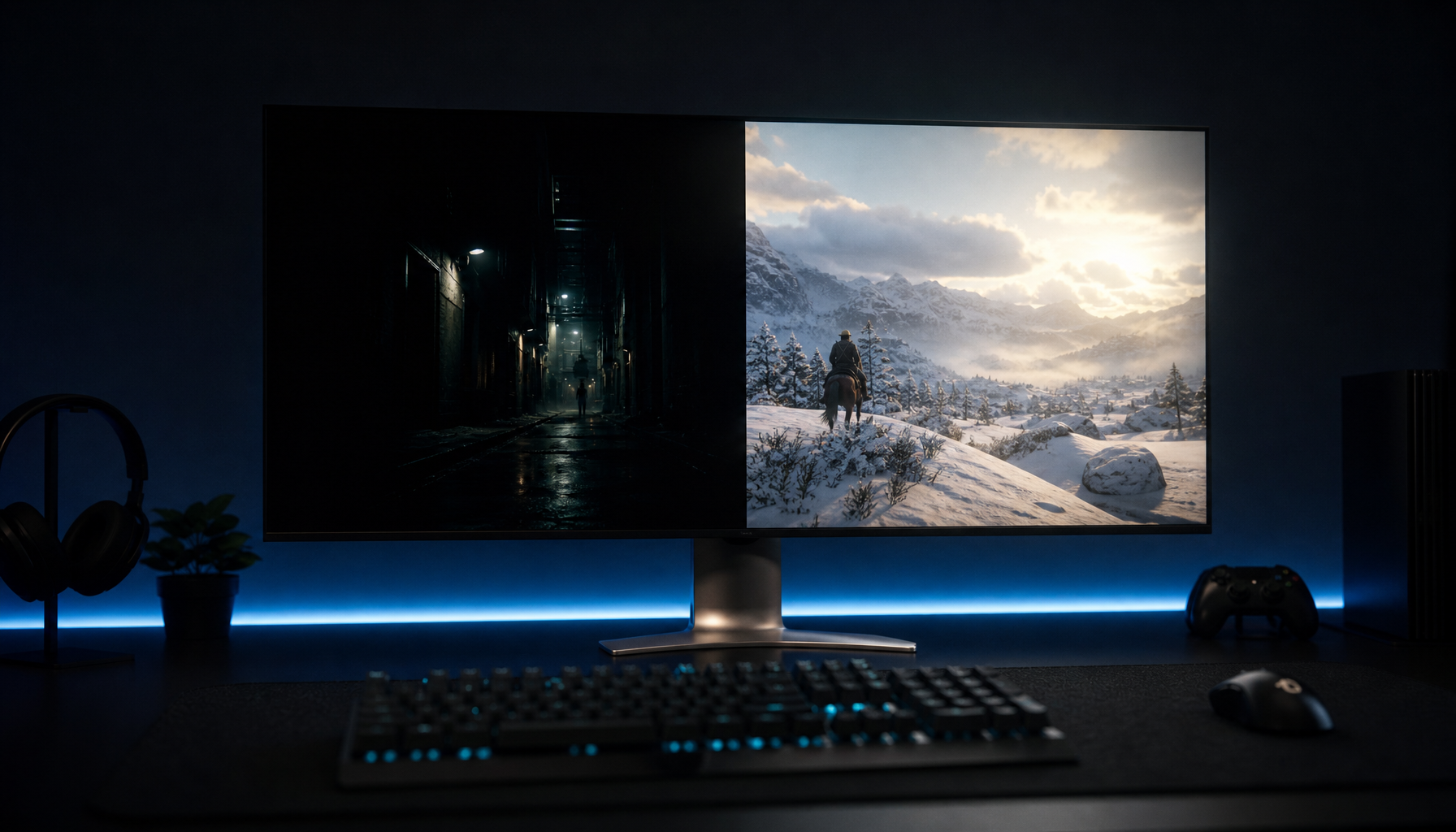
A monitor’s white point is the color of “white” when red, green, and blue are balanced for neutral output. Many screen-first workflows target a D65-like white point near 6500K, while warmer blue-light modes push the image toward amber or yellow. Display testing and monitor guidance consistently treat 6500K as a common color-temperature target for accuracy, and color temperature is one of the first settings that changes how accurate a screen appears.
In real work, that shift creates a compensation error. If your monitor is too warm, you may cool down the image during editing. When the file appears on a normal display, the final result can look too blue or too sterile. A product photographer editing white sneakers under a strong night filter might remove “yellow” that was never in the file, then ship images that look cold on an online marketplace listing page.
Blues, Skin Tones, and Brand Colors Lose Their Anchor
Aggressive blue reduction does not only affect blue objects. It changes the balance of the entire image because neutral values are the reference point your eyes use for judgment. Blue UI accents can look muted, cyan can lose energy, purple can skew, and skin tones can appear healthier or warmer than they really are. That is especially risky when reviewing cosmetics, apparel, food photography, medical visuals, interface themes, or sponsored creative where color approval has business consequences.
The American Academy of Ophthalmology also adds an important reality check: digital eye strain is usually tied more to screen habits, reduced blinking, dryness, and prolonged viewing than to screen light damaging the eye, and it blue light-blocking glasses for routine computer use. That does not make blue light controls useless, but it does mean color professionals should avoid treating strong filters as the default fix for every discomfort symptom.
Shadow Detail and Contrast Can Become Less Reliable
Many comfort modes do more than reduce blue. Depending on the monitor, a low blue light or reader preset may also alter brightness, contrast, gamma, sharpness, saturation, or available picture controls. Even when the user only wanted a warmer image, the preset can flatten contrast or make dark tones harder to judge.
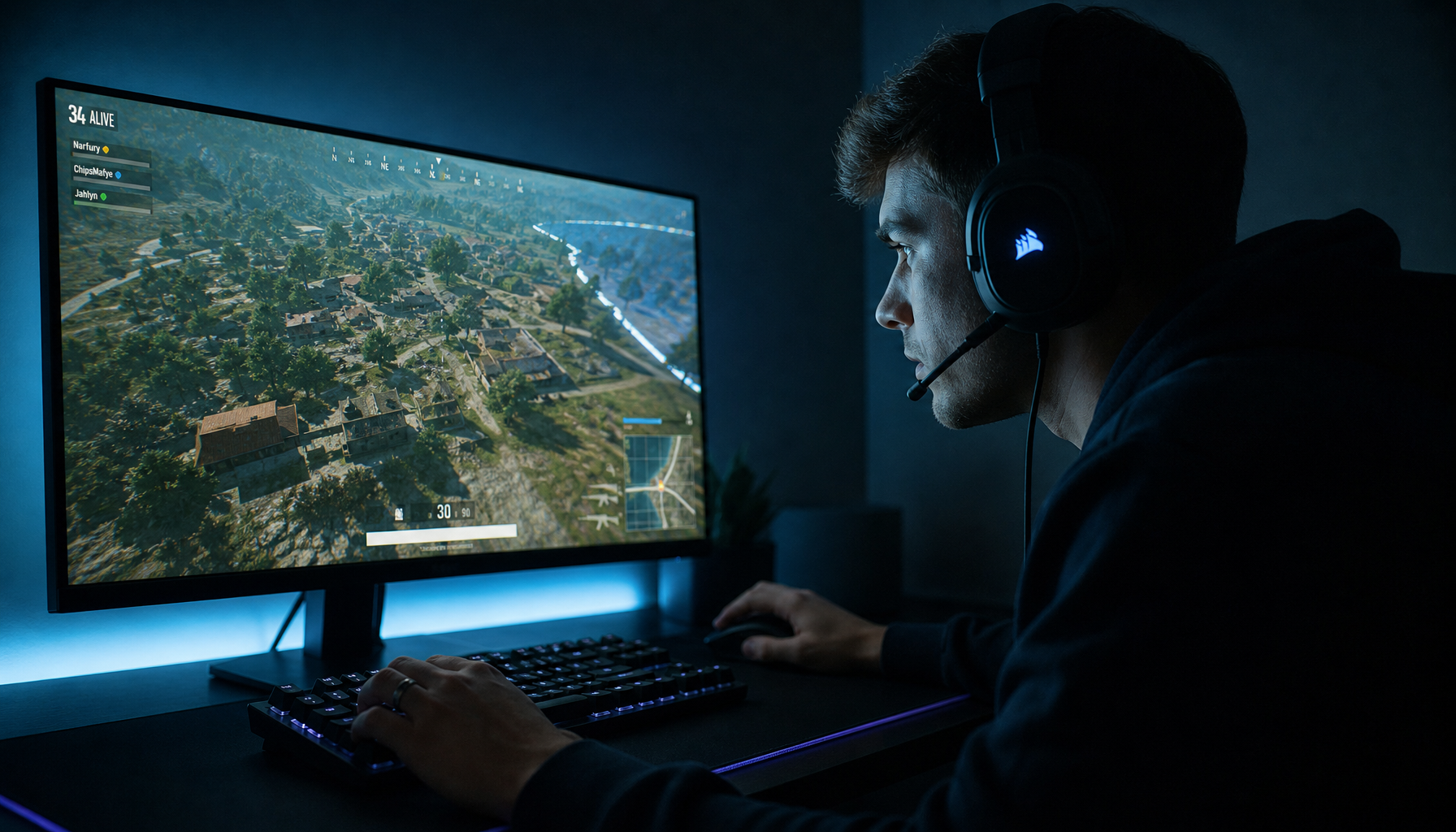
That matters in gaming visuals, video grading, and e-commerce photography. If shadow detail is lifted, you may leave an image too dark. If contrast is softened, you may over-sharpen or over-grade. If blues are dampened, a deep navy jacket may read closer to charcoal, and a subtle blue cast in a white background may go unnoticed until a client sees it on a neutral display.
The Eye-Comfort Benefit Is Real, but Not Universal
Blue light reduction can still be useful. It can make evening reading less harsh, reduce perceived glare for some users, and help signal the brain that the day is winding down. Device-level night modes and display filters are easy to schedule, and night mode commonly shifts the screen warmer, which is exactly why it can affect color accuracy.
The evidence is not a clean “filters always help” story. A 2023 Indian Journal of Ophthalmology study compared laptop tasks with and without a blue light filter in 40 young adult participants and found a mixed outcome: data-entry time improved with the filter, but subjective visual fatigue was higher with it. That blue light filter result supports a practical conclusion: comfort modes should be tested against the task, not assumed to improve every screen session.
Why Aggressive Filters Can Make You Less Efficient
Color-critical workers often lose time because a strong filter creates uncertainty. You check the image, disable the filter, recheck the image, change the room light, compare on another display, then wonder which view is true. The hidden cost is not only inaccurate color; it is decision drag.
A simple example shows the workflow penalty. If a designer spends five extra minutes per asset checking whether a warm filter distorted color, a 24-image product batch loses two hours before export. That is not eye care. That is avoidable friction caused by mixing a comfort profile with an approval profile.
Better Workflow: Separate Comfort From Color Decisions

The most reliable setup is a two-profile workflow. Use a neutral profile for color-critical work and a warmer profile for comfort work. The neutral profile should use the monitor’s most accurate mode, often Custom, User, or sRGB depending on the display and project. Brightness should match the room, gamma should stay near the expected SDR target, and the display should be recalibrated when the environment or hardware changes.
For night work, build a second profile that is intentionally warmer but clearly labeled as non-critical. Use it for writing, admin, coding, research, chat, or late browsing. The key is discipline: do not approve color, skin tone, brand color, product texture, or final grade while that profile is active.
Work Type |
Recommended Blue Light Setting |
Why It Works |
Photo editing, design approval, video grading |
Off or very mild |
Preserves white point, saturation, and tonal judgment |
Product listings and brand-color checks |
Off |
Prevents false corrections to whites, blues, and skin tones |
Office writing and spreadsheets |
Mild to moderate |
Comfort matters more than exact color matching |
Late-night reading or browsing |
Moderate to strong |
Sleep timing and glare comfort may matter more than fidelity |
Competitive gaming with color cues |
Mild, tested first |
Strong warmth can reduce target and HUD clarity |
Fix Eye Strain Without Breaking Color

For color-critical work, start with the fixes that do not tint the image. Set the monitor about 20 to 25 inches away, keep the top of the screen at or slightly below eye level, reduce glare, and balance the room so the display is not a bright rectangle in a dark cave. Ergonomic guidance also points to monitor height, viewing distance, tilt, and bias lighting as major comfort factors; eye fatigue is rarely solved by color temperature alone.
Brightness is the next lever. A monitor set too bright in a dim room can feel punishing even with a warm filter enabled. Lower the brightness until white areas stop glowing aggressively, add soft indirect lighting behind or beside the display, and keep reflections off the panel. Then use the 20-20-20 rule: every 20 minutes, look at something 20 ft away for 20 seconds. That habit protects focusing comfort without contaminating your color pipeline.
Hardware Filters, Software Filters, and Glasses
Software filters are convenient because they can be scheduled and adjusted quickly. Operating-system night modes and similar tools can reduce blue output strongly, but they usually do it by warming the whole image. Independent display testing has found that built-in monitor filters reduce some blue light, while operating-system night modes often remove more and give users more control.
Monitor-based low blue light modes work across devices and can be useful on shared desks, consoles, or portable screens, but they may be less transparent. You may not know whether the preset changed gamma, brightness, contrast, overdrive, or sharpness. For color work, the safest choice is a monitor that offers a calibrated or sRGB mode separately from eye-care modes, so comfort and accuracy are not bundled into one opaque switch.
Glasses add another layer. Clear lenses with minimal tint may be acceptable for general work, but yellow or amber lenses can distort color enough to make final edits unreliable. If glasses are necessary for comfort, remove them during final color approval or calibrate and evaluate consistently in the same lens-and-lighting condition.
When Strong Blue Light Reduction Makes Sense
Strong reduction is most defensible when sleep timing matters more than color accuracy. Within the last hour or two before bed, warmer settings, lower brightness, and reduced screen use can be helpful, especially for reading or administrative tasks. Office lighting guidance also supports using cooler tones earlier in the day and warmer tones later, because blue-rich lighting can support alertness during work hours while warmer light fits evening wind-down.
It also makes sense for users who are not making visual judgments. A spreadsheet, long document, dashboard, or support queue does not need perfect blues. In those cases, comfort can take priority, as long as the display remains readable and does not cause you to increase brightness to compensate for the warmer image.
A Practical Display Specialist Setup

For a serious workstation, create three named modes if your monitor and operating system allow it. Keep one neutral mode for creative work, one comfortable daytime office mode with matched brightness and no heavy tint, and one warmer evening mode for non-critical use. On a portable smart screen, save the neutral mode for client previews and the warm mode for travel writing or hotel-room admin, where ambient lighting is often harsh and inconsistent.
Before final export, run a short visual checkpoint. Turn off night modes, remove tinted blue-light glasses, return the monitor to the neutral profile, and view a known reference image with skin, neutral gray, deep blue, and near-black detail. If those references look wrong, fix the display environment before fixing the file.
Bottom Line
Aggressive blue light reduction is a comfort tool, not a color-management strategy. Use it confidently for late-night reading, office work, and low-stakes browsing, but keep it away from final color decisions. The highest-value setup is not the warmest screen; it is a display workflow that lets your eyes work longer without forcing your colors to lie.


