


Daytime washout usually comes from ambient light, glare, and reflections overpowering your screen’s luminance and contrast. Fix the room first, then fine-tune monitor settings for clearer games, sharper text, and better shadow detail.
Does your monitor look rich after 9:00 PM, then turn pale and low-contrast the moment sunlight hits your desk? A simple change in screen position, room lighting, and brightness matching can make dark-game detail, spreadsheet text, and photo shadows easier to see without buying a new display.
Why Daylight Makes a Good Display Look Bad
A monitor is not viewed in isolation. It competes with the light around it. Screen brightness is the intensity of light emitted by the display, but what your eyes perceive depends on the room, the desk surface, the wall behind the monitor, and whether a window or lamp is reflecting off the panel.
At night, the display may be the brightest object in your field of view. Blacks look deeper, shadows separate cleanly, and colors feel saturated. During the day, ambient light raises the apparent black floor. The darkest parts of the image are no longer truly black; they are black plus room reflection. That is why a stealth game, dark video timeline, or gray spreadsheet grid can look flat at noon but excellent after sunset.

This is also why a fixed brightness target can mislead you. A commonly discussed 120-nit setup may be comfortable in a controlled dim room, but monitor luminance should increase when ambient light increases. For color-critical work, the smarter move is usually not to blast the backlight. It is to control the light falling on and around the screen.
The Core Problem Is Contrast Loss
Washed-out daytime viewing is mostly a contrast problem. Brightness is how much light the screen emits. Contrast is the separation between bright and dark areas. When sunlight or a bright lamp hits the display, reflected light fills in the dark areas first, so blacks become gray and midtones lose shape.
For gaming, that can hide enemies in shadow or flatten HDR-looking scenes into a dull haze. For office work, it makes black text on white backgrounds feel less crisp, especially on glossy panels. For portable smart screens, the issue is even more obvious because they are often used near windows, in cafes, or beside laptops with different brightness behavior.
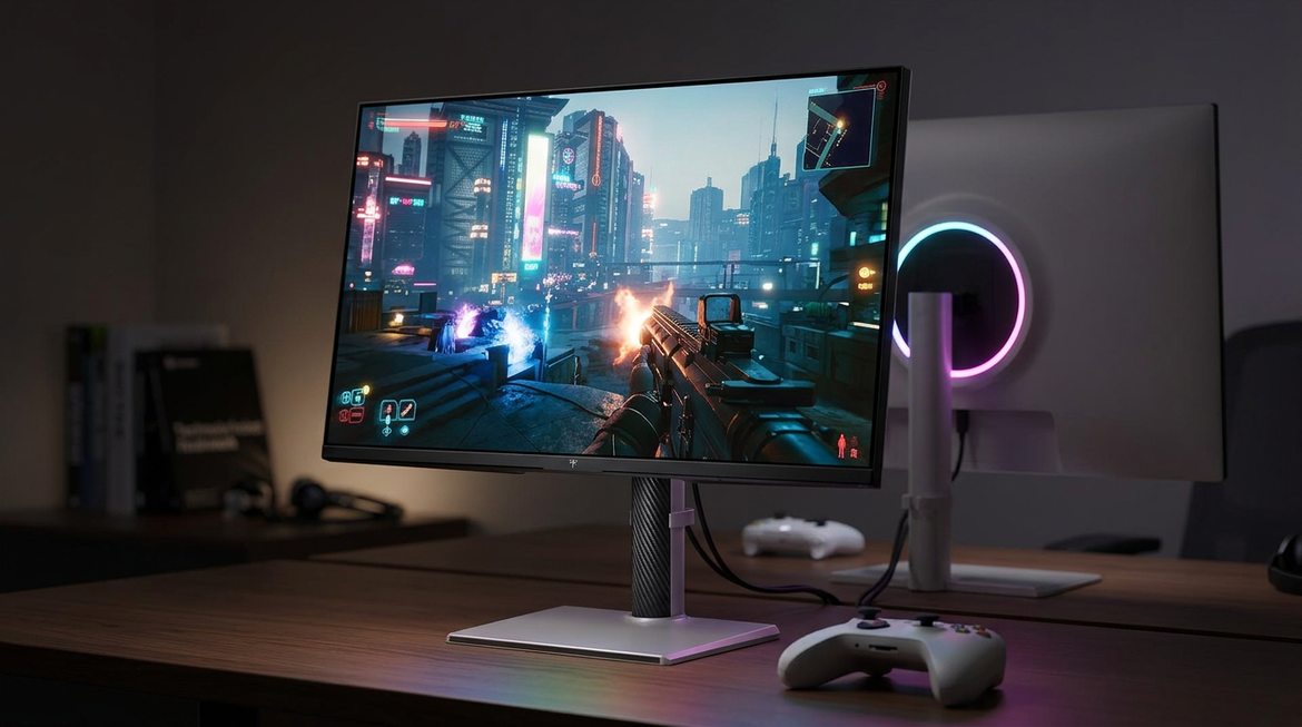
Panel type matters, but it cannot fully overcome a bad room. IPS gives strong color and viewing angles, VA usually gives stronger native contrast, and OLED can switch pixels off for very deep blacks. Still, even a premium gaming display loses perceived contrast if a bright window reflects across the screen. OLED gaming monitors can deliver excellent black levels and contrast, but ambient reflections still reduce what your eyes can actually distinguish.
Fix the Environment Before You Touch the Monitor
Move the Screen Out of the Light Path
The fastest fix is to stop direct light from hitting the panel. Place the monitor so windows are beside the display rather than directly in front of it or behind you. A window behind the monitor makes your eyes adapt to the bright background. A window behind your chair reflects on the display. Side lighting is usually the most controllable compromise.
If you work at a desk 20 to 24 inches from the screen, even a small tilt change can help. A backward tilt of about 10 to 15 degrees is often recommended for reducing glare from overhead lighting or windows. In practice, tilt the screen until the brightest reflection moves away from your main viewing area, then recheck text sharpness and posture.
Control the Room, Not Just the Panel
For accurate viewing, your goal is a stable visual environment. Close blinds during peak sun hours, use sheer curtains if the room becomes too dark, and avoid glossy white desks that bounce light upward into the screen. A matte desk pad can make a surprising difference because it reduces light reflected into your eyes and onto the lower part of the panel.

The calibration discussion references ISO 3664 P2 viewing conditions, where ambient light near the display should be low relative to the monitor’s white point. You do not need a lab setup to use that principle. If your screen looks good at night but bad during the day, the room is likely too bright at the display surface, not necessarily too bright for normal living.
Match Screen Brightness to the Desk
The practical target is simple: the screen should not feel like a flashlight in a dark room or a dim tablet under sunlight. Brightness adjustment improves visibility and comfort in both bright and dim environments, but the correct setting changes across the day.

A low-risk field test is to open a white document and place a white sheet of paper next to the monitor. If the screen looks much brighter than the paper at night, lower it. If the paper looks much brighter than the screen during the day, raise brightness or reduce room light. The goal is not exact measurement; it is visual balance.

Settings That Actually Help
Start With Hardware Brightness, Then Contrast
Use the monitor’s brightness control first because it changes panel luminance. Then adjust contrast only if whites are harsh or detail is clipping. If white web pages feel painfully bright at night, brightness is probably too high. If bright areas lose detail even after brightness feels reasonable, contrast may be too high.
Forum users discussing monitor brightness for eyes disagree on one important nuance: some prefer keeping hardware brightness high to avoid pulse-width modulation concerns on certain displays, then reducing brightness through graphics software. That advice is experience-based rather than universal. If your display is marketed as flicker-free, hardware brightness adjustment is usually the cleaner first move. If lowering brightness causes headaches, visible flicker, or unusual fatigue, test software-side brightness reduction and compare it for a full work session.
Use System Color Tools When Color Looks Inconsistent
If the room is fixed but colors still shift between apps, the problem may be color management. Auto color management is designed to keep colors more accurate and consistent across supported displays and apps. It can also reduce visible artifacts in gradients, shadows, and darker scenes.
This will not remove sunlight glare, but it can prevent a second problem from being mistaken for the first. If your game launcher, browser, editing app, and photo viewer all show different saturation, color management deserves attention after the room lighting is under control.
When a Monitor Upgrade Is the Right Fix
Environment fixes have limits. If your monitor peaks around 250 to 300 nits, has weak reflection handling, and sits in a bright office, it may never look punchy at noon. Bright screens and strong reflection handling are important in well-lit office environments, especially for business monitors used all day.
For productivity, prioritize resolution, ergonomics, and usable brightness. Productivity monitors often emphasize workspace, clarity, comfort, and features such as flicker-free backlights, low blue light modes, USB-C, and height adjustment. A 27-inch 4K screen can make text sharper, while a 32-inch 4K or ultrawide can reduce window switching.
For gaming, choose based on genre and room. Competitive players may prioritize refresh rate and response time, while cinematic players benefit more from contrast, HDR capability, and strong black depth. Gaming monitor choice depends heavily on whether you play fast shooters, open-world RPGs, racing sims, or console titles.
Use Case |
Best Environmental Fix |
Monitor Feature That Helps |
Competitive gaming by day |
Remove reflections from center screen |
Higher brightness, matte coating, fast refresh |
Dark RPGs or HDR games |
Dim room behind and beside display |
OLED, Mini-LED, strong HDR, high contrast |
Office documents |
Match white screen to desk brightness |
4K clarity, ergonomic stand, flicker-free backlight |
Avoid window-facing setup |
Higher peak brightness and anti-glare finish |
A Practical Day-to-Night Calibration Routine
Set one daytime profile and one nighttime profile. During the day, reduce reflections first, then raise brightness until white pages look close to the brightness of your desk surface. At night, lower brightness until a white document no longer lights up your face or nearby wall aggressively.
For a gaming monitor, test with a dark scene you know well, not just a settings menu. For an office display, test with a white document, a spreadsheet, and a dark-mode app. For a portable screen, test it beside your laptop because mismatched brightness between two displays can cause fatigue during long sessions.
FAQ
Should I use dark mode during the day?
Dark mode can reduce glare from large white areas, but it does not solve reflection. In a bright room, dark mode may actually make reflections more visible because the screen contains more dark areas. Use it if it feels comfortable, but fix light placement first.
Is 120 nits always the best brightness?
No. It can work in a controlled dim room, but it may be too low in daylight. Treat 120 nits as a calibration reference, not a universal comfort setting.
Do blue light modes fix washed-out daytime image quality?
No. Low blue light modes may improve comfort for some users during long or evening sessions, but washed-out daytime viewing is mainly caused by ambient light, glare, and reduced perceived contrast.
A great display does not only need the right specs; it needs the right environment. Control the light, match brightness to the room, then let the panel’s resolution, contrast, refresh rate, and color performance do the work you paid for.


