


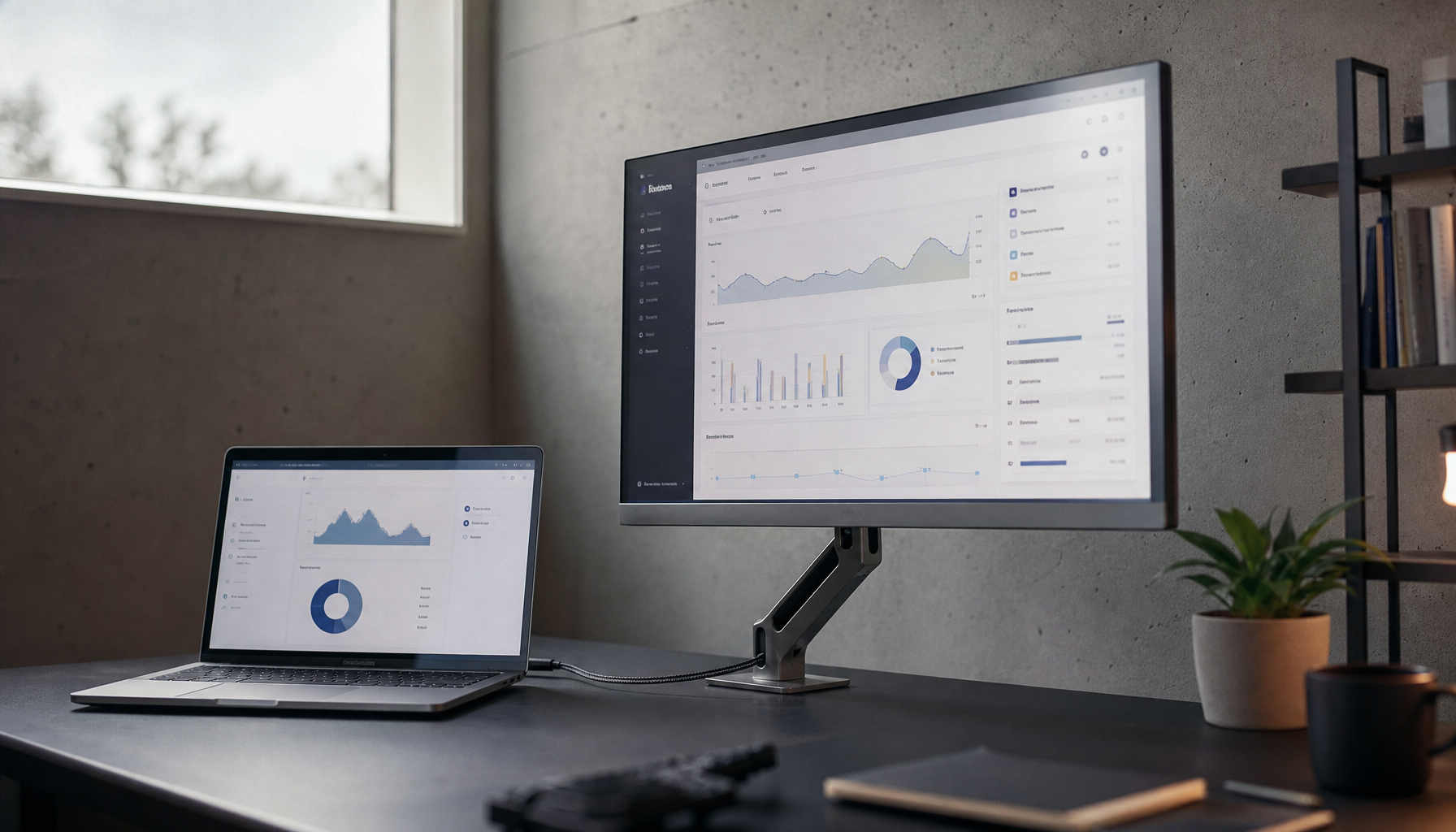
IPS contrast depends on more than the panel label alone. Native panel quality, backlight control, tuning, room light, and calibration all affect how deep blacks and bright highlights look.
Does your IPS monitor look crisp on spreadsheets but strangely gray and flat once a game or movie turns dark? A simple 30-minute warm-up and a few careful black-and-white pattern checks can quickly show whether the panel is truly limited or just badly set up. You’ll leave with a clear way to judge IPS contrast, improve it in practice, and decide when a different panel type makes more sense.

What contrast really means on an IPS monitor
The static contrast ratio is the number that matters most in real monitor use because it describes how bright white and dark black can appear in the same frame. That is why one IPS panel can make a dark game lobby look acceptably deep while another turns the same scene into charcoal gray, even if both are advertised with flashy marketing numbers.
A high dynamic contrast ratio is far less useful because it usually reflects scene-to-scene tricks rather than the black level you actually see. In practice, the better IPS panel is the one that preserves shadow detail, separates bright highlights cleanly, and avoids the washed-out look that ruins immersion in dark games, late-night editing, or dim office lighting.
Why one IPS panel looks richer than another
Native panel quality still sets the ceiling
Most IPS displays are built around a native contrast level near 1000:1, so small differences in panel quality matter more than many buyers expect. If one unit keeps blacks a little darker, holds gamma more steadily, and avoids crushing midtones, it can look substantially more premium even before you touch the settings menu.
A monitor marketed as an LED display is usually still an LCD with LED backlighting, not a different panel class altogether. That matters because two IPS monitors may both be sold as LED products, yet the better one can still win on contrast through a stronger backlight system, tighter factory tuning, and better brightness uniformity across the screen.
Brightness and room light change perceived contrast
The right brightness level depends on the room, not just the spec sheet. Around 300 to 500 nits is generally fine indoors, but the same IPS monitor that looks punchy in a controlled office can lose apparent contrast near a sunny window, where reflections and ambient light lift the black floor and make every dark scene look milky.

A room with roughly 10 to 20 foot-candles of ambient light gives an IPS panel a much better chance to show its real contrast. On a real desk, that means avoiding a bright window directly behind you, keeping the screen slightly below eye level, and judging picture quality after the panel has warmed up instead of in the first few minutes, when brightness and color temperature can still drift.
Factory settings can help or hurt more than buyers realize
Generic brightness and contrast settings are unreliable because the numbers mean different things on different models. One IPS display may look punchy at a contrast setting of 75, while another starts clipping bright detail at the same number. That is why two people can own similarly priced IPS monitors and report very different contrast impressions.
A contrast setting around 70% to 80% is often a sensible starting point, but it is only a starting point. If brightness is too low, dark gray tones collapse into black and you lose shadow detail. If contrast is too high, clouds, UI highlights, and white text edges lose separation. The quickest real-world check is a black-level and white-level test image: if you cannot distinguish the darkest grays or brightest near-whites, your panel may be fine but your setup is not.

Build quality and IPS glow affect black depth
One reason IPS buyers sometimes feel let down is that IPS glow and backlight inconsistency can make blacks look brighter than the panel’s spec suggests. On a black loading screen, a cleaner unit keeps corners calmer and the center more even. A weaker one shows bright haze at the edges, which your eyes read as poor contrast even if the advertised ratio sounded acceptable.

This is also where source language gets messy. Some manufacturers describe IPS positively for contrast and clarity, while KTC still places VA clearly ahead for native black depth. The most likely explanation is that some guides use contrast loosely to mean overall image punch and color separation, while gaming-focused comparisons mean literal black-versus-white performance. For buying decisions, native black depth is the safer interpretation.
What better IPS contrast usually looks like in practice
The difference between brightness and contrast becomes obvious when you compare panels side by side. A bright screen with weak contrast often looks clean on a white webpage but flat in a dark game. A better IPS screen does not necessarily look darker overall; it looks more controlled, with cleaner separation between shadow, midtone, and highlight detail.
Panel style |
Typical contrast feel |
Best fit |
Main compromise |
Standard IPS |
Usually around 1000:1 and solid for everyday work |
Productivity, mixed gaming, shared viewing |
Blacks can look gray in dim rooms |
Better-tuned IPS |
Cleaner shadow detail, less washed-out dark content, more stable image across the panel |
Hybrid desks that mix office work, creation, and gaming |
Costs more and still does not reach VA-level blacks |
VA |
Often around 3000:1 to 5000:1 |
Dark-room gaming, movies, cinematic single-player use |
Some models trade speed and can show more smearing |
The 3000:1 to 5000:1 range is the key reason VA remains the contrast favorite for dark-room play. If you mainly use a monitor for horror games, movies, or late-night story-driven titles, even a very good IPS may still feel merely competent rather than dramatic. If you split time between fast games, work apps, and bright-room use, a better IPS often feels more balanced and more reliable.
How to judge an IPS panel before you buy or keep it
Checking third-party reviews and real measurements matters more than reading a box that promises extreme dynamic contrast. The useful questions are simple: Does the panel preserve shadow detail? Does it keep highlights from clipping? Do the corners stay reasonably clean on a dark screen? Does it still look convincing in your actual room rather than a showroom?
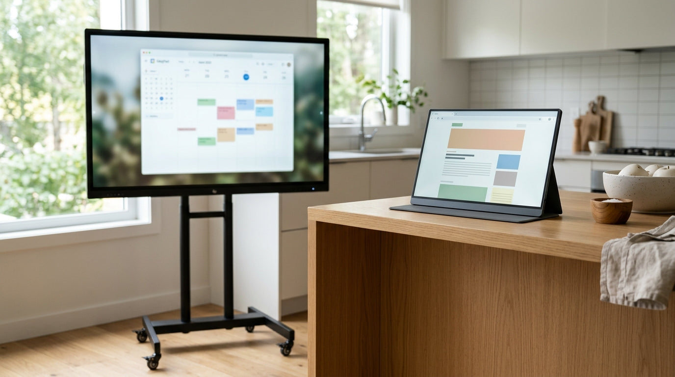
A wide-angle IPS design still makes excellent sense for office setups, shared desks, portable smart screens, and mixed gaming stations where color stability matters. For example, a portable IPS display used in hotel rooms, coffee shops, and client meetings benefits more from stable viewing angles and decent daylight readability than from chasing theater-grade blacks it will rarely show in controlled darkness.

The practical bottom line
Some IPS panels have better contrast because they combine a stronger native panel, better backlight control, smarter factory tuning, and a setup that fits the room. If you want the best all-around screen for work, gaming, and everyday reliability, choose the IPS model with the best measured static contrast and the cleanest real-world tuning. If your top priority is deep-black drama, IPS may simply be the wrong tool for the job.


