


Text clarity usually comes down to pixel density, subpixel layout, and desk distance, not just the panel name. For long coding or reading sessions, IPS is the safest baseline, Mini-LED is the brightest LCD-style option, and OLED is the most likely to show colored fringing on small text when the layout and software assumptions do not line up.

For readers who want the shortest answer: if you work in small fonts for hours, start with a sharp IPS display and treat OLED as a contrast-first choice, not a text-first one. How OLED Subpixel Layout Affects Text Clarity on Desktop explains why OLED can look impressive overall while still showing edge color on fine text.
Why Text Clarity Feels Different
A monitor can look sharp in one task and soft in another because text rendering depends on more than resolution. Font size, scaling, and how close you sit all change whether pixels are noticeable. If the question is "what should I check first," the answer is usually native resolution and expected viewing distance, because those two factors often decide whether a panel feels crisp or merely acceptable.
OLED can look very clean in motion, but small black text on white backgrounds may show red, green, or magenta edges when the subpixel layout does not match the operating system's text rendering assumptions. Color Fringing on Displays is a useful follow-up if you are trying to diagnose whether the issue comes from the panel, scaling, or software.
Mini-LED usually behaves like an LCD for text, because the backlight changes brightness and contrast, not the pixel structure itself. That means it can improve perceived punch in bright rooms without automatically fixing text sharpness. IPS stays the most predictable option when you want text to look familiar across office apps, browser tabs, spreadsheets, and mixed operating systems.
What Actually Makes Text Look Sharp
Pixel Density and Font Size
Higher pixel density makes the edges of letters easier to hide. In practical terms, a denser display gives each letter more tiny steps, so stair-stepping becomes harder to see at normal desk distance. Monitor Pixel Density Guide frames the rule well: once density rises enough, text stops looking coarse and starts looking more continuous.

That is why 27-inch 4K often feels safer than 27-inch 1440p for dense work. The resolution itself is not magic; what matters is how much detail is spread across each inch of screen area and whether your font size is small enough to expose the gaps.
Subpixel Layout and Color Fringing
This is the biggest OLED-specific trade-off for text-heavy use. If the subpixel pattern does not match the rendering method, colored edges can appear around letters, especially in light-mode editors and terminals. On large headlines or video, many people barely notice it. On code, docs, and spreadsheet grids, the effect can be enough to annoy you every day.
Scaling, ClearType, and App Behavior
Operating-system scaling can help or hurt. A clean 4K setup often looks better when the OS and the app scale text consistently, while a messy scaling chain can soften even a good panel. Windows users are especially likely to notice this because subpixel rendering can be sensitive to the panel's layout. See ClearType registry settings for how rendering parameters interact with different layouts.
Brightness, Contrast, and Desk Lighting
Mini-LED's real advantage is easier readability in bright offices or near windows. The extra backlight headroom helps keep light-mode interfaces visible without washing out the screen. That said, brightness does not replace pixel density. A very bright display can still show soft text if the panel itself is not dense enough.
OLED, Mini-LED, and IPS Side by Side
| Panel Type | Text Fringing Risk | Bright Room Readability | Long Reading Comfort | Best Fit |
|---|---|---|---|---|
| OLED | Higher on small fonts if subpixel layout and scaling do not line up | Good, but not the main advantage | Best when contrast matters more than text precision | Users who value contrast and can accept some text trade-offs |
| Mini-LED | Low to moderate, depending on the underlying LCD panel | Strong | Good for mixed office lighting | Buyers who want brightness plus LCD-style text behavior |
| IPS | Usually the most predictable | Good on the right model | Strong for long sessions | Coding, writing, spreadsheets, and general productivity |
If you want the least risky text-first choice, IPS is usually the cleanest answer. If your room is bright and you still want a familiar LCD-like text appearance, Mini-LED is the more interesting upgrade. OLED makes the most sense when contrast, dark-room use, or motion quality matter enough to outweigh possible fringing on small fonts.
For a browsing starting point, the IPS Monitors collection is the most direct place to compare text-friendly LCD options, while the All-Mini-LED Monitors collection is better if you want more brightness and contrast without moving to OLED.
Best Choice by Work Style
Long Reading and Writing
If you spend hours in long articles, docs, or editing tools, stable text edges matter more than deep blacks. That points most buyers toward IPS. OLED is not a bad screen type overall, but it is a weaker default when your main goal is to forget about the display and just read.
Coding in Light Mode
Coders who keep editors, terminals, or browser-based tools in light mode should check small-font rendering first. If the text size is 11 to 13 points and you sit close to the screen, fringing becomes easier to notice. In that case, a sharp 4K IPS is the safer fit, and Mini-LED is best treated as a brightness upgrade rather than a sharpness upgrade.
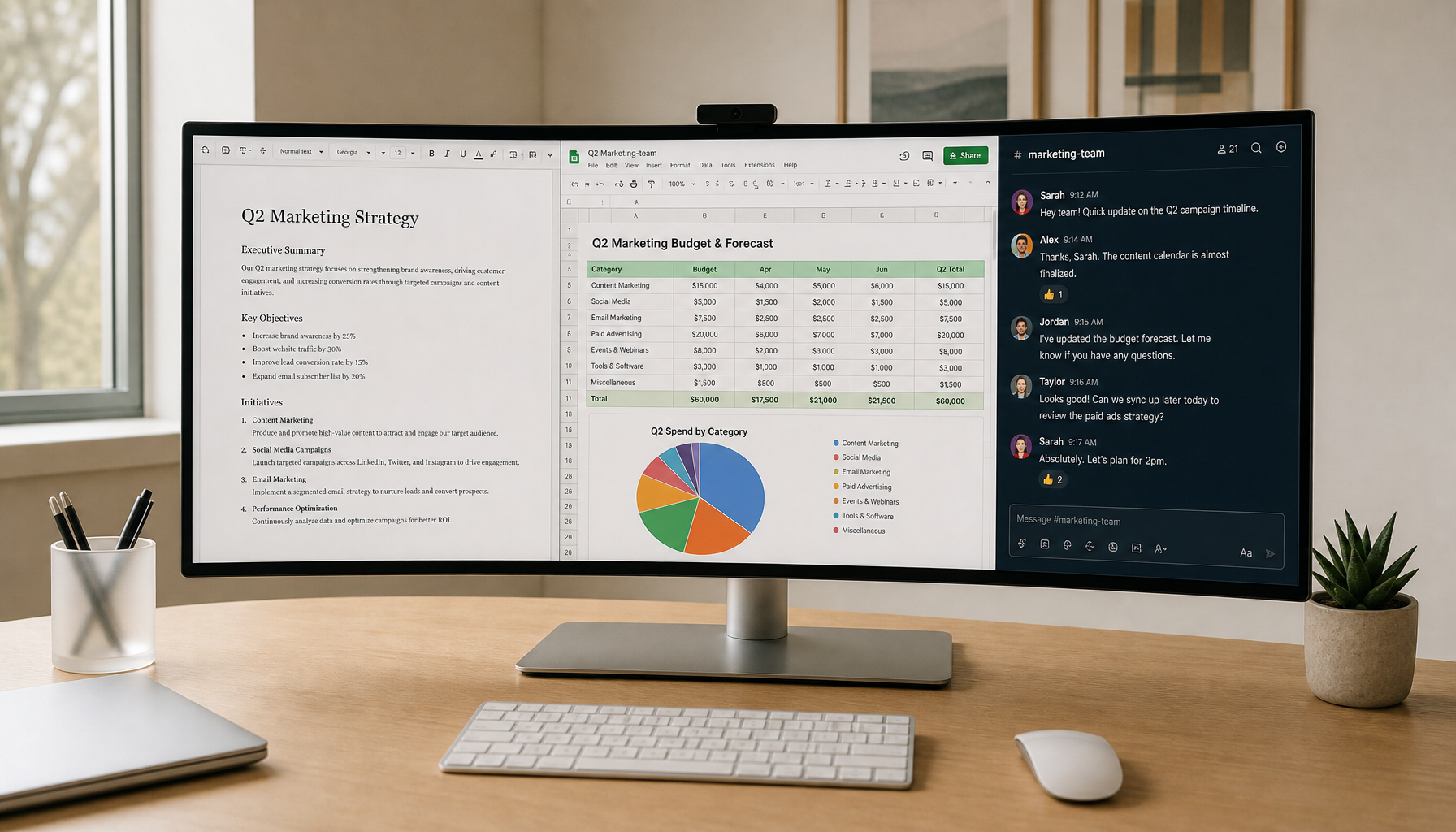
Spreadsheets and Dense Tables
Spreadsheet work rewards crisp gridlines and numerals. That usually favors high-density IPS or a sharp Mini-LED LCD. OLED can still look beautiful, but if your eye keeps landing on tiny numbers and borders, predictable text rendering often matters more than contrast.
Bright Office or Shared Desk Use
This is where Mini-LED becomes more compelling. If the room has mixed daylight and overhead light, the extra luminance can make text easier to read without cranking brightness to uncomfortable levels. That said, if the underlying panel is not dense enough, brightness alone will not rescue small text.
A practical example is the KTC 27" 4K IPS 60Hz Low blue Light Home&Office Monitor | H27P27. It fits the text-first side of the decision better than OLED when the priority is predictable reading and coding comfort.
If you need more brightness and contrast for a mixed-use desk, the KTC Mini LED 27" 4K 160Hz HDR1400 Gaming Monitor | M27P6 is the better fit to check next, especially if you want LCD-style text behavior with a more punchy image.
Resolution and Distance Rules That Matter
- Start with your usual chair distance, not the marketing spec.
- Prefer 4K on 27-inch if you read or code in small fonts.
- Treat 1440p as acceptable when you sit farther back or use larger text.
- Be cautious with OLED if you rely on light-mode editors and tiny fonts.
- Check scaling before buying, because bad scaling can make a good panel look worse than it should.
For a more detailed distance check, 32-inch 1440p viewing distance guide is useful as a planning reference. The exact numbers differ by panel size and density, but the rule is simple: the closer you sit, the more likely you are to notice pixel structure and text edge artifacts.
Text Clarity Checklist Before You Buy
- Check native resolution before you compare panel types.
- Match the screen to your font size and normal viewing distance.
- If you work in light mode, pay extra attention to subpixel behavior.
- Choose IPS when you want the most predictable everyday text rendering.
- Choose Mini-LED when brightness and contrast matter, but only after density is good enough.
- Choose OLED when you care more about contrast and motion quality than perfect text edges.
- Verify whether 4K is available if your work depends on fine text.
A helpful next step is the 4K Monitor collection, since 4K is often the simplest way to improve text sharpness before you start overthinking panel labels.
When the Recommendation Flips
OLED can be the better choice if your work is not text-dominant and you care a lot about contrast, dark-room viewing, or overall image quality. Mini-LED can beat plain IPS if your office is bright and you want more luminance headroom. IPS wins when the screen is mainly for reading, coding, spreadsheets, or anything else that punishes unstable text rendering.
That is the key boundary: if text is your daily job, buy for predictability first. If image punch is more important and text is secondary, the trade-off can move toward Mini-LED or OLED.
FAQs
Q1. How Do I Know If OLED Text Fringing Will Bother Me?
If you use small fonts, sit close to the screen, and notice colored edges quickly, OLED is more likely to annoy you. If your fonts are larger or you mostly watch video, the issue may be minor. The best check is a real desktop demo at your normal distance with your own scaling settings.
Q2. What Is the Safest Panel Choice for Coding Text Sharpness?
For most desk setups, a 27-inch 4K IPS monitor is the safest starting point because it combines high density with predictable text rendering. Mini-LED can be a good alternative when brightness matters more, but it should not be treated as a substitute for pixel density.
Q3. Can Mini-LED Improve Text Clarity by Itself?
Not really. Mini-LED mainly changes the backlight, so it can improve contrast and perceived brightness, but the actual sharpness still depends on resolution, pixel density, and the panel's LCD structure. If the text already looks soft, Mini-LED will not fully solve that by itself.
Q4. Why Does Windows ClearType Sometimes Make Text Look Worse?
ClearType assumes certain subpixel behavior, so it can help on some LCDs and look worse on others. If the panel's layout does not match the rendering method well, colored edges can become more visible instead of less. That is why the same setting can feel helpful on one monitor and distracting on another.
Q5. What Resolution Should I Choose for a 27-Inch Work Monitor?
If the monitor is mainly for reading, writing, or coding, 4K is usually the safer choice. 1440p can still work when you sit farther away or use larger fonts, but it gives you less room before text starts to look coarse. If you are shopping for a text-first desk, resolution should come before refresh rate.
If you are narrowing the decision to a practical shortlist, compare the IPS Monitors collection first for predictable text, then review All-Mini-LED Monitors if your room lighting or contrast needs are higher.


